He spent more than a decade as part of the creative team at Ralph Lauren Home, where he directed the presentation of collections in London, Milan and Brussels. A member of the British Institute of Interior Design (BIID) and the Society of British Interior Design (SBID), Maurizio Pellizzoni has received awards from SBID, the ID & A Awards, the International Design Awards and the International Property Awards, to name just a few, ever since he established his firm seven years ago.
Personal relationships with clients are central to Maurizio Pellizzoni’s work ethos. He has designed and created interiors for listed, period properties, new buildings, spacious country mansions and bijou townhouses in the UK and abroad. Maurizio’s aesthetic is inspired by the glamour of Lake Como, cosmopolitan New York, and daily life in London where he lives.
Johnny D interviews the renowned architect – designer for Design Trends:
Johnny D: What was the Client’s brief?
Maurizio Pellizzoni: The client, who was originally from Australia had a clear idea of the style he wanted for the refurbishment of the apartment. He wanted a warehouse-style loft, which was perfect for Shoreditch (East London).
JD: Please share with us an interesting anecdote during the first Client – Designer’s Meeting.
MP: I met the client long before the project, in fact I met him at the gym while I was studying architecture at London Metropolitan University. Since then, we became very good friends. He always talked about me helping him with his new project in London as soon I was graduating from university. The first design meeting was very straight forward as the client didn’t like any of the existing features in the apartment, so I was asked to redesign the space.
JD: What were the major challenges faced by you while designing the space?
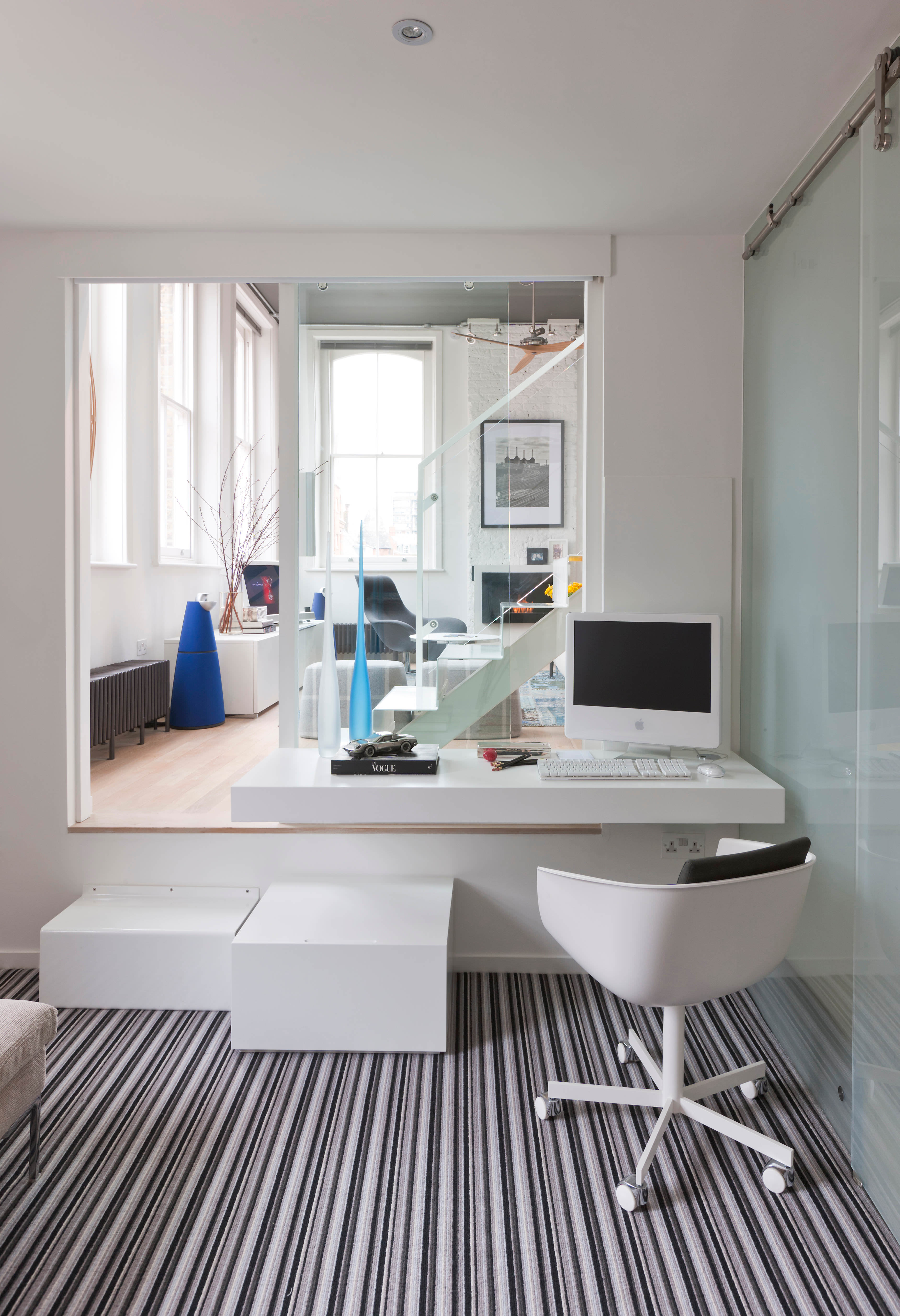
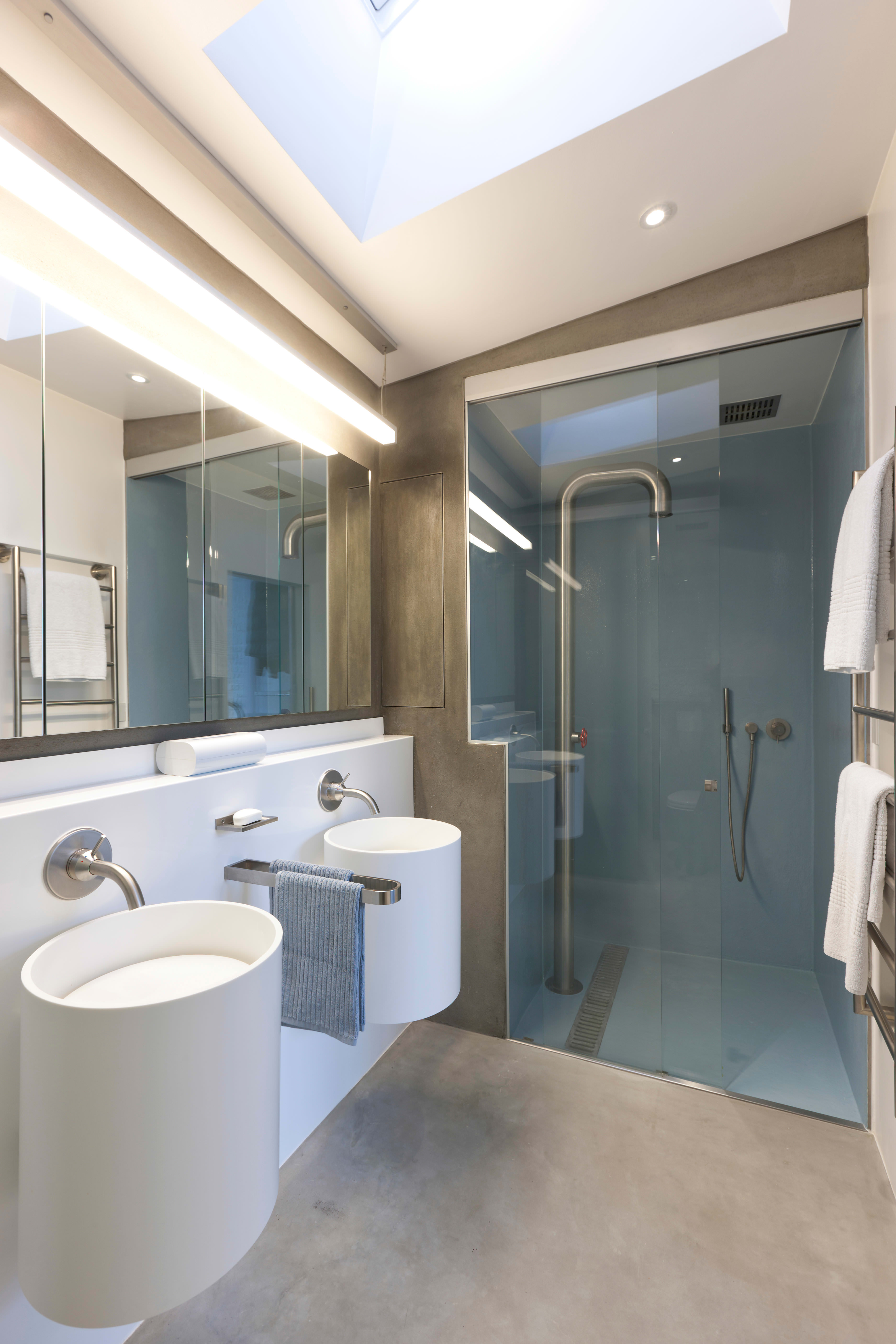
MP: The most challenging part of the project was to convince the council on the new layout for the apartment. The original layout had the accessibility to the small bedroom via a small door, which was located near the entrance and made the small room segregated from the rest of the apartment. My idea was to create an opening into the sitting room with a large window so the small bedroom / study was more part of the house. We also added a double sliding door to the downstairs bathroom making it spacious. We managed to convince the Council with a few minor adjustments.
JD: How did you overcome them creatively? Please elaborate.
MP: Looking at the original precedents in order to support all of our design ideas and convince the Council of what we were doing was the big challenge. During the entire design process and installation we tried not to compromise on any of the design, so it took time and patience.
JD: What were the design elements incorporated in the project. Please specify briefly the reasons behind it.
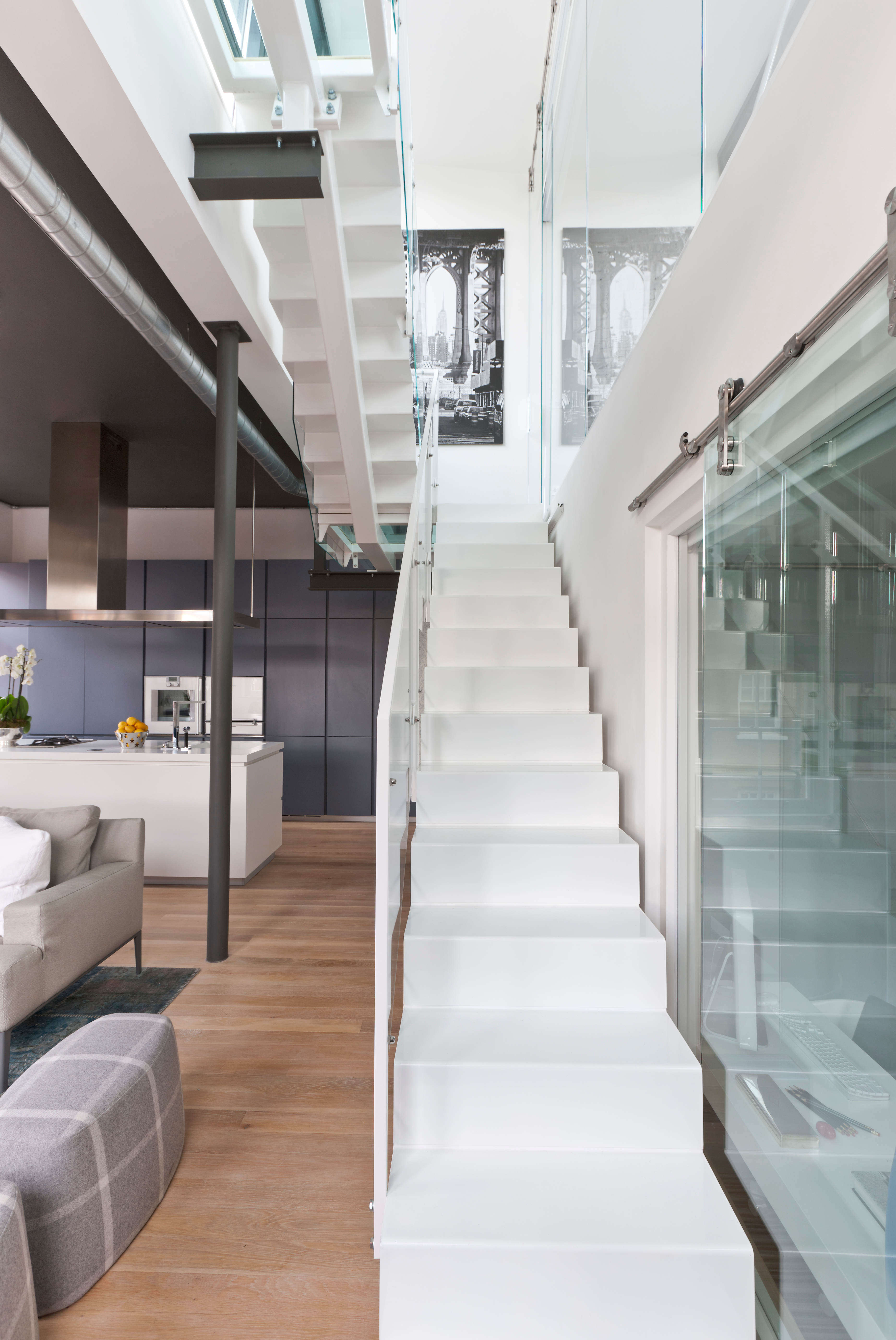
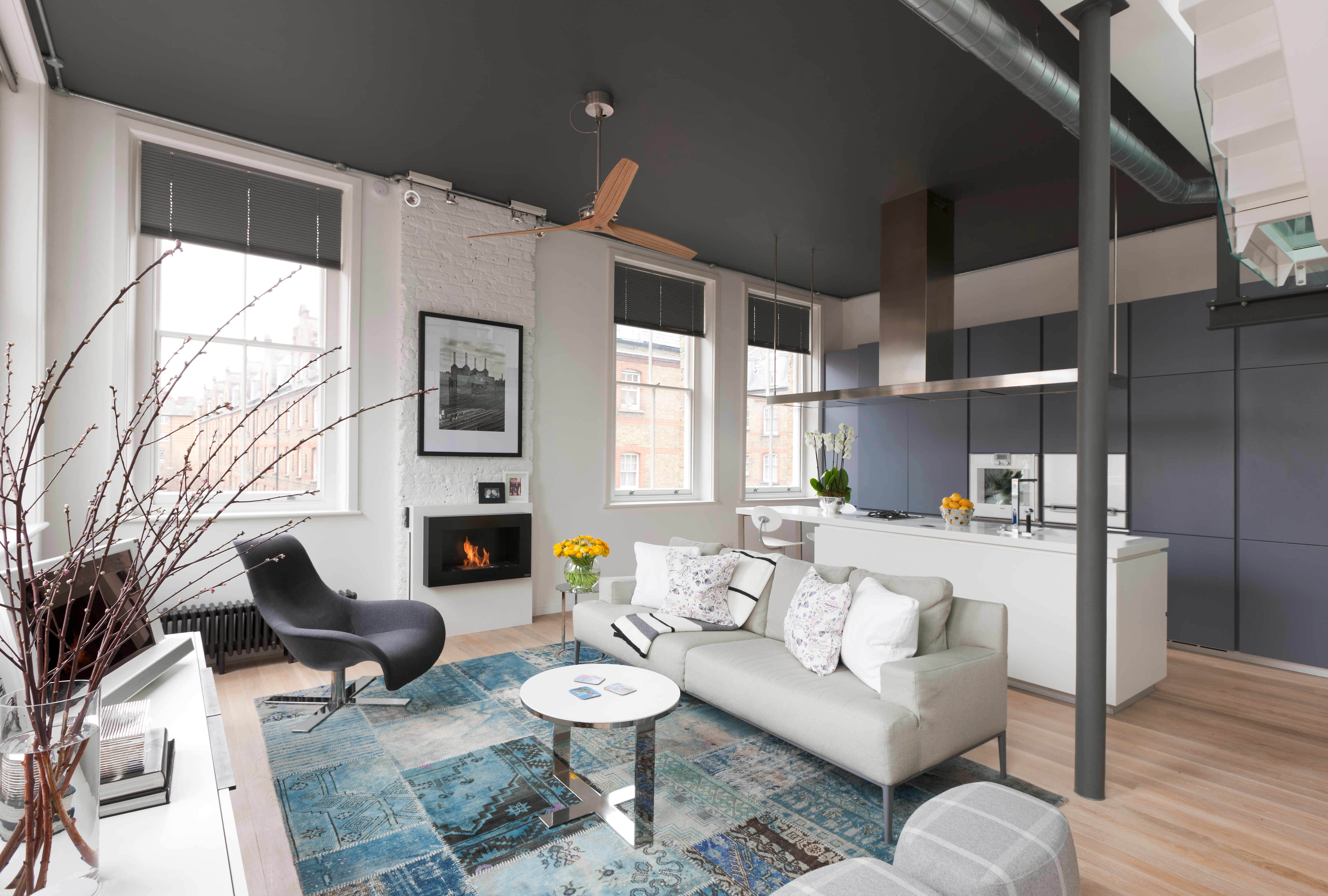
MP: The first major design element was the new staircase. This was designed to become the centre of attraction in the house, connecting the living space to the master bedroom and the outdoor terrace. The staircase took nearly a week to be assembled and it was taken in to the flat via the terrace with a large crane. It was made of powder coated steel designed in a unique and bold manner.
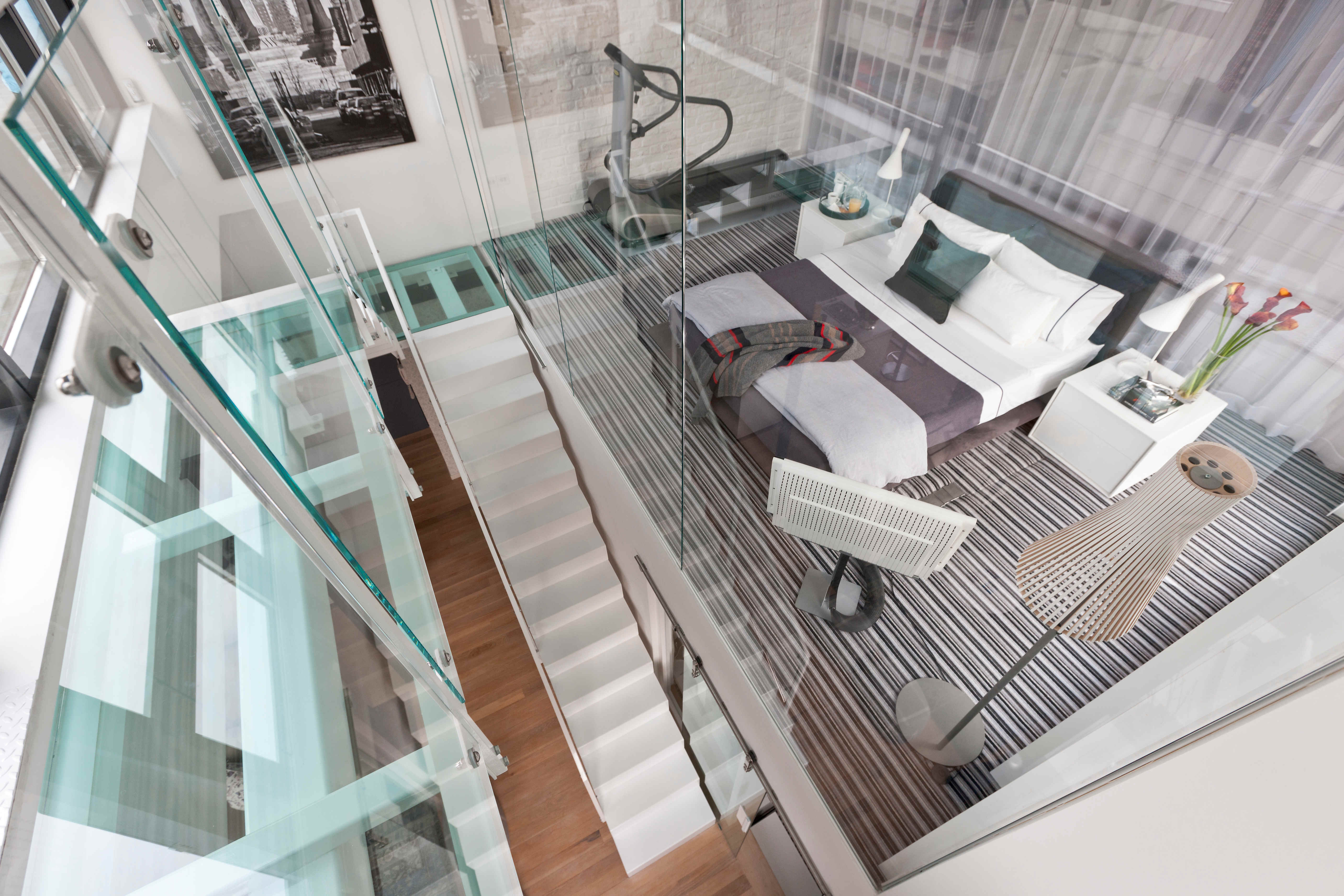
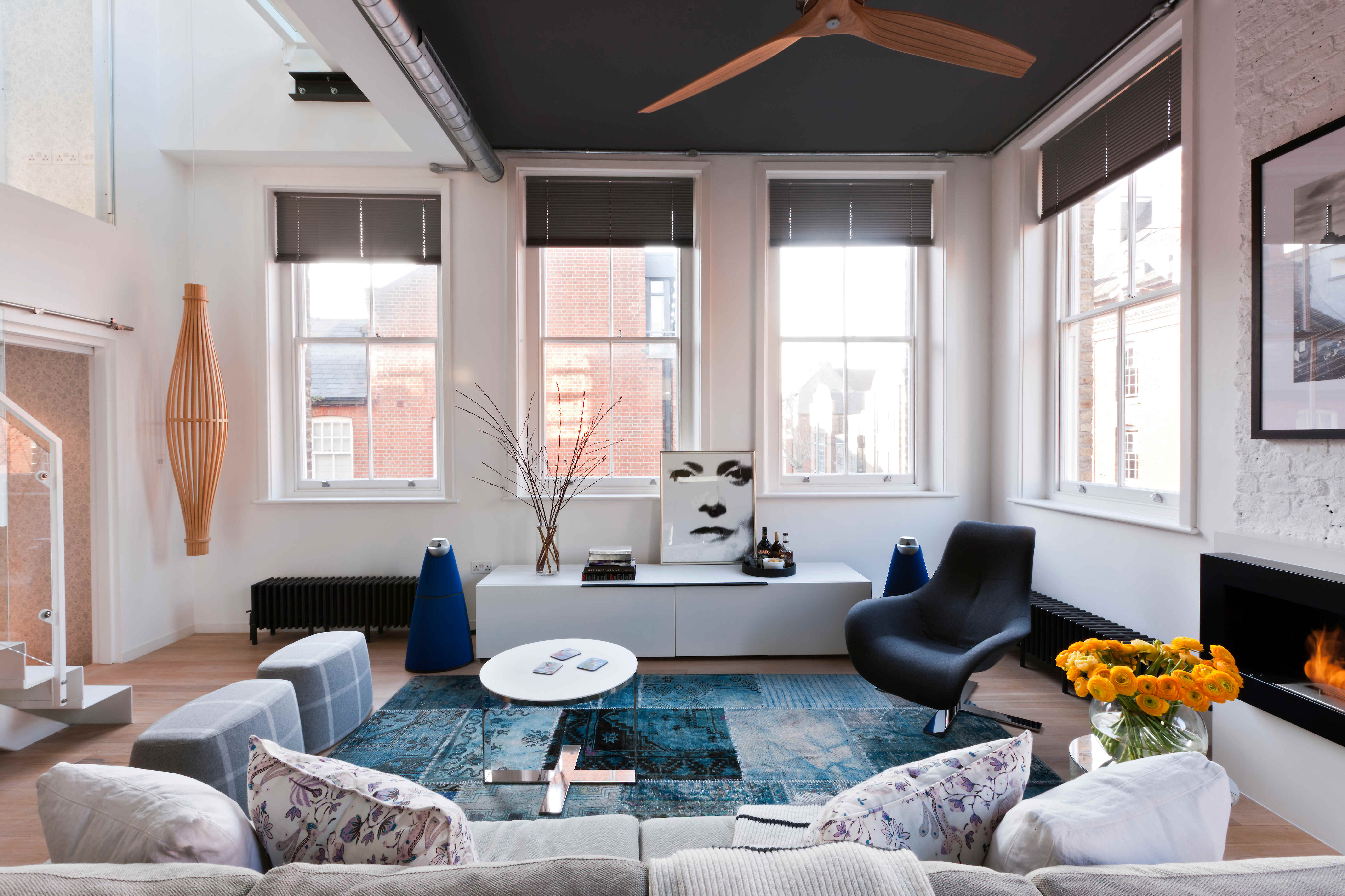
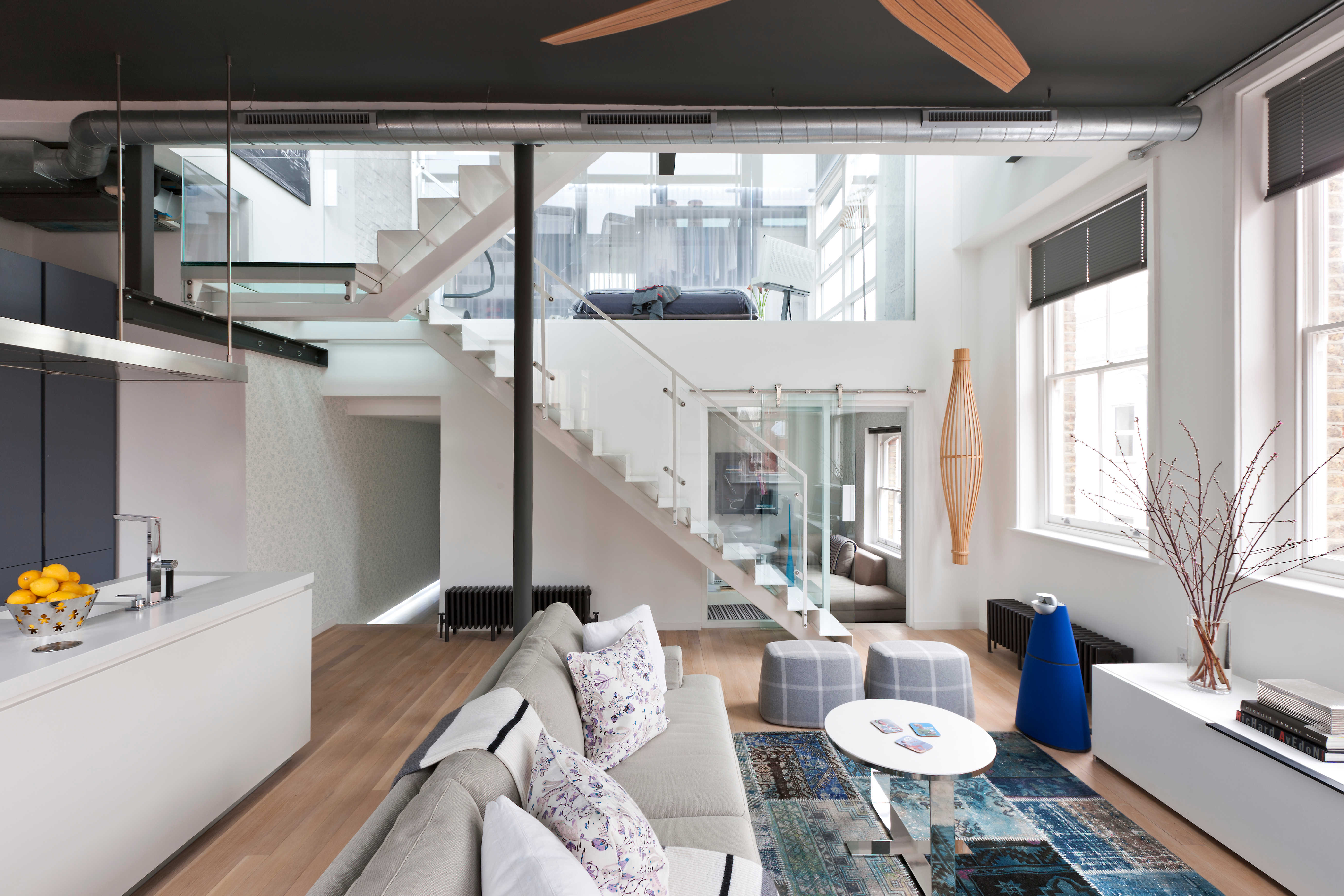
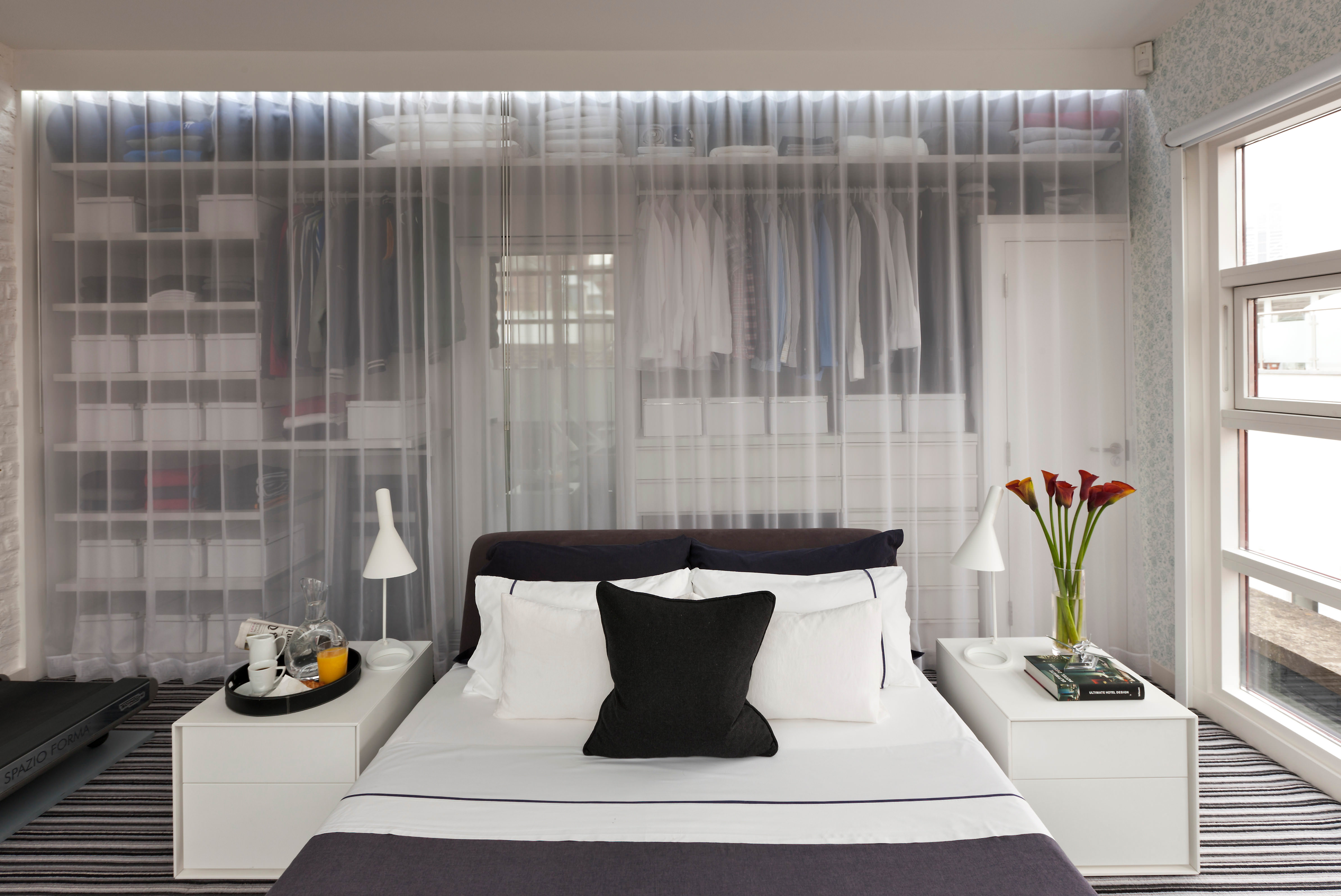
The second big design element of the apartment was the crystal glass we used for all of the walls and internal windows. For the glass wall between the master bedroom and the living room, we used three large glass panels. They were very expensive and not easy to maneuver.
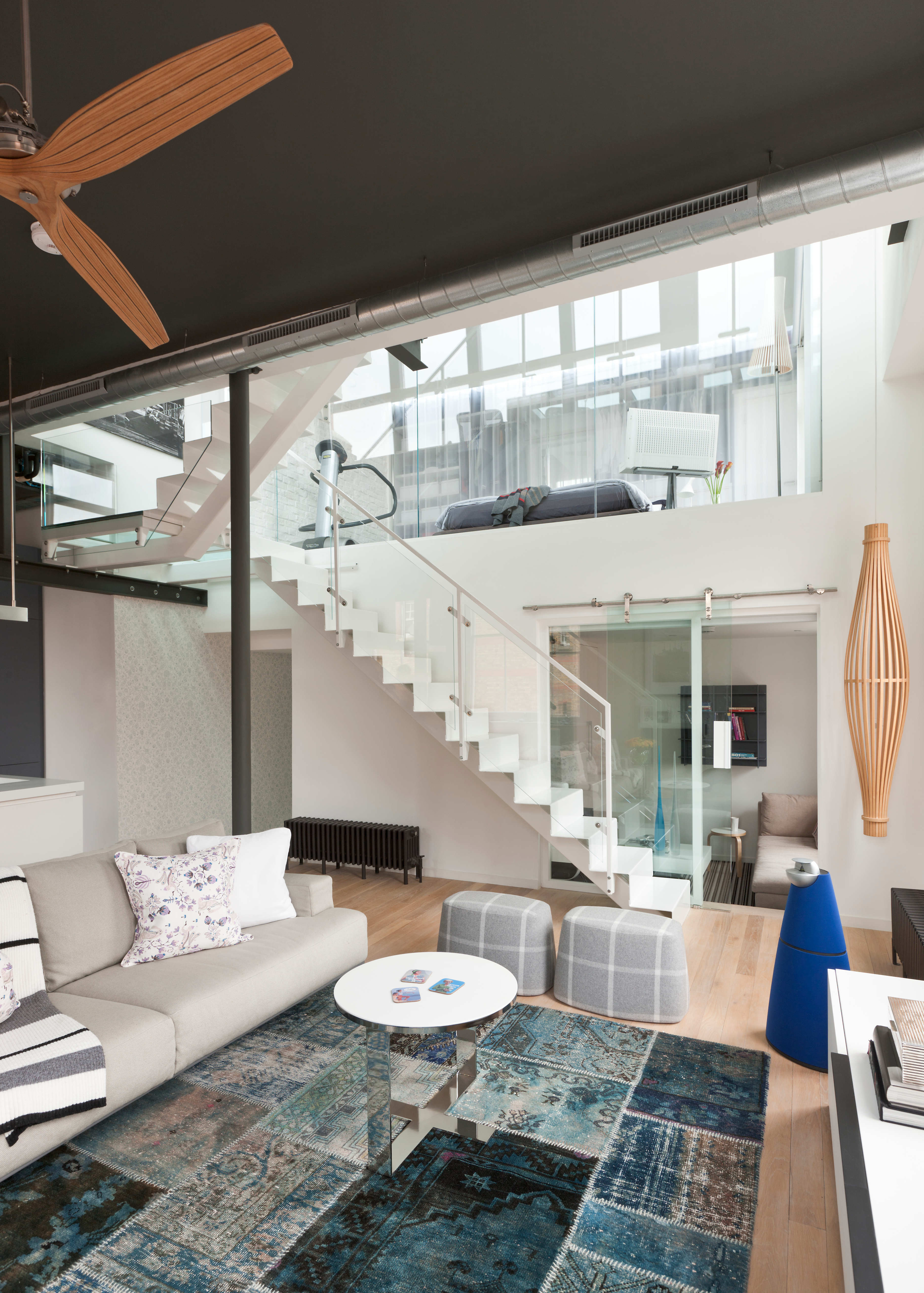
The Poliform kitchen was another design element that we had to custom design for the apartment according to the client’s need. I worked very closely with one of the designers from Poliform to design a unique kitchen with extra tall cupboards for extra storage space by utilising the height of the living room.
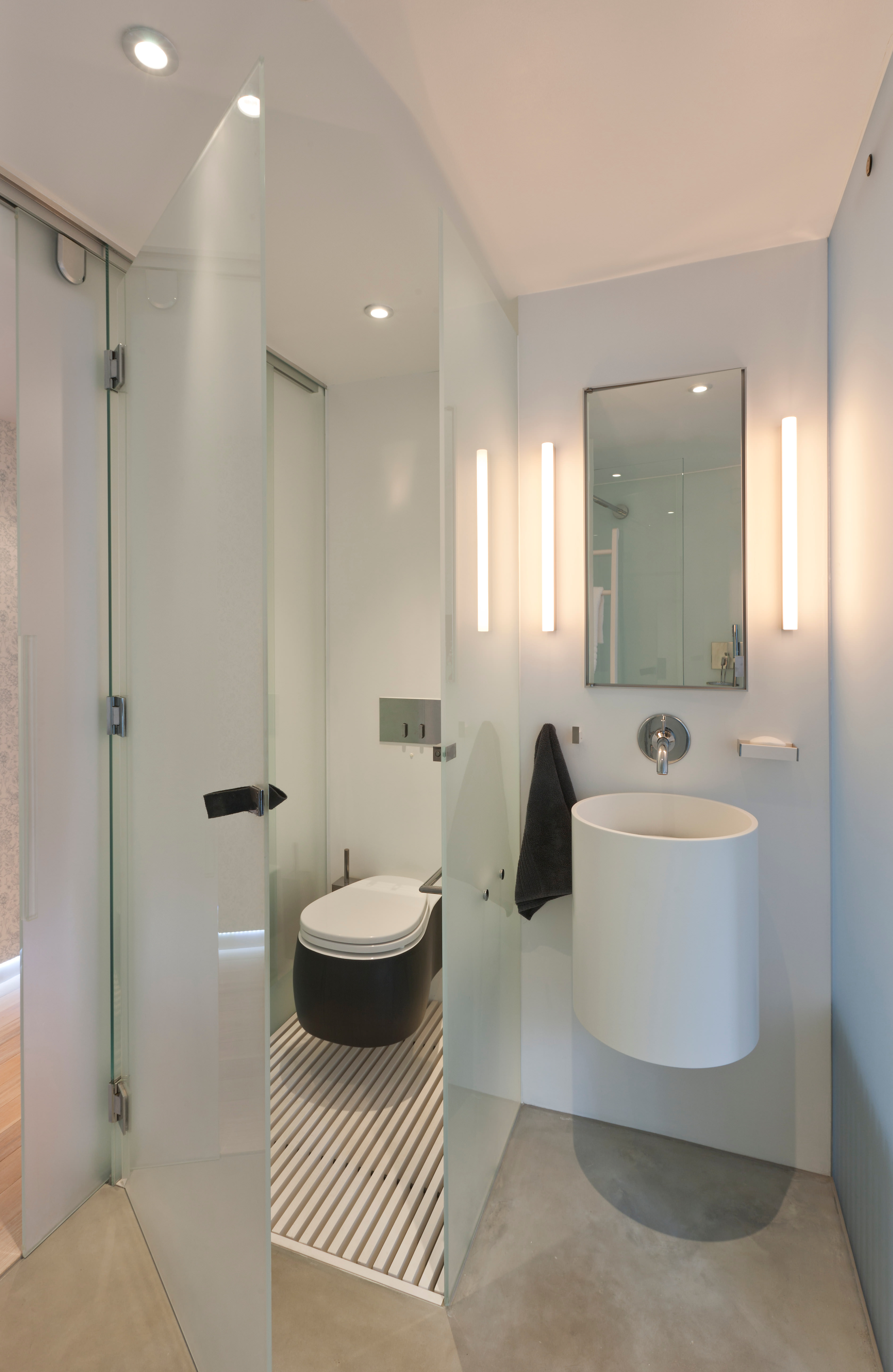
For the bathrooms, we used Boffi sanitary ware. It was more expensive than other brands but stylish in look as per the design requirements.
We used the Designers Guild wallpaper on two of the walls of the apartment. This wallpaper was carefully chosen to add an extra design feature, but also to make something unique and different from all of the loft design seen before.
JD: Your elegance in design reflects in the subtle use of the colour palette. Any particular reason(s) for not using bright colours? Please enlighten us.
MP: For each project I always try to design something unique and different. Design is very personal and when a client gives us the chance to design a house for them, I think it is our responsibility to design something which reflects their personality, the way they want to use their space. The client wanted something fresh and elegant, mainly to reflect some of the other property he had in Australia, so most of the apartment is designed keeping this in mind.
JD: What was the time-period taken by your firm from the designing stage to completion of the project?
MP: The whole project took just over three years. The client decided to live there during the refurbishment so we had to manage all of the large installation (staircase, kitchen glass walls etc) during some of his long holidays. One of the good things on this project is that the client was not in a rush to finish and at the same time he didn’t wanted to compromise on any of the agreed design decisions.
JD: What was the approximate cost of the project?
MP: The cost for this project was approximately £500K.
JD: What was the total area of the Loft?
MP: The whole apartment, including the outdoor space is about 150 m2 / 1615 sq. ft area.
JD: Every designer leaves behind their signature style in each project they design. What is your Signature Style?
MP: My distinct signature, for this and any of my projects is to create something unique but most importantly livable for any of my clients. Paying great attention to the final details, I always make sure I create a livable home and not a show home, which most of the time are cold and impersonal.
JD: Last but not the least, what was the client’s first reaction when you handed over the project?
MP: The client, like most of the people visiting the apartment after the refurbishment was very impressed! He was extremely happy with the end result and thought that the new staircase was exactly what he had in mind for his London pad.
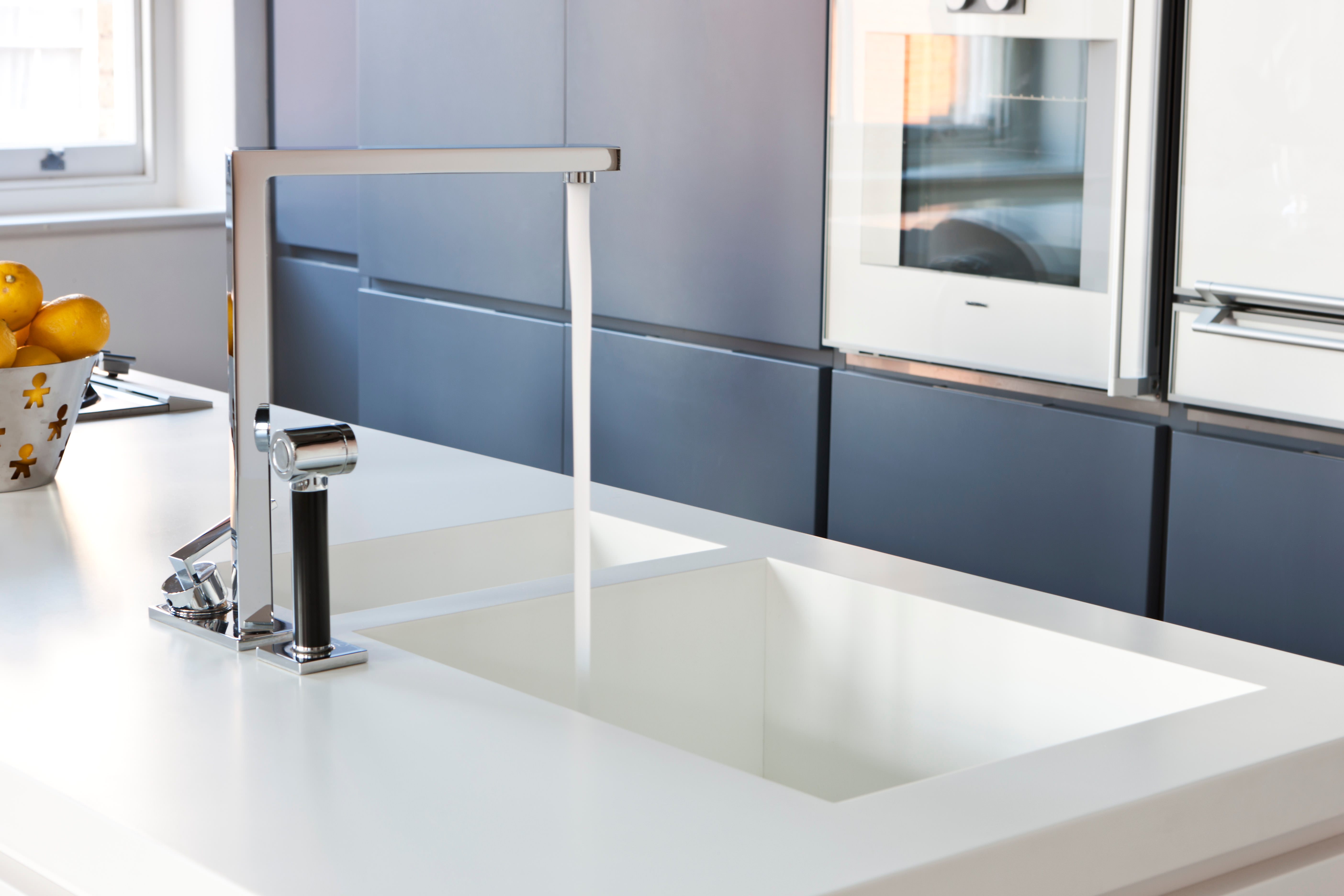
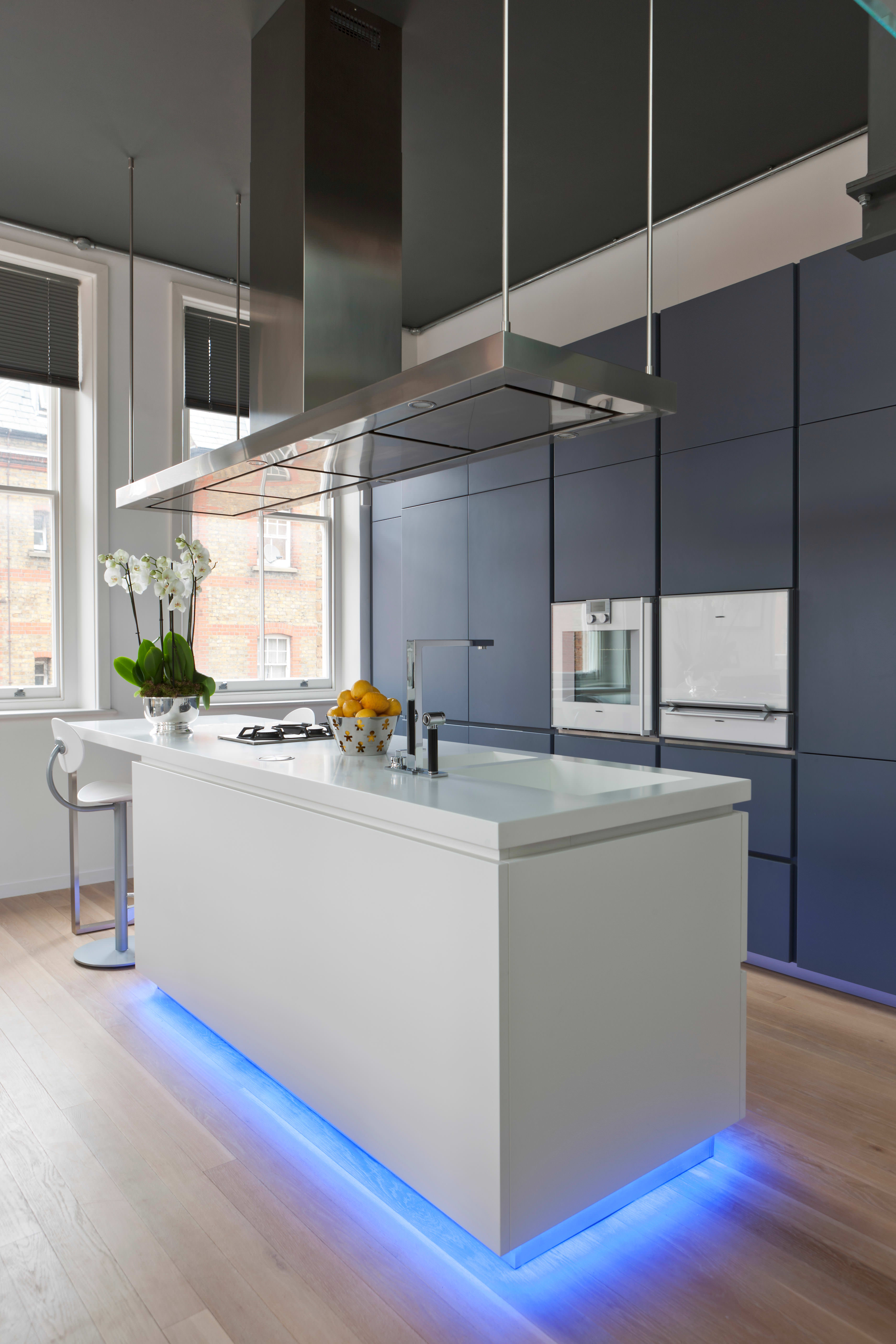
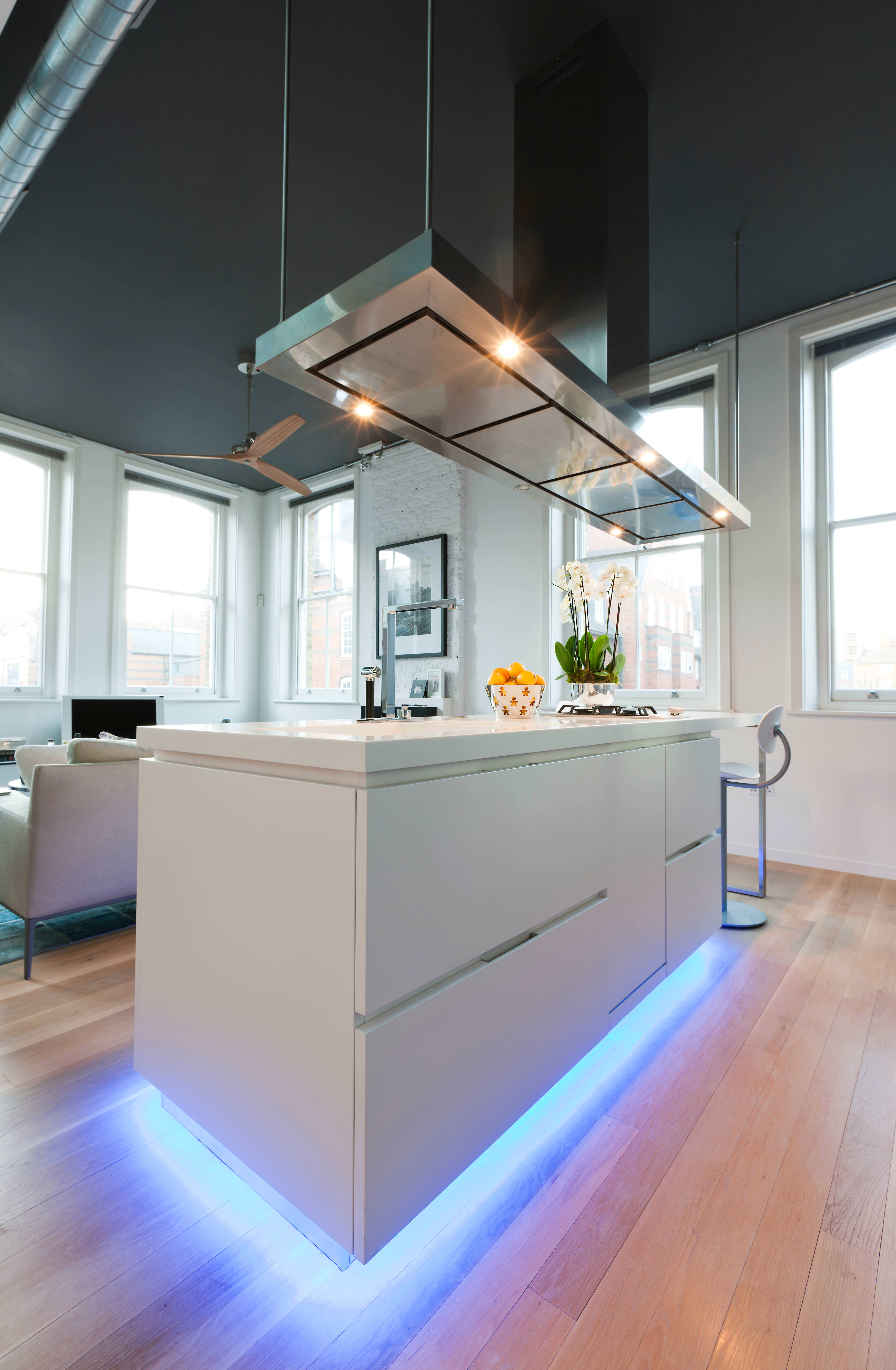
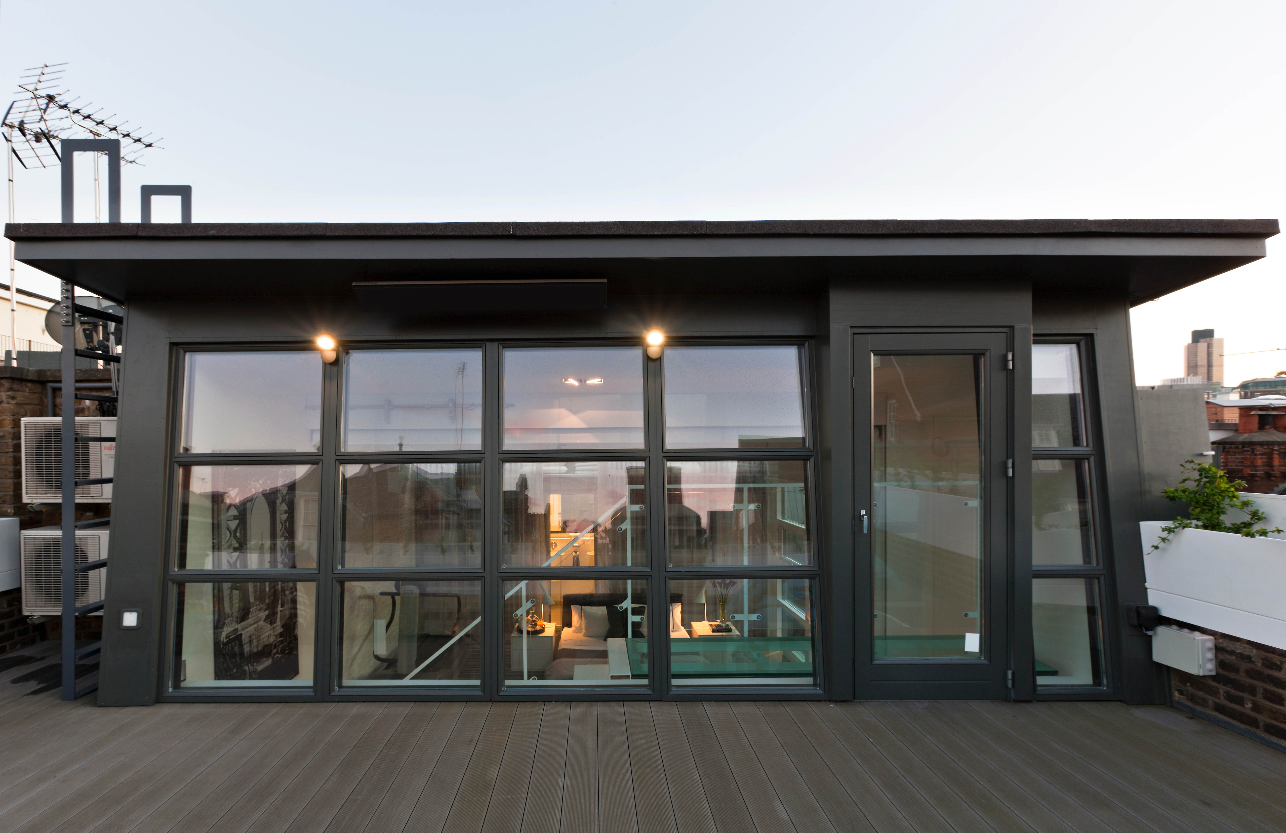
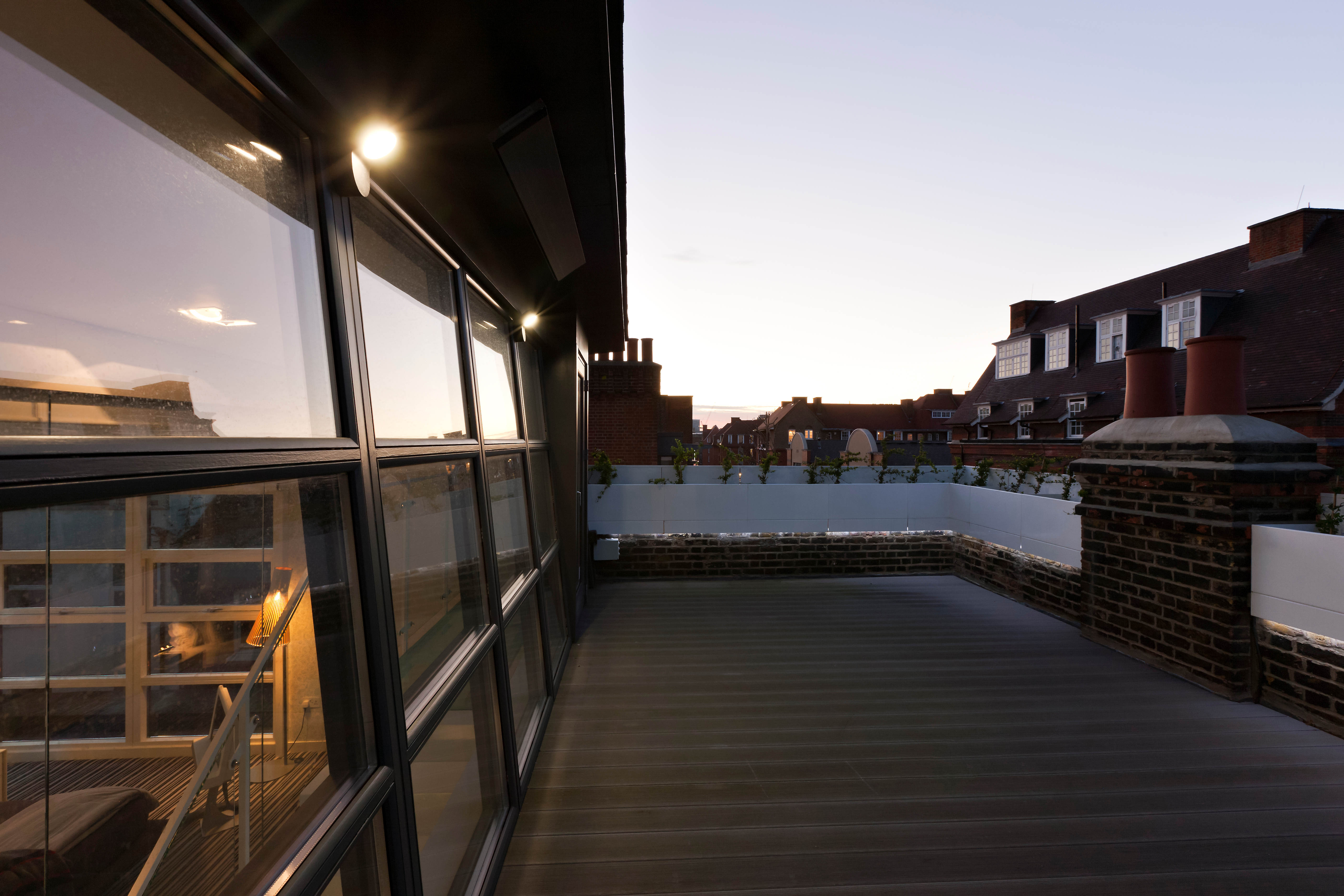
Photo Courtesy: The Architect
Photography: Jake Fitzjones
Related Posts
Modern Exterior Designs In Wonderful World
An Interview with Renowned French Architect – Vincent Callebaut
An Interview with Renowned Italian Architect-Designer Alberto Apostoli
Urban Architecture Design
An Interview with Renowned Belgian – French Architect Vincent Callebaut
An Interview with Multiple AIA Award-Winning American Architect Eric Strain
An Interview with RIBA Award-Winning British Architect Sandra Coppin
An Interview with Multiple Award-Winning Italian Architect Carlo Enzo Frugiuele
An Interview with Multiple WAF Award-Winning Spanish Architect Jaime Oliver
An Interview with Multiple Award-Winning Croatian Architect Ante Vrban
An Interview with Renowned Turkish Architect Melkan Gürsel
An Interview with Renowned Dutch-American Architect Winka Dubbeldam
An Interview with Multiple Award-Winning German Architect UWE Schmidt-Hess
An Interview with Renowned Singaporean Architect Look Boon Gee
An Interview with Renowned Singaporean Architect Chang Yong Ter
