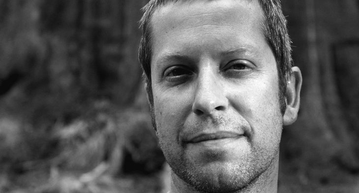
The innovative Dutch urban designer-architect Marco Vermeulen’s designed ‘Biesbosch Museum’ celebrated the hat-trick to win three Jury Prizes at the Architizer Awards 2016. The project won awards for magnificent architectural design creation, splendid landscape and the Public Award in the Museum Category.
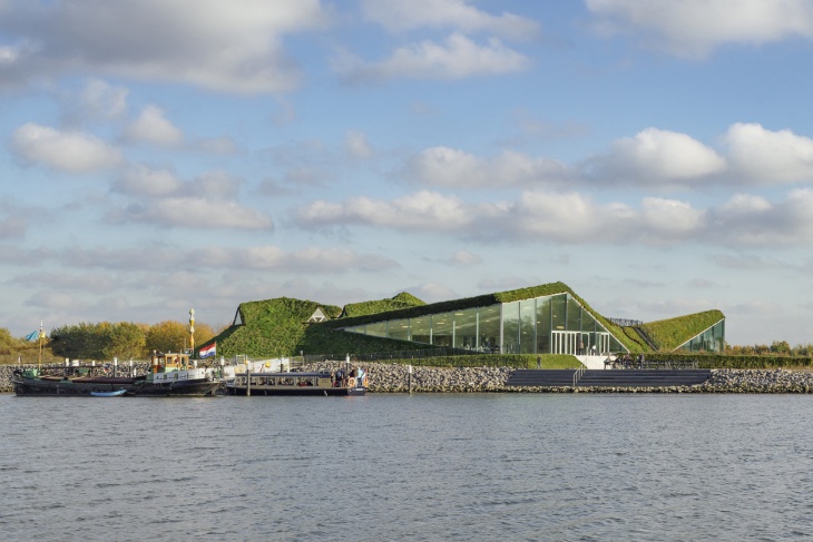
The Biesbosch Museum Island
Studio Marco Vermeulen’s working concept is based on the reciprocity between program, location and raw materials. Vermeulen’s intelligent interlinking of these typologies and programmatic alliances contributes and broadens the discipline of architecture. His design creations say it all!
Spectacular View of the Museum
From 1999 to 2009, Marco worked as a Guest Tutor to impart knowledge to students at the Eindhoven University of Technology for a decade. He graduated from the ‘Faculty of Built Environment and the department of Architecture and Urban Design’ from the same university.
The Perfect Blend of Architecture and Nature
He has also taught at the Delft University of Technology and Rotterdam Academy of Architecture. Marco’s stature in the Dutch Architecture can be gauged by his place at the YoungEDBR – Member Young Economic Development Board Rotterdam in 2006. He was also the co-director of Urban Affairs for 9 long years, 1999 to 2008.
The Existing Buildings
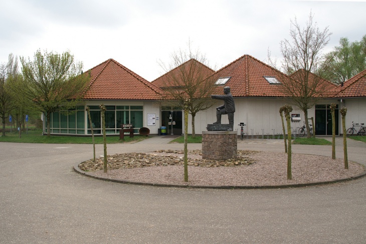
In 2009, Studio Marco Vermeulen was established in Rotterdam. The studio is involved in urban design, architecture, landscape and research work.The new order of the Modern World in the ever-growing demand for food, energy and raw materials require new directions, strategies and technological innovations to preserve and restore the eco-system. Amsterdam-based urban designer-architect Marco Vermeulen’s designs reflect how challenging it has become to create designs, while balancing aesthetics and the need of the hour.
Island Features
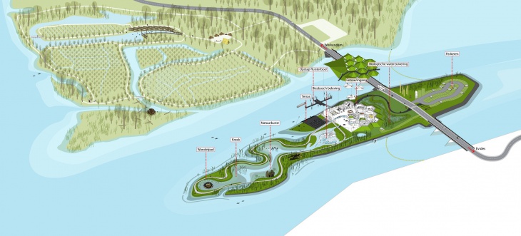
Johnny D interviews the multiple award-winning architect about various challenges his architectural firm SMV – Studio Marco Vermeulen had to overcome, while designing the Biesbosch Museum Island.
Building Legend
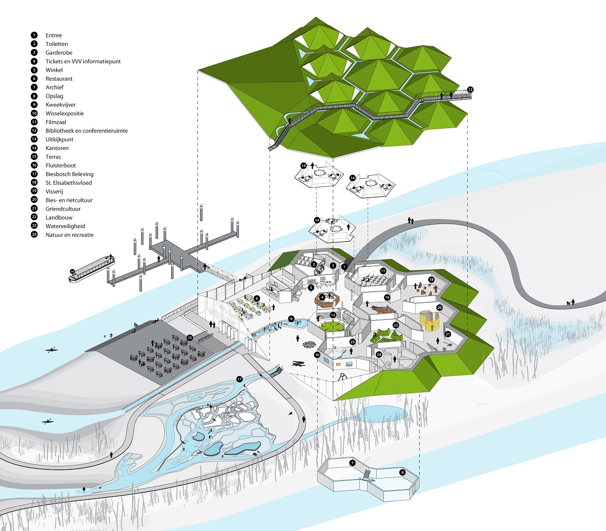
Johnny D: What was the brief?
Marco Vermeulen: The brief was to renovate and expand the existing museum with space for three offices, while creating ample of space for the growing numbers of visitors. Simultaneously, creation of a new island for the development of the Biesbosch Museum with respect to water safety was also mandatory. The 4,450 hectare Noordwaard Polder was to be developed, as a water-retention area and act as part of the National Water Safety Programme in the Biesbosch National Park.
The Illuminated Beauty
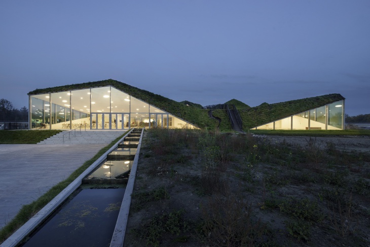
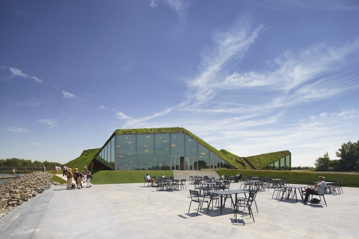
The Spacious Outdoor
JD: Please enlighten Design Trends’ readers about various possibilities you saw and planned to present your design proposal.
MV: We saw various possibilities to transform the Museum and the National Park, where the museum is located. Our design proposal to transform the whole area and space was well-received. Our design extended with a new wing, which opens to beautiful surroundings, house a restaurant for visitors to enjoy and an exhibition space for contemporary art.
Camouflage in Nature
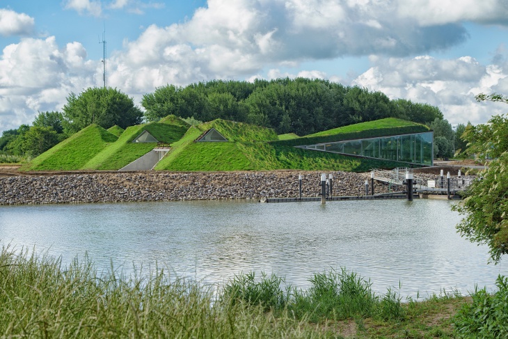
We also designed a large water model of the Biesbosch and a freshwater tidal park on the Museum Island. The transformation has become a historical development of the region. The locals and tourists love the new space.
Intelligent Sustainable Design
JD: Enlighten us with Studio Marco Vermeulen’s approach to designing the project.
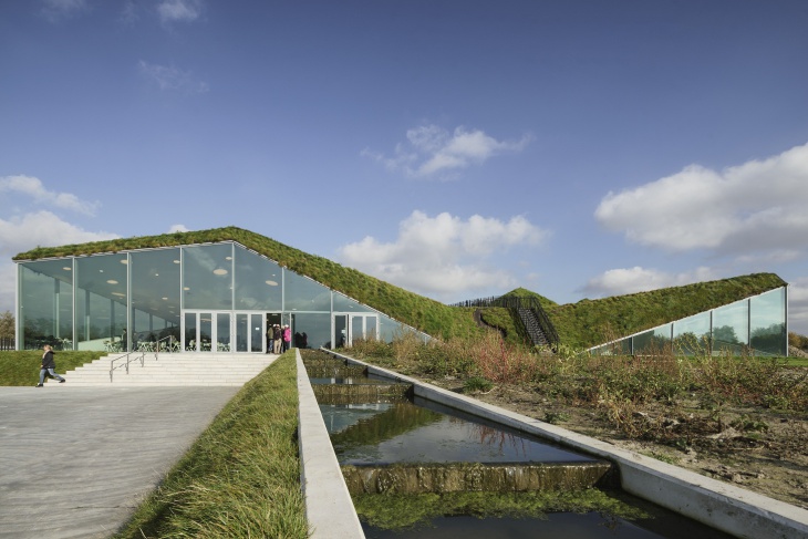
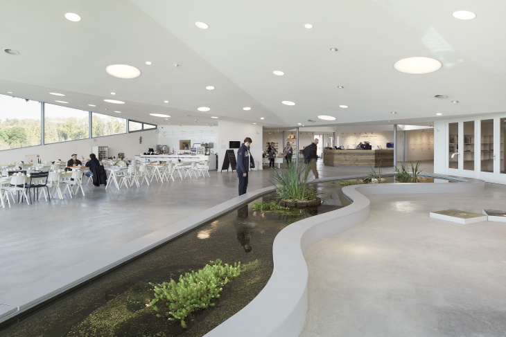
MV: A new 1,000 m2 wing was added on the south-western side of the Museum building. We avoided unnecessary wastage of materials or energy by retaining the original hexagonal structure of Biesbosch Museum pavilions. The wing opens to the museum garden on the island, featuring extensive areas of fenestration. The extended wing houses an Organic Restaurant, which offers views of the adjacent water, beautiful landscape and a space for temporary exhibitions.
Spacious Beauty
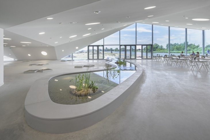
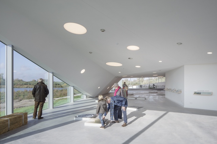
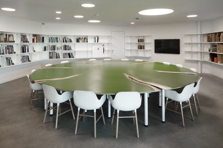
The existing building houses the permanent exhibition, library, multi-purpose theatre, entrance area with reception and Museum Shop. The addition of large dormers on the roof created space for the Museum’s offices, the Dutch Forestry Commission and the Park Board.
View of the Cafeteria
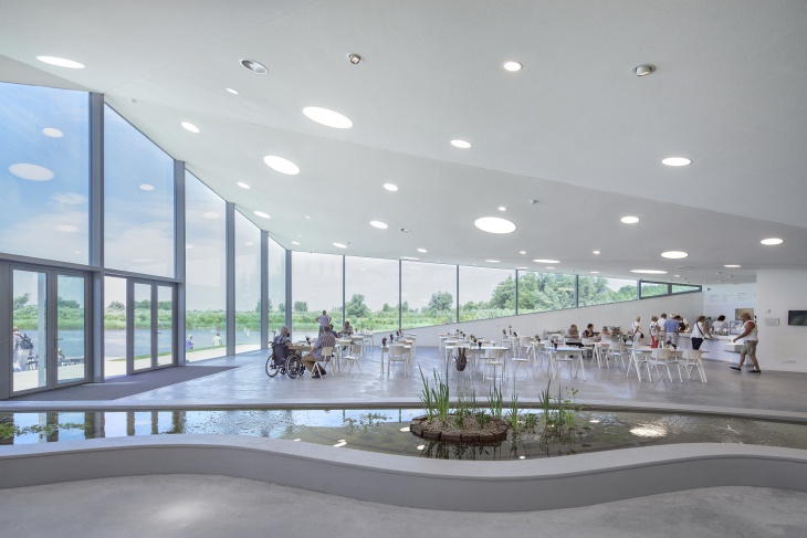
Spectacular View from Inside
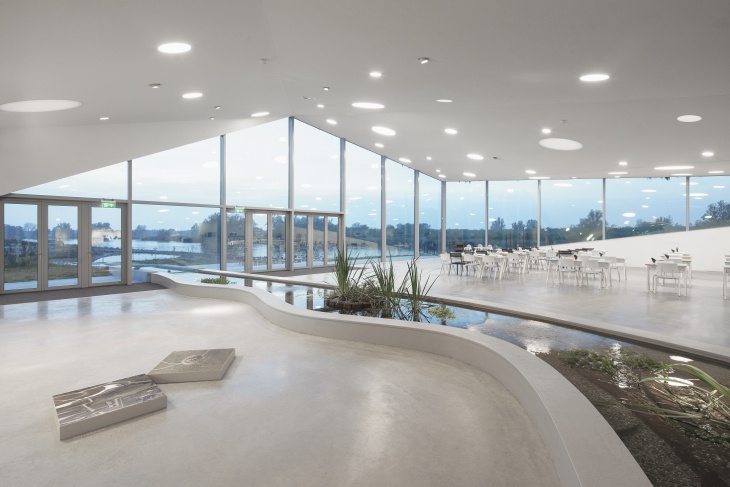
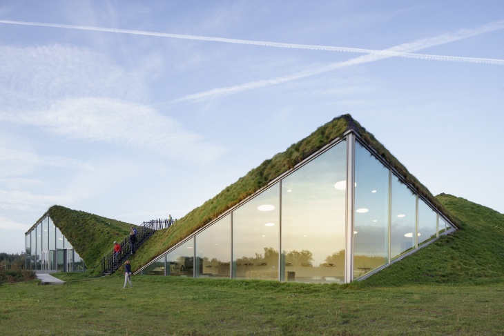
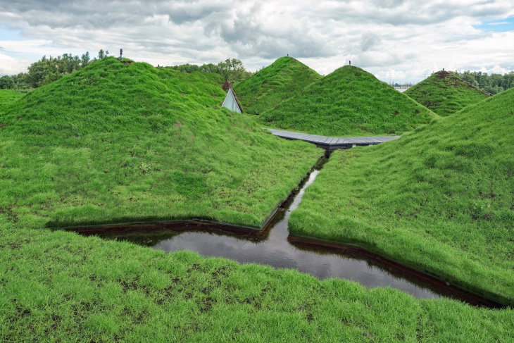
The old and the new sections of the museum are surrounded by earthworks and covered with a roof of grass and herbs. The roof adds ecological value, creating a sculptural object that reads as land art manifesting itself in the surrounding landscape. A fold in the roof gives way to an adventurous mountain trail and a lookout post.
Natural and Artificial Lighting
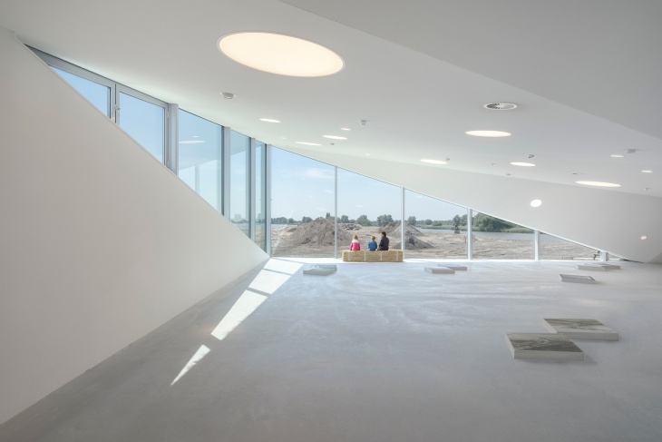
Visitors Enjoying the Display
JD: What were the major challenges of the Project’s Magnitude?
MV: Time period was the biggest challenge of designing the project. The project was realized in a very short period of just 8 months. While aspirations kept growing as the project progressed, the limited budget became crucial. However, we were successful with the end result and that is what matters.
The Information Centre
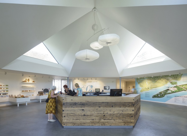
Purity of White Interiors
JD: What will be the ‘Time Period’ needed to execute such a large project?
MV: SMV accomplished the project in just 8 months.
The Library Area
JD: Please enlighten us about the project cost.
MV: € 3 million for the building.
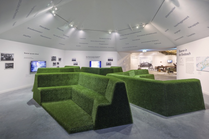
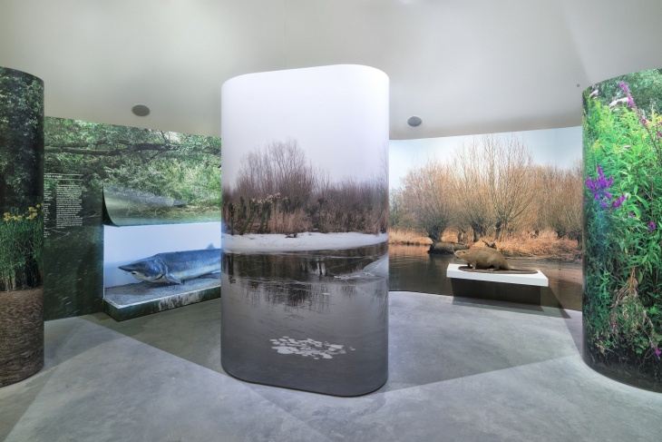
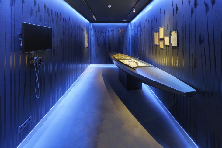
Exhibition on Display – I
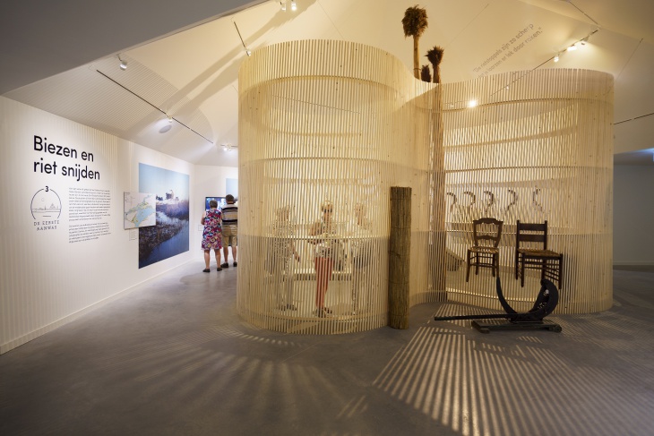
Exhibition on Display – II
JD: Construction Engineers are breaking frontiers to give shape to Architects’ Designs’ Visions. How much credit is attributed to their conscientious efforts? Please name the Engineering Firm your firm always rely on to execute projects to the perfect T.
MV: For the structure in this project, we worked with: W5A Structures / University of Technology Eindhoven.
Exhibition on Display – III
JD: Sustainability has become the most sought after feature in architectural practice in our modern world. With such an expanse for the project, please specify 5 major sustainable features you have incorporated in the project.
MV: The following sustainable features were incorporated in the project:
Exhibition on Display – IV
- Reusing the Existing Building: We avoided unnecessary wastage of materials to manage our restricted budget. We reused the original hexagonal structure of the Museum Pavilions.
- Heat-Resisting Glass: Both, the new wing and existing volume were designed to minimize energy consumption. The glass front is fitted with state-of-the-art heat-resistant glass that eliminates the need for blinds.
- Isolation: The earthworks on the north-western side and the green roof serve as additional insulation and a heat buffer.
- Biomass Stove and River Cooling: On cold days, a biomass stove maintains the building at the right temperature through floor heating. On warm days, water from the river flows through the same pipeline to cool the building.
- Willow Filter: Sanitary wastewater is purified through a willow filter: the first in the Netherlands and an acknowledgement of the wicker culture of the Biesbosch. Willows absorb the wastewater and the substances it contains, among them nitrogen and phosphate. These substances act as nutrients and help the willow to grow. The purified water is discharged into the adjacent wetland area and flows from there into the river. Once the willows are sawn and dried, the wood can be used as fuel in the biomass stove in the museum or for other purposes.
Related Posts
An Interview with Vincent Callebaut Design Trends - Premium PSD ...
An Interview with Renowned Architect – Designer Dr. Carlo Ratti ...
An Interview with Eric Strain Design Trends - Premium PSD, Vector ...
An Interview with Multiple Award-Winning Croatian Architect Ante ...
An Interview with Multiple Award Winning Architect Architecture ...
An Interview with Multiple Award-Winning Italian Architect Carlo ...
An Interview with Architect Masayoshi Nakanishi Design Trends ...
Interview with Christophe Rousselle Design Trends - Premium PSD ...
An Interview with Renowned Turkish Architect Melkan Gürsel ...
Interview with World Renowned Architect Luis De Garrido Design ...
An Interview with Sandra Coppin Design Trends - Premium PSD ...
An Interview with Lina Ghotmeh Design Trends - Premium PSD ...
An Interview with Architect-Designer Alberto Apostoli Design ...
An Interview with Designer Jon Sealey Design Trends - Premium ...
