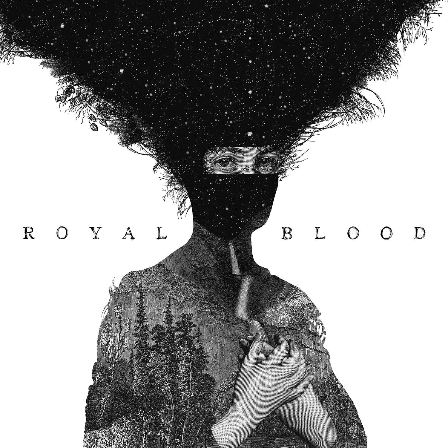
Most of the albums you have seen in the stores are based on the photographs, having a photo of the artist and a plain background, putting the spotlight on him. And we are not surprised when we see albums with such covers because we are used to of it and this is what we see ever time.
However, similar to most of the things in the world, the dimensions of the covers of albums have also changed. There are many reasons to why the covers are changing but one of the most important reasons is that the traditional covers do not refer to the art in the album. In the other words, you can also say that the essence of the material in the album is lost due to traditional covers.

The covers of the albums are considered as the front page of a book. However, it is said that we should not judge a book by its cover and same goes for the albums, we usually do not do so. Being humans, we are judgmental and we do judge people by their looks, books by their front page, and albums b their coves. Hence, it is mandatory to select such designs of the covers that attract the people and the spirit of the song should also be present.

The design of the cover of the album should b e in such a way that it attracts people. When an individual enters a store with the intension of buying an album, your album should attract him first. Even if it is not his intension to buy the CD, still your album should grab his attention and this can only happen by the cover. Hence, it is crucial for the singer to have such design for the cover of his album that attracts the customer.

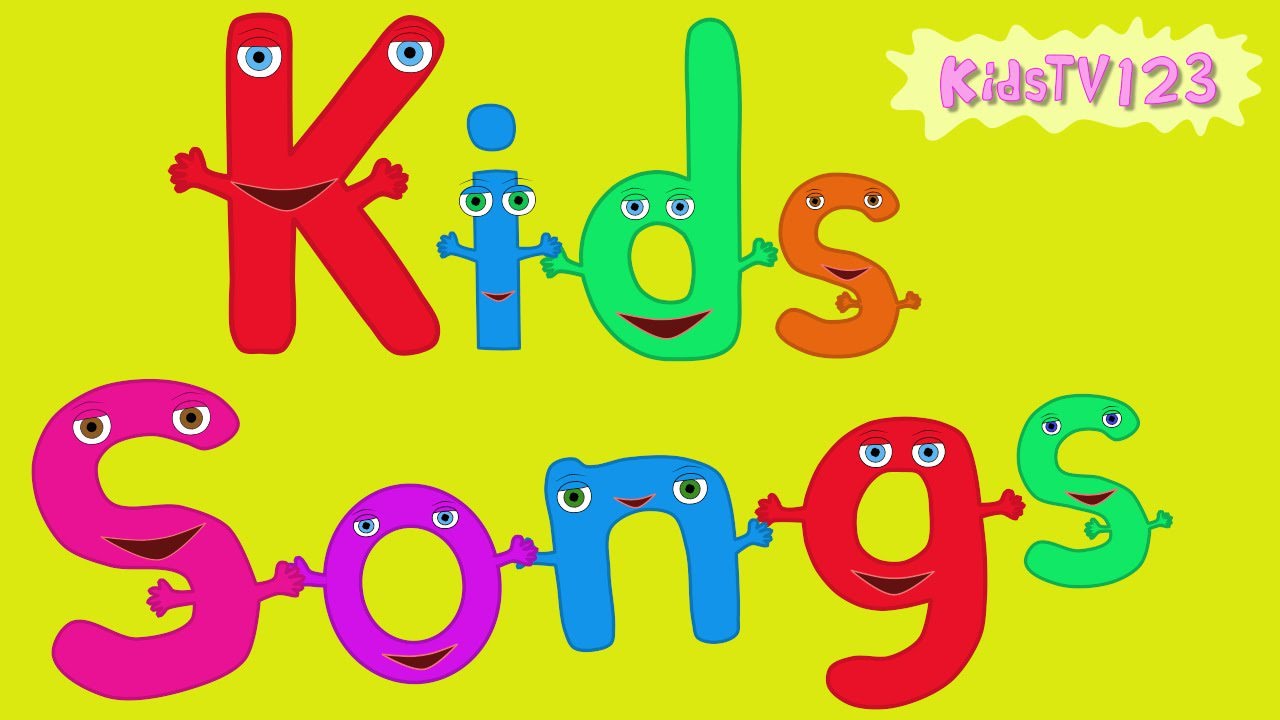
It is not possible to exactly tell that which type of the design should be uses as the cover of the album. It is because it depends on the content inside the album. If you are doing something for the children, then yes, you must go for vibrant colors. You may also add cartoon characters or make your own to attract the young ones.

However, if your song is for the teenagers, you may use something that represents teenagers. It may be the car, gun, speed, or anything else that teenagers like. The one thing you should keep in mind that your only objective is to attract the people.
So just focus on what the people might like and then go for the cover. It is also possible that your songs do not target anyone and anyone listen them. In that at case, you may select something which is liked by most of the people.
If you have something that targets the elderly people, the grownups, or the professionals, you may add decent designs to your cover. The cover should be designed and laced with the things that professional people prefer to have. The background should not be colorful and the words on the cover should be chosen wisely.
Moreover, while selecting the designs for the album cover should be according to the content or the songs in the album. It is seen that a number of albums have failed because their covers did not covey the correct message about them and people read them wrong. Hence, it is mandatory to have covers that translate the songs, to an extent.
Related Posts
13+ Wedding Label Designs - Premium PSD ...
10 Modern and Trending Brochure Designs ...
14+ Round Label Designs - Premium PSD, Vector ...
18+ Tree Silhouettes - PSD, EPS, Vector Illustrations Design ...
25+ Widget Designs - PSD, JPG, AI Format ...
Holiday Photocard Ideas for Inspiration - Premium ...
14+ Product Label Designs - Premium PSD, Vector ...
16+ Hipster Fonts, TTF, OFT Download - Premium ...
7+ Book Layout Designs - Premium PSD, Vector ...
18+ Heart Silhouettes - PSD, EPS, Vector Illustrations Design ...
9+ Artistic Yoga Illustration Designs to Celebrate Yoga Day Design ...
9+ Thank You Label Designs - Premium PSD ...
7+ Summer Party Poster Designs - Premium PSD ...
40+Label Designs - Free PSD, EPS, AI, Illustrator Format Design ...
44+ Box Template Designs - PSD, Vector, AI ,EPS Format Download ...


