Blog designs are far from stagnant and as the internet continues to reach new places, new people, and new ideas, it’s no surprise that design trends change.
Here are some of the top blog design trends in 2021, along with what makes them so interesting and appealing.
Retro Blog Design
The world may be more and more technological, but that doesn’t mean there isn’t a strong appeal for the retro aesthetic. This blog design is very trendy right now, and though it has a modern update, it’s easy to see how these designs hail from earlier times.
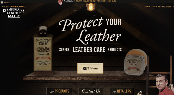
Here’s an example of a blog design for a company that sells leather conditioners and furniture treatments. It looks like an advertisement from the 1920s which is a good fit for the products they’re selling.
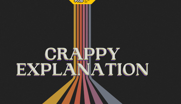
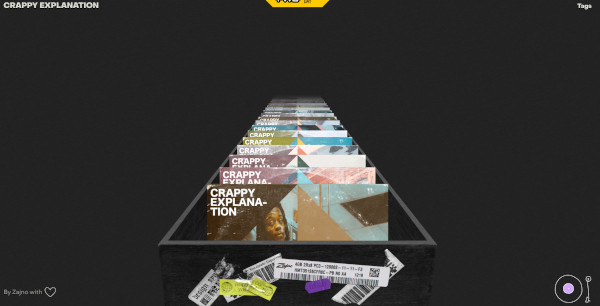
Here’s a website called “Crappy Explanation” designed to look like an 80s vinyl record store. The purpose of this site is to share playlists with people.
Illustrations
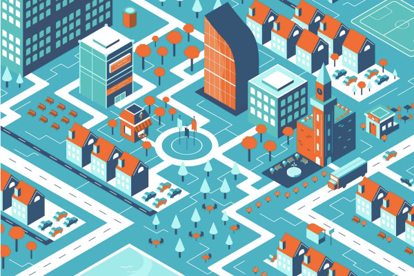
Image and text have long dominated the blogging world, but illustrations have also found a real home in blog and web design. Illustrations come in many iterations like geometric shapes, hand-drawn illustrations, cartoons, isometrics, 3D art, and neumorphism 3D art.
Here’s an example of an isometric illustration from design artist Tea Velizarova. This type of illustration is meant to show a three-dimensional object in a two-dimensional drawing.
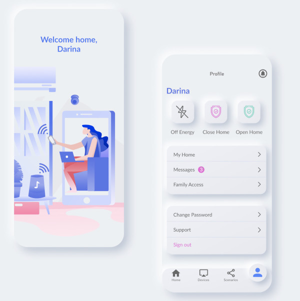
Neumphorism is a new take on an older design referred to as “skeuomorphism.” This type of illustration is often made to give an illusion that buttons and elements are 3D and could be pressed as you would a physical object. It also often has a light color palette and subtle contrasts to differentiate between elements.
Here’s an example of neumphorism by creator Igor Lutensko:
Multimedia Design
When most people think of blogging they imagine the text and images that have been around since blogging began in 1993. Today, a multimedia approach will keep your blog relevant and interesting to modern visitors.
Many blog design trends incorporate graphics, illustrations, audio, video, animation, and so much more. Social media apps like Instagram and TikTok show that today’s audience craves that video interaction.
As bloggers, that doesn’t mean you should ditch the written word. This is still the major basis of blogging and a lot of people like to consume information through reading, but videos can enhance the work you’re doing and attract a wider audience. Podcasts have also gained popularity and are another way to turn your blog into a multimedia experience.
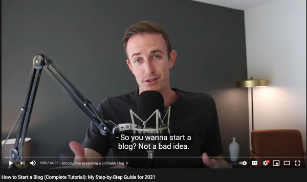
Here’s an example of one of my top blog posts, How to Start a Blog, that I turned into a YouTube video to connect with those who prefer to learn from video rather than text.
Comforting Colors
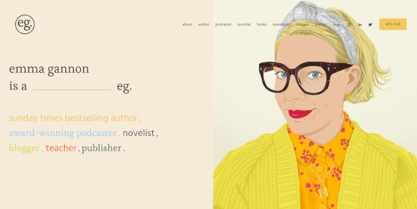
Color palettes for web designs in 2021 are often comforting, subdued, and neutral. Neon or flashy colors are not overtaking the design scene, and although you will see bright pops of color, they’ll be tamed by surrounding pale or neutral colors.
Here’s an example from blogger, podcaster, and author Emma Gannon of warm neutral colors with small pops of color:
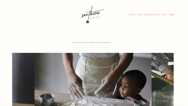
Here’s another example of simple neutral colors from blogger, Erika Council of Southern Souffle:
Non-Traditional Scrolling
Another trend you may be noticing in 2021 blog designs is non-traditional scrolling. Unique scrolling options like horizontal scrolling and parallax scrolling are becoming more common.
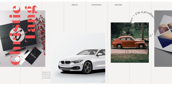
Christie Tang, a UI/UX product designer uses horizontal scrolling on her website to show off her photography and design work.
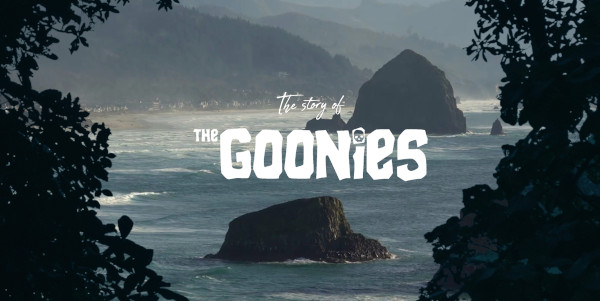
Parallax scrolling creates an effect where it appears the foreground and background elements scroll at different speeds. It adds depth to the field of vision and can make it seem like you’re looking at something 3D.
This website, dedicated to the beloved 1980s movie the Goonies, uses parallax scrolling with many different moving images and graphics.
Minimalism
Minimalism is perhaps one of my personal favorite blog design trends. I’ve intentionally created my blog to be minimalistic so that the material I want the reader to see is not obstructed by an overly busy design scheme.
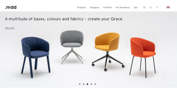
A minimalist design uses simple elements, plain fonts, and limited color schemes. In fact, you’ll often find these types of blog designs to be monochromatic with black, white, or gray used to fill in everything else. It’s common for there to be large focal images with a bare-bones design surrounding the rich pictures and graphics.
This website design from .mdd shows the single focal point of the picture surrounded by white space. This is signature minimalist web design:
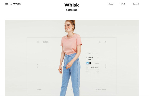
Another example is a portfolio website for product designer Kirill Pavlov:
Interactive
The final 2021 blog design trend I’ll cover is websites with an interactive element. Interactive parts of a website can sometimes be distracting or cause the website to run slow, but they can also be interesting, entertaining, and memorable for your visitors.
Ideas for interactive elements include:
- Animations that can be triggered
- Autoplay videos (with the sound turned off)
- Quizzes
- Surveys
- Polls
- Interactive infographics
- Text
- Interactive call to action buttons
- Interactive scrolling
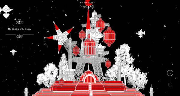
Pierre Herme and Nicolas Buffe’s storytelling website called “A Story of the Kingdoms of the Moon and Sun” is an incredible example of interactive website elements. There’s a drag and drop feature that unlocks animations, art, and micro-interactives that go along with a story. As the reader, you set the pace for how quickly the story unfolds.
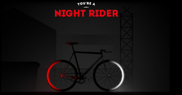
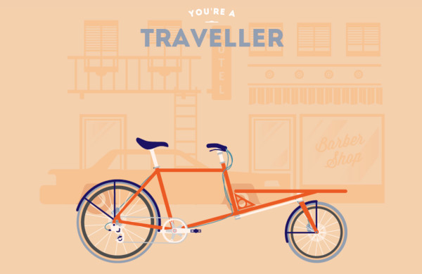
The website Cyclemon features a selection of bicycle illustrations that you can browse through parallax scrolling. As you scroll down the page, a new image appears, unlocking an entirely different feeling with each piece of art.
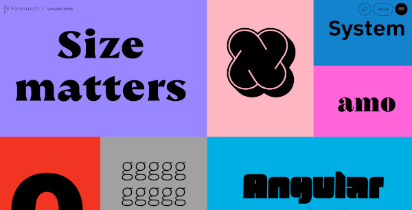
Fontsmith, a design company based in London with a focus on fonts, has a selection of fonts they call “variable fonts.” These fonts are dynamic and responsive, you can play with them in real time on their site.
What Blog Design Trends Are Best For Your Blog?
It’s always important to keep in mind that with any trend, you have to pick those that best suit you and your branding. The current trend toward comforting colors may not suit your blog if you’ve built it on a color scheme that’s bold and bright. A retro design scheme may distract from your blog if it doesn’t fit your aesthetic.
The same is true for anything that’s trending. Choose what works for your blog, and forget those that don’t match your vision.
On the other hand, if you’re looking to shake things up on your blog or considering designing a new blog, these 2021 blog design trends can inspire you to create something beautiful and inviting for your visitors.
Related Posts
Branding Design Trends 2023
Top 11 Email Marketing Trends for 2023
The Best New Portfolio sites, March 2023
Best Poster Designs 2023: Ideas and Tips
Hit and Miss of Olympic Logo Designs from 1924 till 2023
10 Iconic Moments Photographed in 2023 Rio Olympics
Top 5 Logo Design Trends of 2023
2023 Packaging Design Pentaward Winners
Digital Design Trends for 2023
Best Travel Apps for 2023
9 Script Fonts for 2023
10 Best Free Fonts for 2023
10 Best Mobile Games of 2023
Logo Design Strategies for 2023
Top 9 Web Design Trends for 2023
