Logos are the face of every brand, and the most prominent feature of brand identity. The entire personality of the brand and its behaviour can revolve around the logo. Hence, graphic designers use every trick in their toolkit to create logos that are outstanding and exemplify the message the company wants to communicate. Like any design feature in any category, some logo designs are evergreen while others are trendy for a time. It always pays to be on top of ball when styles are rolling. Here are the design motifs that will hold sway in 2016.
Mobile Power
The unprecedented proliferation of mobile applications has changed lifestyles with the majority of smart phone owners using the Internet on their handsets. This has spurred companies to create logos, which are optimised for mobile screens and the trend will only grow bigger in 2016. With consumers demanding better mobile experiences, designers have no option but to give them logos for mobile-friendly brand interactions.
Vacuumed Designs
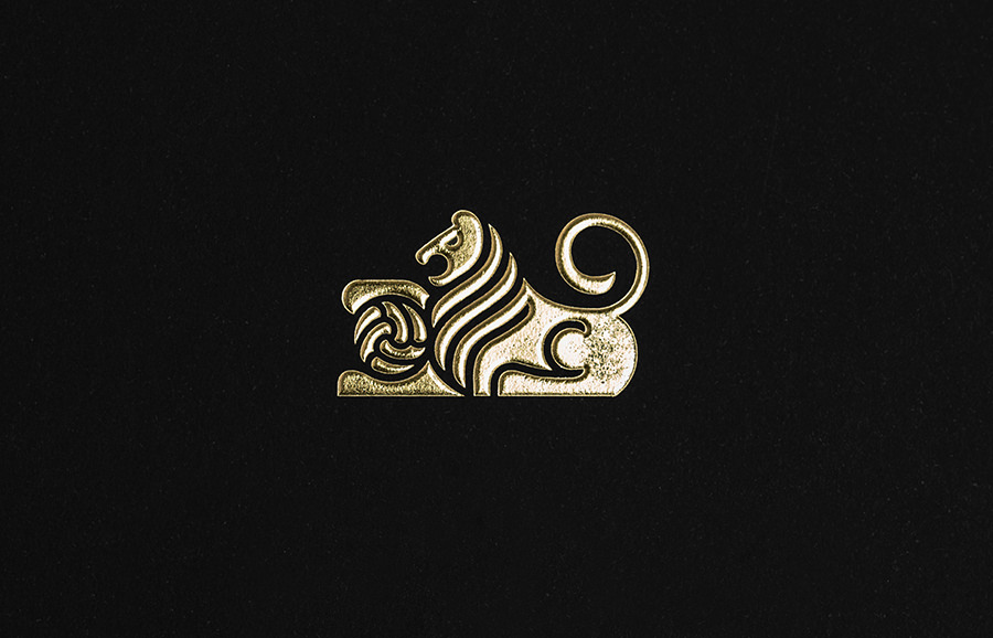
Also called negative space design, logos that incorporate this element are more expressive, which makes for a killer first impression. Empty space designs lend unique visual dimension within the logo, enhancing its overall ambience. Sophistication in aesthetics results in excellent brand interactions and user experiences. Hence, it’s easy to see why negative space design is so popular and why its usage is expected to grow this year.
Low Polygon
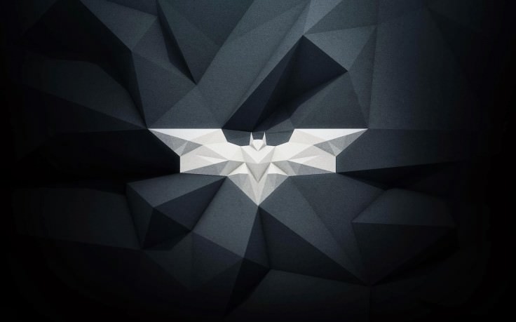
Thought to be on the wane, Low Polygon design has made a strong comeback and will be one of the most popular logo styles in 2016. The 3D mesh with a low polygon quantity creates a stunning look with simple, geometric forms. Textures give an added sophistication to the logo. Such designs at once portray the technology behind the product or service, creating instant brand associations.
Flat Design
Some design styles are evergreen and are always popular among its enthusiasts. Flat designs have been trending since eternity and are now holding their own amidst other rapidly evolving, tech-enabled styles. They reflect a conservative image, which needs no tech-enabled design embellishments, which in turn conveys authority, which inspires respect. Expect flat designs to get more creative in 2016, with innovative dimensions, which can breathe some life into them.
Overlapping Elements
One of the best ways to infuse sophistication and elegance in a logo is to use overlapping elements in the design. Most people would not be aware that overlapping is a mainstream device in design. It creates a three-dimensional effect, which makes the logo more dynamic and memorable. Considering the enhanced visual appeal of overlapping on digital screens, expect more and more designers to embrace this style in 2016.
Stencilled Typography
This is another design, which has powered its way into the popular imagination of designers and companies alike. Stencilled lettering generates a symmetrical combination of solid and empty spaces, which create a unique optical hierarchy. This adds a charm and grace to the logo, which transcends product categories. With so much going for it, stencilled typography is sure to grace many new logos and brand messages of this year.
Customised Typeface
Specially designed typefaces ruled the roost last year and it popularity has not only spilled over into 2016, it is set to be on fire throughout the year. A successful company’s logo design is extremely susceptible to adaptations and Google’s customised “Product Sans” typeface has made this genre very popular with both the creative and business folks.
Beauty of Simplicity
Some concepts never lose their charm and simplicity remains at the top of the list. Experts have long held that design simplicity works the best in branding. Much like with flat logo designs simplicity abhors clutter and complexity, which make them more appealing in terms of inspiring confidence and brand recall.
Logotype Identity
The use of logos, with interesting placements of the typeface in the name, by some ultra-successful companies has made logotypes a much in-demand design style. The beauty of logotypes lies in its self-contained brand identity. Like customised typefaces and flat designs, logotypes covey both solidity and simplicity, which are all some brands need to evoke trust and loyalty.
Calligraphic Logos
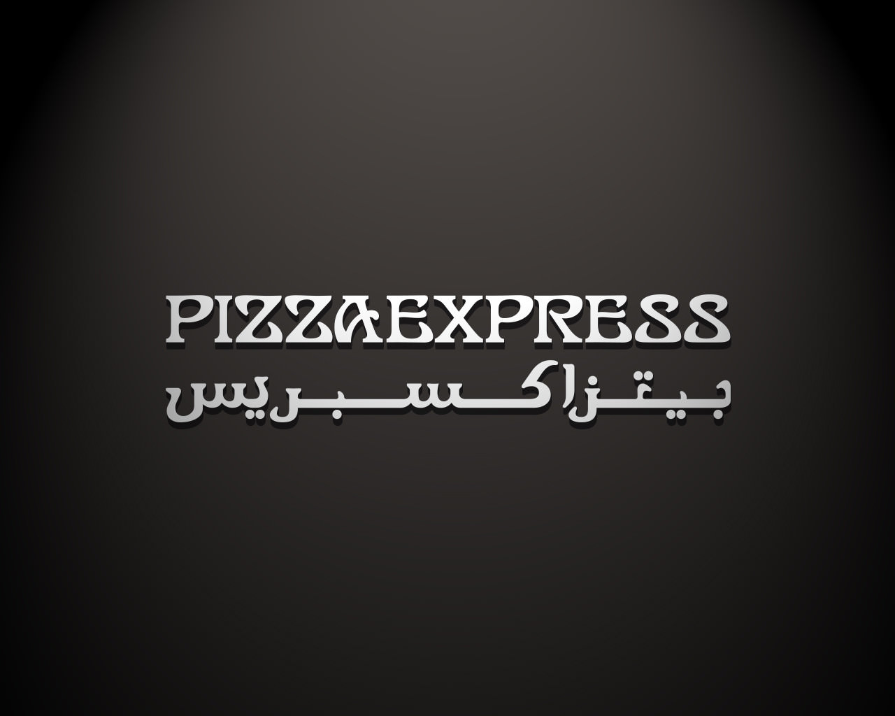
Logos that look as if they’ve been written or created by hand have a singularly rustic and old-fashioned flavour that became very popular in 2015. The trend is expected to continue in 2016. More and more brands will turn to calligraphy professionals for creating hand-written logos Apart from its freshness as a style, hand-lettered logos represent both a design sophistication and creative simplicity.
Related Posts
24+ Booklet Mockups - PSD Download - Premium ...
21+ Business Card Mockups - PSD Download ...
Truck Mockup Designs
15+ Square Business Cards - Printable, PSD, EPS ...
Logo Design Strategies for 2017 - Premium PSD ...
9+ Cosmetic Label Designs - Premium PSD, Vector ...
20+ T Shirt Mockups - Editable PSD, AI, Vector EPS ...
14+ Restaurant Packaging Designs - Premium PSD ...
30+ Stationery Designs - PSD, PNG, JPG, Vector EPS Design ...
19+ Pizza Box Mockups - PSD Download ...
21+ Free PSD Label Mockups Mockups - Premium ...
14+ Packaging Label Designs - Premium PSD ...
26+ Restaurant Mockups - PSD Download ...
28+ Creative Triangle Logo Designs, Ideas ...
Photorealistic Can Mockup Designs


