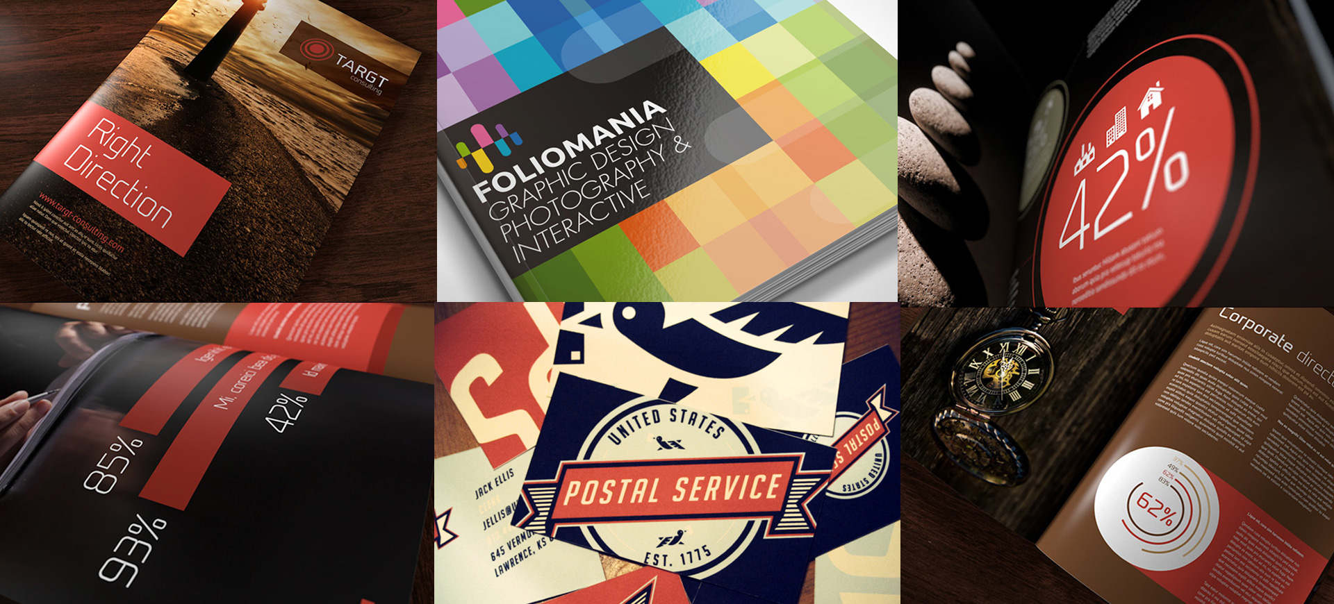
Brochure in general details the information to your target customer or the audience, but who says it is supposed to be plain and boring. An impressively designed brochure can not just make a memorable impression but also prove to be a functional promotional tool to keep you a step ahead of the competitors. Look below for the 10 best brochure design examples for innovative and unique inspiration.
1. Lake Shore
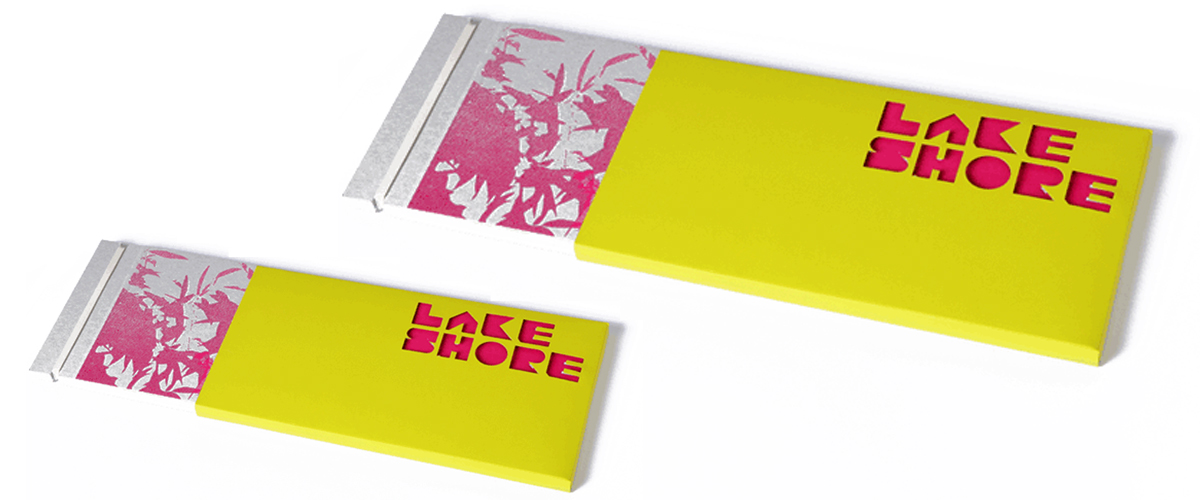
Designed by creative director John Owens, the brochure design for Lake Shore, includes reflective typography, branding, illustration, photography and fold out plans. The overlay print and patterns create a palette that appears true to the nature of Lake Shore, a unique development of eco homes in Bristol.
2. Coral Palace Luxury Resort

Michigan-based printed Company Folders designed the elegant brochure for Coral Palace Luxury Resort. The brochure takes the unusual route by ditching the conventional palm trees, seashells and bright colours found on most of the resort brochures available in the market. Instead, the brochure carries that handcrafted look with a floor plan of the apartments to make the occupants feel like they are at the comfort of their home.
3. Harter- How We Work
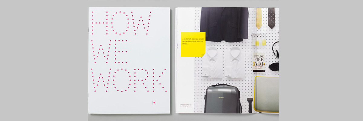
Designed by branding and design consultancy Red Antler, the 48-page brochure carries the lovely use of patterns and colours. The brochure was designed for the launch of a new task chair by design solutions company Harter.
4. Vespa
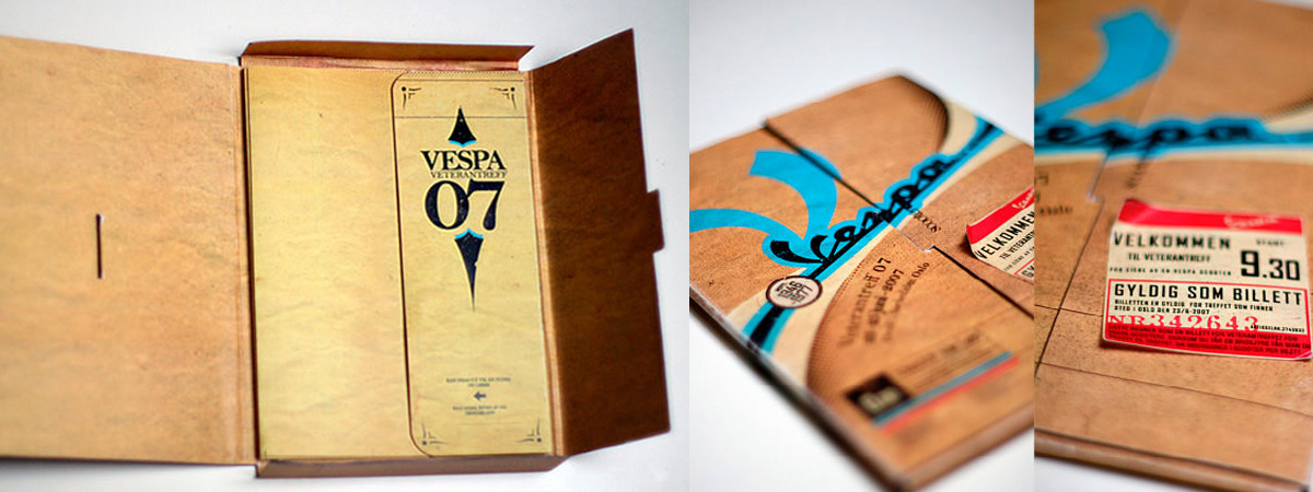
The retro-styled brochure of Vespa was designed by graphic designer by the name of Niggez on the devianART website. The brochure has been beautifully crafted with the simple and elegant elements that draw a nostalgic value through the design.
5. Contemporary Slovenian Writers
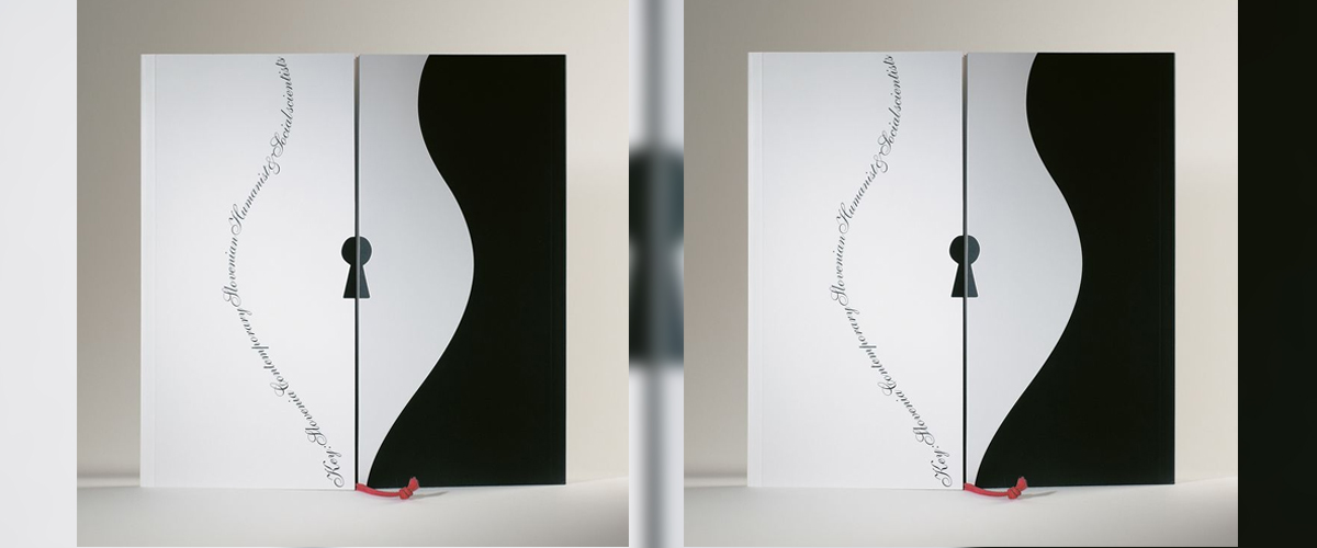
This contemporary Slovenian writers brochure was designed with the intention to present information on the writers at the Frankfurt book fair. Created by graphic designer Tomato Kosir, one-half of the brochure shows the Slovenian humanists and the second social scientists. Furthermore, the colour indicates well on the nature of the brochure.
6. Typographical Brochure
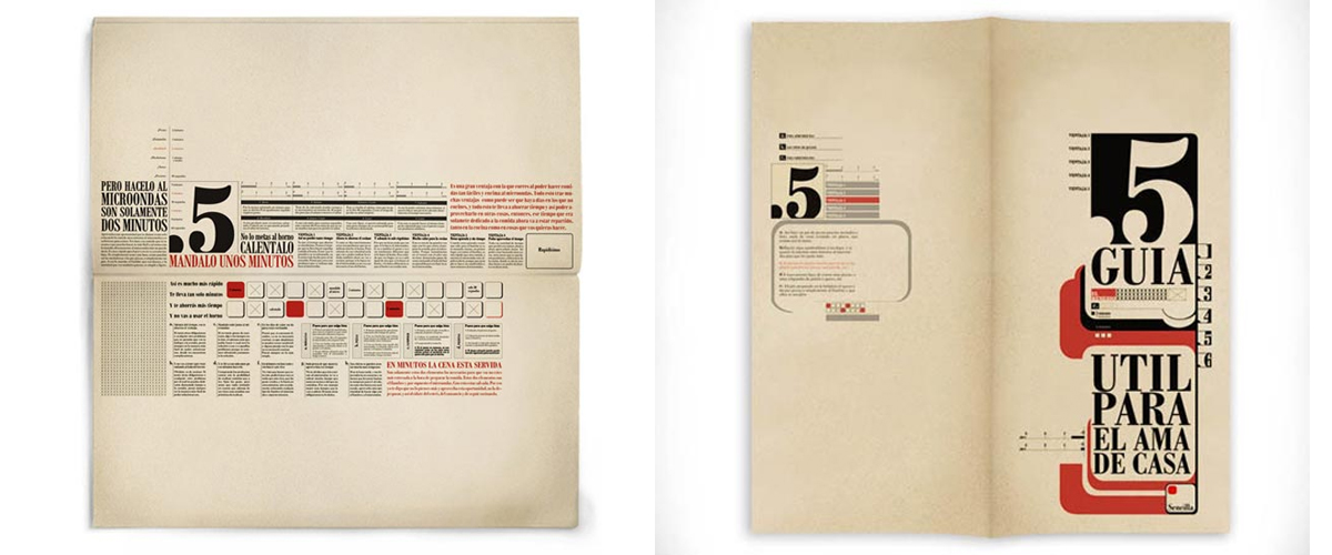
This typographical brochure captures the attention of the reader with the impressive play of fonts matched with the varied size and style of type. The use of three staple colours makes the brochure unique and one of a kind.
7. RVC CPD Brochure 2013
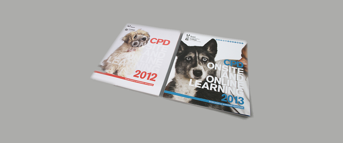
This beautiful brochure designed for Royal Veterinary College CPD coordinates accurately to its name with bright and beautiful pictures placed parallel to the colorful and legible font. The brochure holds that empathetic value which every animal lover would relate to.
8. Corporate Business Brochure
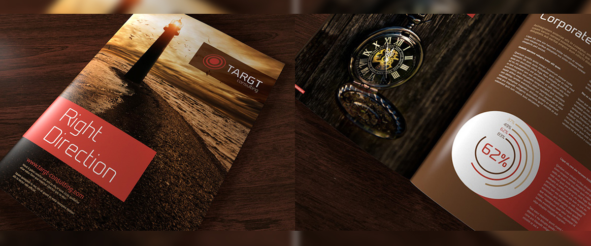
This 16-page brochure carries that perfect corporate design with a clean, professional and modern template. The right usage of colours and font make the design distinct and precise without any undisturbed or unwavering elements.
9. Foliomania
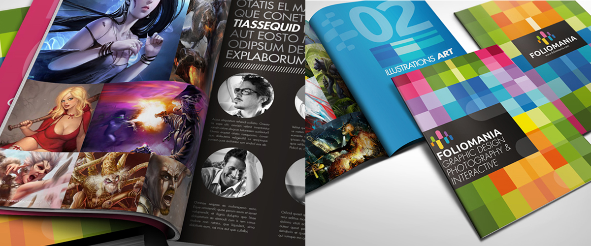
Foliomania is a portfolio brochure for designers created by multimedia design house Lemongraphic. The bright and vibrant colour in the distinct pattern grabs the attention of the viewer immediately.
10. United States Postal Service ReBranding
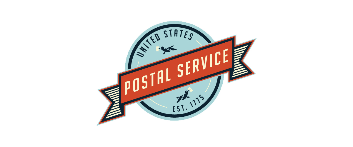
The complete rebranding of the USPS mail system with various merchandising and promotional tools brings an impressive and uniform visual element to all the rebranding pieces. The design is sleek, smart and attention-getting in the first glance.
Take inspiration from these examples to design an impressive brochure for your next creative project.
Related Posts
36+ Company Brochure Designs - PSD, AI, InDesign, Vector EPS ...
24+ Real Estate Flyer Designs - Premium PSD ...
Business Brochure Design - Premium PSD, Vector ...
10 Modern and Trending Brochure Designs ...
21+ Conference Flyer Designs, PSD Download ...
20+ Business Logo Designs, Ideas, Examples ...
44+ Company Brochure Designs - Premium PSD ...
10+ Cosmetic Flyer Designs - Premium PSD, Vector ...
29+ Cafe Logo Designs, Ideas, Examples ...
12+ Best Examples of App Profile Page Designs ...
Best Examples of Material Design in Mobile Apps ...
20+ Beauty Flyer Templates - Printable PSD, AI, Vector EPS Format ...
Best Examples of Material Design in Mobile Apps ...
33+ Monkey Logo Designs, Ideas, Example ...
Illustrator Brochures - Premium PSD, Vector ...
