Many business people tend to neglect the importance behind business cards, and that they would not take it seriously when they make one. These people just make business cards just for the sake of having one that they can use in case they would need to give a copy to people, when in fact, business cards are given to promote yourself and your business by sharing your contact details to prospects.
Here, we have listed down the ten commandments of business card designs which will serve as your guide. If you want to assure yourself of a professional-grade business card that will surely stand out, then simply read the commandments below and apply them on your business card design.
First Commandment: Thou Shalt Know Thy Own Business
Knowing your company well and the nature behind what your company does is essential when designing your own business card. You should also be familiar with your target audience, or the people who you intend on giving your business cards to, to guide you in the process. If you really know how your business works, then you will have an idea on what elements you should include on your business card design.
Second Commandment: Thou Shalt Not Apply the Idea of Bigger Being Better
Business cards are about being compact and portable, so the mentality of being better when it’s bigger can not be applied here. A business card may be big in size but the design is cluttered or the information supplied on the business card is lacking, which totally defeats the purpose.
On the other hand, a business card may be small but its features are being arranged in a neat and organized fashion, and it contains all the necessary contact details that a reader needs to know about the businessman or the business itself. So regardless of the size, a business card may either pack a punch or make itself useless if it is not able to serve its purpose.
Third Commandment: Thou Shalt Be Aware of the Use of Typography in the Design
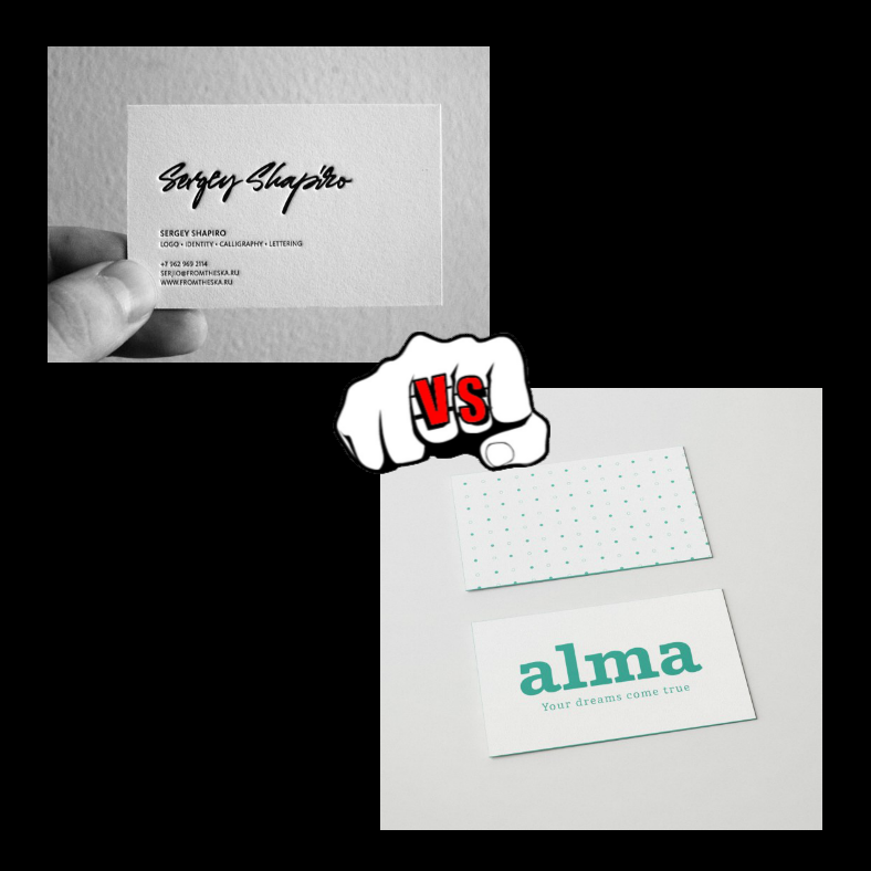
The business card samples above show two different styles of typefaces. (Image Sources: http://cardview.net/gallery/sergey-shapiro-business-card/3690/ and http://www.freepik.com/free-psd/front-and-back-view-business-card-mock-up_866030.htm)
When trying to decide on what font to use, it would be best to go with a typeface that is 1) clean; 2) easy to read; and 3) appropriate. What do mean by those three? Aside from the images and other graphics, your typography font should also compliment the design in a way that it also helps in representing your business.
If you’re business is about organizing events or planning weddings, then an elegant script font, such as the ones used on our collection of wedding planner business cards, may be used. But if you are a lawyer or a journalist who needs to have a more formal looking business card, then using script would be inappropriate and you should use either a serif or a sans serif font instead.
One thing to keep in mind: never ever choose comic sans as the typeface of your business card.
Fourth Commandment: Thou Shalt Always Encourage A Call To Action
When sharing or exchanging business cards, you don’t just do it without any intention or without expecting a call from the person whom you shared your business card to. The point of giving out business cards to prospective customers and potential business partners is to provide them with your name, your contact details, and information about the business that you represent.
Sharing business cards is just like selling yourself to the general public and other business people, and you will need to make your business card design appealing and have a motivating call to action to encourage readers to contact you.
Fifth Commandment: Thou Shalt Not Make Thy Design Complicated
Or in other words, thou shalt keep your business card design simple. While we don’t need to explain this commandment that much, we still need to put emphasis on the fact that a complicated business card design will give the impression that you are disorganized and unprofessional. Keep your business card design simple, and let the reader focus their attention on the more relevant features such as your name and your contact details.
Sixth Commandment: Thou Shalt Take Advantage of QR Codes
The business card design above shows a QR code on the bottom left corner of the back side. (Image Source: https://creativemarket.com/MustaART/618988-Creative-Business-Card)
In today’s generation, it’s mostly about going paperless and taking advantage of technology to promote businesses and the services offered. And when providing people with your contact details through business cards, you don’t necessarily have to write down each and every information because doing so will only mess up your business card.
If in case there are other details that you want to share but will no longer fit on the business card, the best thing you can do is to use QR codes. But first, you will need to have your own website or social media page bearing all information about you and generate a QR code for your business card to redirect clients to that site.
Seventh Commandment: Thou Shalt Not Forget To Proofread Thy Business Card
Proofreading. Of course. Why would you even neglect such act? In every business document, advertising tool, or anything that requires composing something regardless of how short it is, you should always take the time to proofread before finalizing it.
With business cards, since it is usually involved during the first direct interaction between the businessperson and the prospect, it serves to provide the latter’s first impression of the former. When errors are found on the business card, it can definitely have a negative impact on your business since it only shows that you take things for granted. Now, would you rather not proofread your work and risk losing or not gaining clients? I hope not.
Eighth Commandment: Thou Shalt Not Copy Thy Neighbor’s Design
Unless you want to get yourself in trouble for ripping off other people’s work, you should NEVER, EVER copy their business card designs, most especially those that have been issued by the company that they represent. While you can always use other people’s business card designs as reference or as a guide to give you ideas for your own business card, you should always make up with something unique and different.
Ninth Commandment: Thou Shalt Not Underestimate Thy Own Creativity
Here is a good example of a business card design that effectively uses creativity to make it stand out. (Image Source: https://www.designmantic.com/blog/15-business-card-fonts-for-smbs-2016/)
Don’t be afraid to get creative, and don’t be afraid to explore your own creative capabilities. When designing your business card, make sure it will stand out from among the competitors by being creative. When getting creative with your business card, it involves more than just the printed design.
You may be creative with regards to the shape, the texture, or the way the business card is presented in general such as with transparent business cards. The bottom line is, think outside the box and just be creative for the sake of making your business card stand out. You may want to check out our list of some creative business card designs to give you an idea.
Tenth Commandment: Thou Shalt Invest on A Good Card Stock
Lastly, you should have your design printed on a high quality card stock, don’t go with cheap materials. Business cards made with poor quality materials or printed in low resolution (to save up on the printer’s toner) will most likely end up ignored, forgotten, or in the trash bin. Since you are trying to give the impression that you are a professional, you should also make your business card look professional by investing for quality, not just quantity.
We hope you were able to learn something from those commandments mentioned above. You don’t really need to follow each and every one of them, you just have to take them into consideration when designing your own business card. What’s important is, never take your business card designs for granted so it will get noticed and you, in turn, will also get the response that you deserve.
Related Posts
10+ Blank Thank You Cards
11+ Rustic Thank You Cards
11+ Professional Thank You Cards
7+ Wedding Thank You Cards
8 Artistic Greeting Card Designs
7+ Vintage Travel Postcard Designs
7+ Retro Thank You Card Designs
9+ Square Business Card Templates – AI, Apple Pages, Ms Word
17+ Editable Identification Card Template Designs – PSD, AI, Word
9+ Designs for Wedding Planner Business Cards
12+Transparent Business Card Templates – Ms Word, AI, PSD, Publisher
12+ Business Card Designs for Landscapers
16+ Lawyers Business Card Templates – PSD, Ms Word
15+ Business Card Designs for Every Photographer
13+ Unique Pop Up Greeting Cards


