Working as a real estate agent is no walk in the park, they encounter a lot of hits and misses throughout their career and that they will need to constantly go the extra mile just to be able to get the clients they need. This is because the products that they are trying to sell are expensive even though the clients are allowed to pay in installments, yet these still require some serious investments. When real estate agents try to sell something, they should always try their best to convince their prospects that every penny that they will be spending is worth it, and that is not an easy thing to do.
For realtors to be able to market their properties effectively, they can make use of different marketing tools such as real estate flyers or real estate brochures, and for those who wish to use large-scaled tools, they can also go with real estate banners. But for some who would want to go the extra mile in order to reach out to people, they can also make use of postcards that feature the property that they are trying to sell. With postcards, realtors can reach out personally to their prospects, and they can even include a short message for their prospects to read. Below are a collection of real estate postcard designs that you may want to check out. Go ahead and see the designs yourself. You may also see Corporate Postcard Templates.
Purple and Green Real Estate Postcard Design
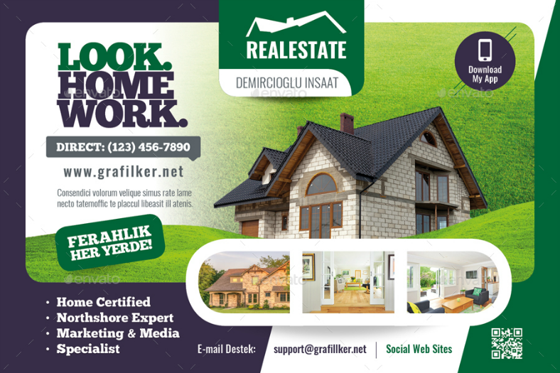
Let’s get things started with this multilayered and colorful real estate postcard design that makes effective use of a two-tone backdrop. To be more specific, the left half of the design’s backdrop is in purple while the right half is in green. Since we have mentioned that this postcard design is multilayered, there is a layer on top of the backdrop that is used for placing an image of the property being advertised. Also, on this layer are some text indicating some information about the property and the real estate business, including their contact numbers and email address. And then just below this layer is another small one simply intended for placing more pictures of the property, and this could be one that is taken from a different angle, or it could also be images of the property’s interior. You may also see Vintage Travel Postcard Designs
Multipurpose Real Estate Postcard Bundle
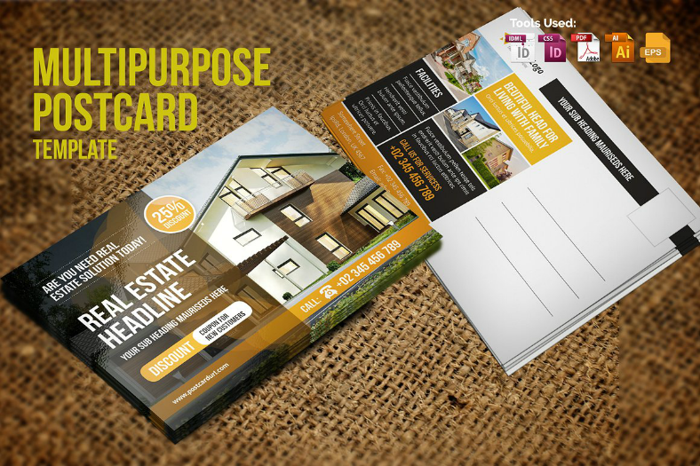
Here is another real estate postcard design that you may want to consider if the previous one didn’t really fit what you were looking for. For this one, the front side of the postcard is intended for placing a full-scale image of the entire property, with a translucent layer covering the left half of the design for the text. For the back side of this postcard design, there are a few more thumbnails of the property and some details with regards to its features, and on the right half is a space provided for writing a personalized message to the recipient.
Deep Red Real Estate Postcard Design
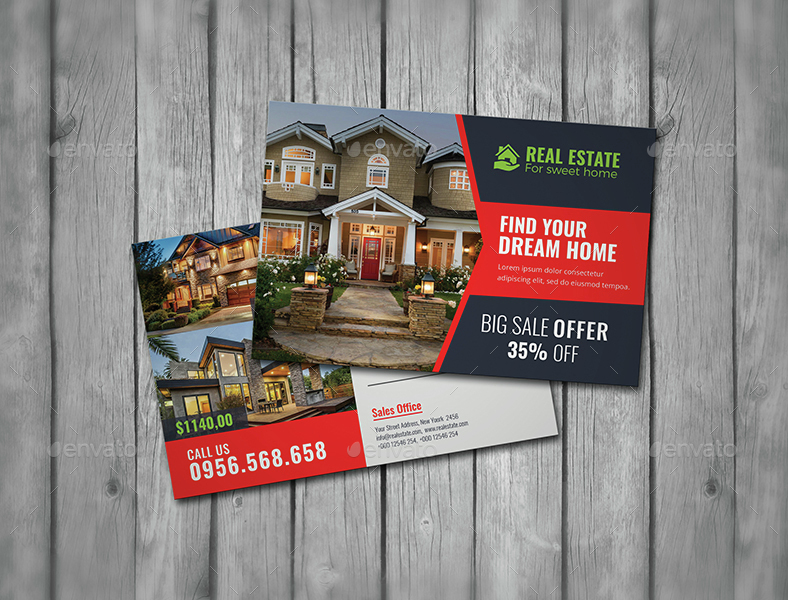
Red goes perfectly with almost any dark color, not just black, and this is because of the sharpness of red balances with the deepness of dark colors. For this design, both front and back sides are divided into two columns consisting of an image of the property and a space provided for the typography. For the front side, the typography is written on the right side of a red and dark gray background. However, for the back side of this card, the backdrop is in solid white and is intended for writing personalized messages.
Clean Minimalist Real Estate Postcard Design
For those real estate agents looking for a rather clean and minimalist look on their postcards, then the design above may provide you with what you need. Judging from its minimal use of colors and elements, this design is very simple and straightforward. The only elements that you can find on this design are the text for describing the property and for the contact details, and the images showcasing both the interior and exterior aspects of the property. And since this is a postcard design, we can already expect a space provided for writing a personalized message for the recipient.
Photographic Cover Real Estate Postcard Design
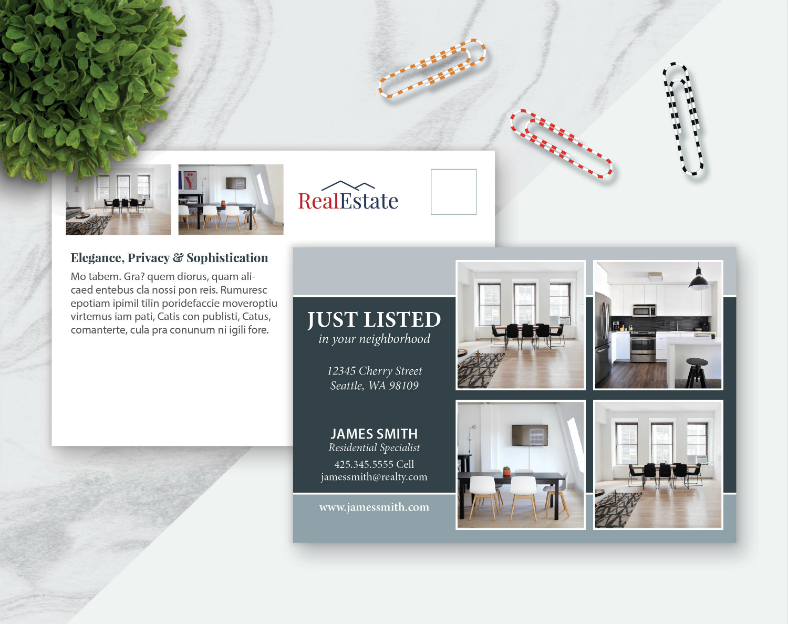
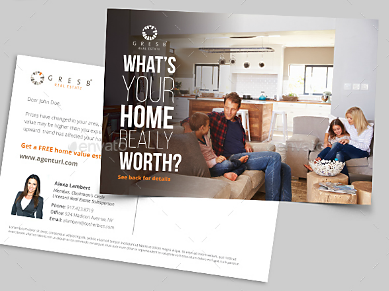
If you wish to keep your postcard design simple by limiting the use of images, then you may be interested with the design shown above. The front side of this postcard design heavily resembles a magazine cover with its full-scaled image and a short caption written over it. For its back side, you may choose whether or not to include an image of the property, putting more emphasis on the description of the property’s best features, along with the contact details of the real estate agent. But for those who choose to include an image on the back side, they may also add a portrait image of the real estate agent to go along with their encoded profile.
Luxury Homes Real Estate Postcard Design
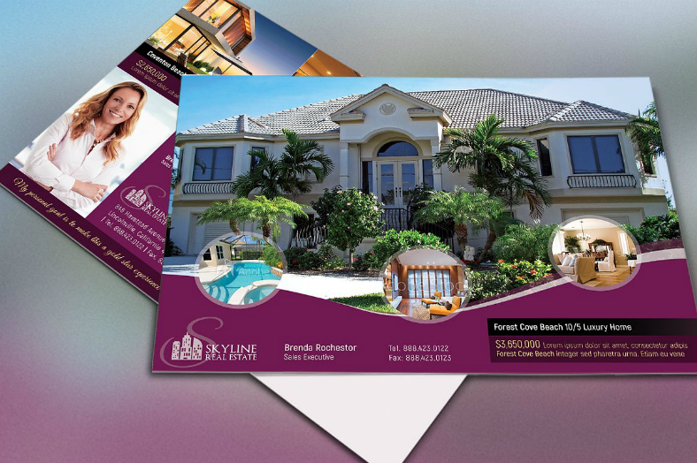
Just as much as you want to promote a luxurious house to your prospects, you would also want to keep the look of your postcards luxurious to make it consistent. If you are looking for that kind of postcard design, then check out the sample shown above. This design has got the features that can surely convert your prospects to actual clients with its smart, simple, and elegant look. On its back side, the elements are also arranged well to accommodate more elements, plus a space for writing a personalized message for the receiving prospect.
Columnar Stock Real Estate Postcard Design
Here is another real estate postcard design that you may also be interested in. For this one, both sides of the card are divided into two columns for placing an image of the house and incorporating other details. On the front, the image of the property is found on the right half while the other half is used for the text. The back, on the other hand, switched the placement of the elements, wherein the image is placed on the left and the right is kept blank for the real estate agent to write a personalized message for their prospects.
Green Landscape Real Estate Postcard Design
Purple is a nice color, and not to mention it goes well with green. Why did we bring that up? It’s because the front side of this real estate post card design features a purple lower border and a beautiful green landscape. Proper landscaping can help in beautifying an entire home, and it can also stimulate the mood of the people living in that home, which is why it is being featured here on this modern postcard design, to help in stimulating the mood of the prospects. According to most people, houses and homes are synonymous, but to us, a house can never become a home if it isn’t able to bring a comforting and secure feeling to its residents, and one way these can be achieved is through a good landscape.
Dream Home Real Estate Postcard Design
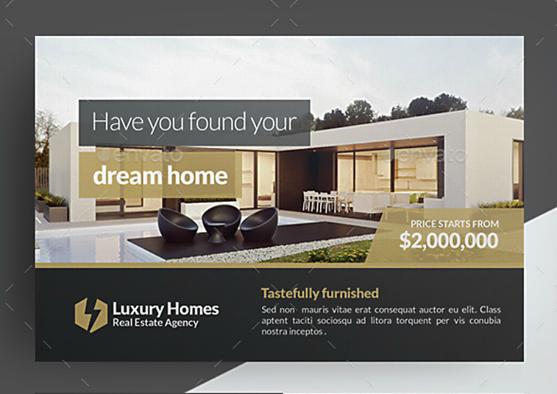
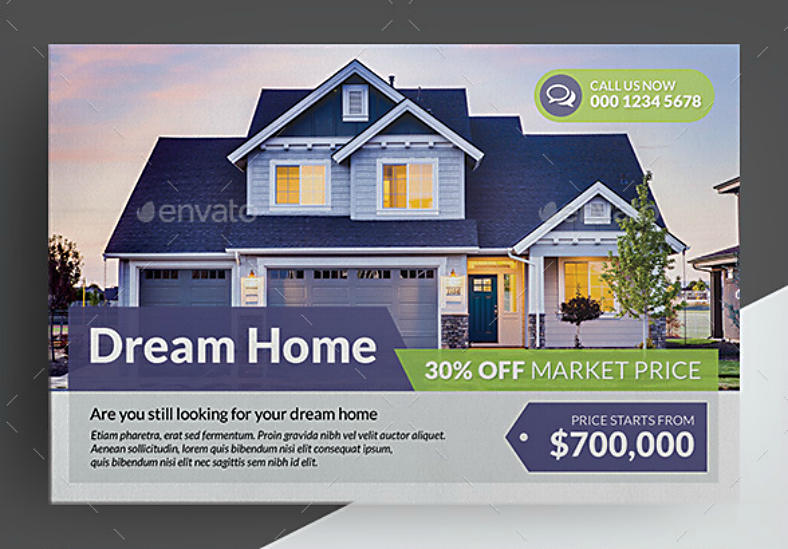
Give your prospects the realization they need for getting the home of their dreams with this simple postcard design. Maximize your use of the front page by putting a single full-scaled image of the property’s exterior aspect and let your prospects gaze upon its beautiful features. And to add some supporting details to these features, you may also include some descriptions to the property along with its price. For the back side of the card—like most of the designs here—allow a sufficient amount of blank space for writing a personalized message to the prospect, you can never have too much blank space on a postcard, just make sure to write an optimistic message to entice your prospect into becoming an actual paying client.
Blue Minimalist Real Estate Postcard Design
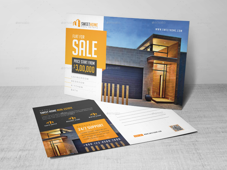
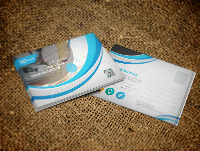
For those real estate agents wanting to minimize their use of images and focus more on the descriptions of the property’s best features, you may want to consider the postcard design on top. This postcard design makes use of only one image of the property which is found on the front side, with a few added elements to help in preventing the postcard look dull. On its back side still, are more text indicating more of the property’s features, but also includes here the real estate agent’s contact details. To those wondering how the recipient may be able to find more images of the property, the real estate agent can make use of the QR code provided to redirect the reader to their industry’s online profile.
Photo Collage Real Estate Postcard Design
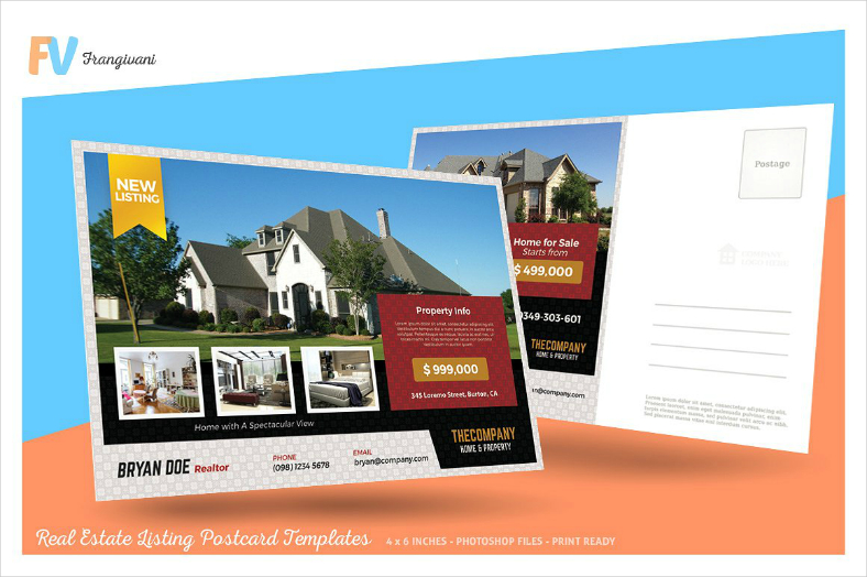
To those who found the previous design interesting, you may also like this postcard design since it is very much similar, but a bit more artistic. This postcard design also features a full-scale image that shows the entire exterior aspect of the house including its front lawn, and a few thumbnails to showcase the house’s interior aspect. Below these elements is the real estate agent’s profile, and beside it is the company’s name. On the back side is another image of the house—which is basically the same image as the one used on the front side—but is compressed on the left half of the design, and the right half is used for the personalized message.
Open House Real Estate Luxurious Postcard Design
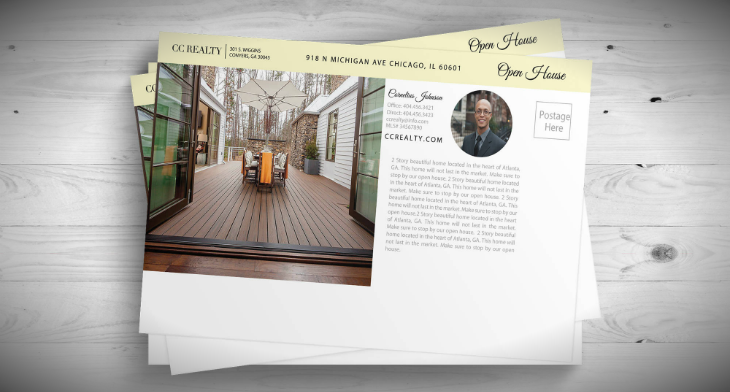
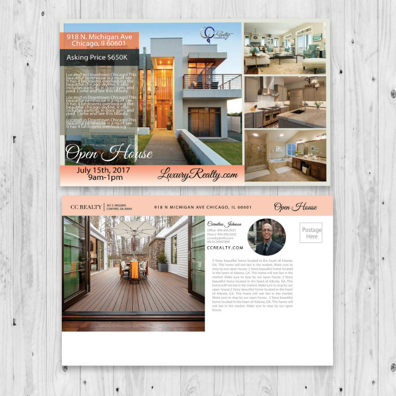
And finally, another luxurious postcard design for a highly luxurious house. This corporate postcard design features a full-scaled collage of images showcasing both the interior and exterior aspects of the house. The front side of the card also contains text describing the house’s features and are written over a translucent layer to make it legible enough. On the back side of the design, you also add another image of the house that may or may not similar to the ones used on the front. Also, on this side is the realtor’s portrait image, profile, and the background of their career, and on the topmost border is the name of their company along with their street address.
So what did you think of our collection of postcard designs? Were you able to find one that works for you? We sincerely hope you did since we gathered them specifically for you. These postcard designs have been created by some of today’s best graphic artists from all over the world in hopes of being able to provide realtors with the tools they need to be able to convert prospects to clients. And what’s great about these designs is that they are already halfway done, meaning you won’t have to stress yourselves into having to start all the way from the bottom to be able to make your own postcards.
Most of these designs come in vector format, which is the format of choice for many graphic artists. The advantage of using vectors is that they are fully editable, they have excellent resolution, and they are able to adapt to alterations, meaning they can maintain their sharpness even after undergoing a lot of edits. Lastly, these designs are very accessible and are easy to download, and they can be downloaded at a very reasonable price. With all that said, you can already start downloading a postcard design. But before you actually do that, take time to read about some information about printable cards, then you can proceed to download your own postcard design.
Related Posts
15+ Barber Shop Templates
17+ Raffle Flyer Templates
10+ Political Flyer Templates
10+ Vintage Wedding Invitations
9+ Owl Silhouette Designs
8+ Vintage Invitation Card Designs Design Trends
Top 10 Selling Products by Gucci Design Trends - Premium PSD ...
50+ Font Designs
30+ Thanksgiving Freebies Designs
24+ Real Estate Flyer Designs
21+ Birthday Vectors
19+ Marketing Calendar Templates
18+ Invitation Flyer Designs
15+ Dining Room Chandelier Designs
8+ Father's Day Greeting Cards to Express Your Love to Your Dad
