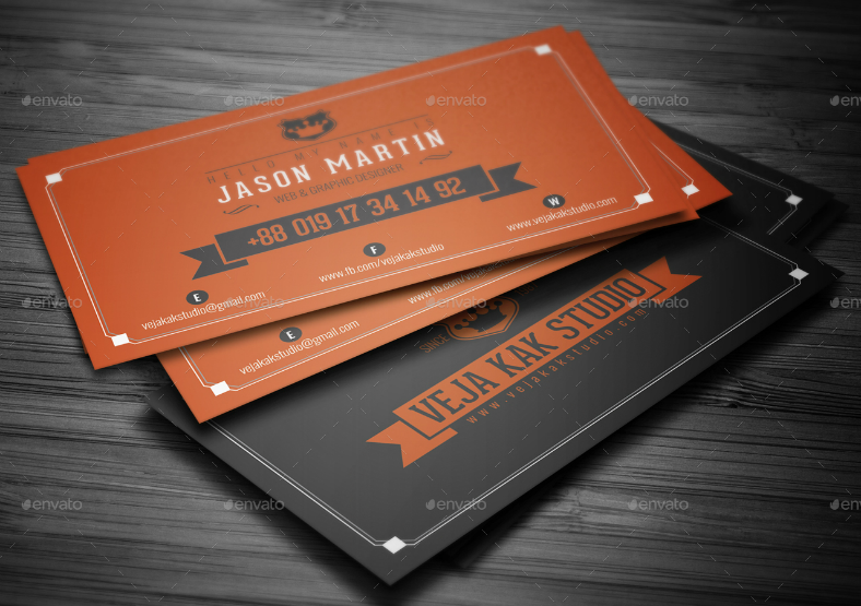
By this time, we already know that business cards are one of the most important and most effective means of sharing contact details between a business person and a prospective client, and between two business partners. It has long been used by business people and is still used up to this day. These business cards don’t need to rely heavily on creativity just to get the attention they deserve, some are even very simple yet are still able to turn heads. What’s important with business cards is how they are presented to the prospects who receive them, which is why with vintage business card designs, they are still visually appealing even though the designs are more on the minimalist side.
On this page, we have gathered around some of the most attractive vintage business card designs for you. You can find here vintage business cards that are more on the typography, while there are also those that contain some graphics. With these business card designs, you won’t need to do much other than just modify some features, you’ll save yourself the hassle in having to make business cards from scratch.
Vintage Style Business Card Template in Pages
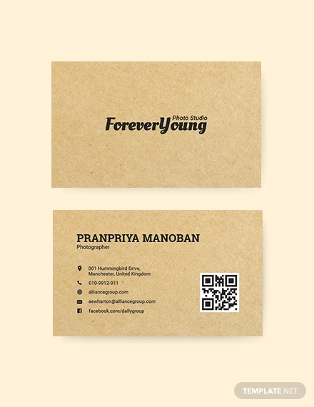
Free Vintage Business Card Template
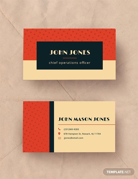
Giant Typography Vintage Business Card Design
The first vintage business card mockup design on this collection leans more toward simplicity and puts emphasis on typography than other features, though this still contains some of those features but are kept at a minimum. However, you may still be able to add more elements to this business card design as you wish, the only thing to keep in mind is to avoid from making the design look overly cluttered to maintain professionalism in your business card’s appearance.
For this business card design, it is more suitable to those businessmen who would prefer using a clean business card with a lot of white space. On the front side of this business card design, all the relevant information about the business person can be found such as their name as well as the name of the company that they are working for, their designation in that company, and then their contact details, which are all compressed on the lower right corner of the card. On the back side of this business card design, there are stripes of different washed out colors from the top of the design to the bottom, and these stripes extend from the left side of the design to the right, resulting in making the entire back side of the business card appear vintage-like.
Rustic Texture Vertical Vintage Business Card Design
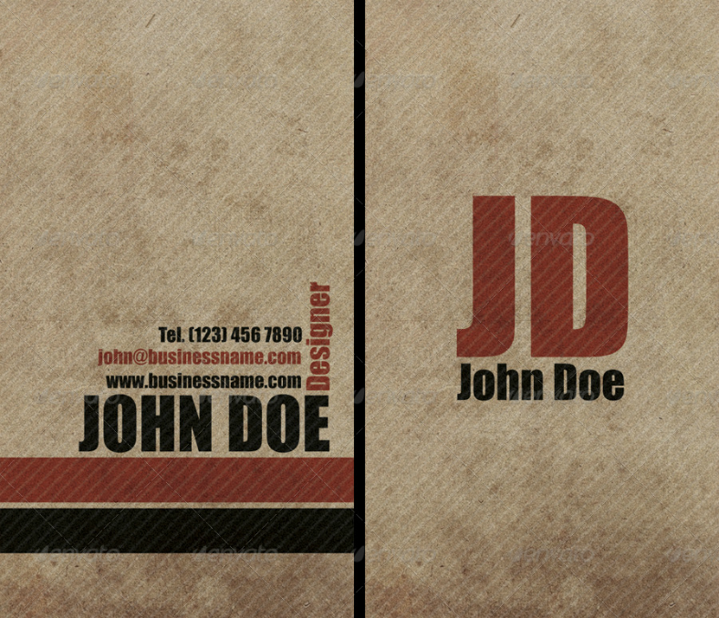
The typographic business card design shown above gives the impression of being vintage-inspired by having uneven marks all over the card to make it look worn out. As seen on the sample above, the front side of the card contains the relevant details about the business person, though it doesn’t fully occupy the entire space, and is only compressed on the lower half of the design, including the red-and-black lines that extend from the left to the right side of the card. On the back side, you can simply find the initials of the businessman written in large text, followed by their complete name right below it. Though the sample above shows that the text are written in a parallel orientation to the card, you may also choose to have it written at an angle, which can further make the business card look creative.
Vertical Orientation Flat Business Card Design
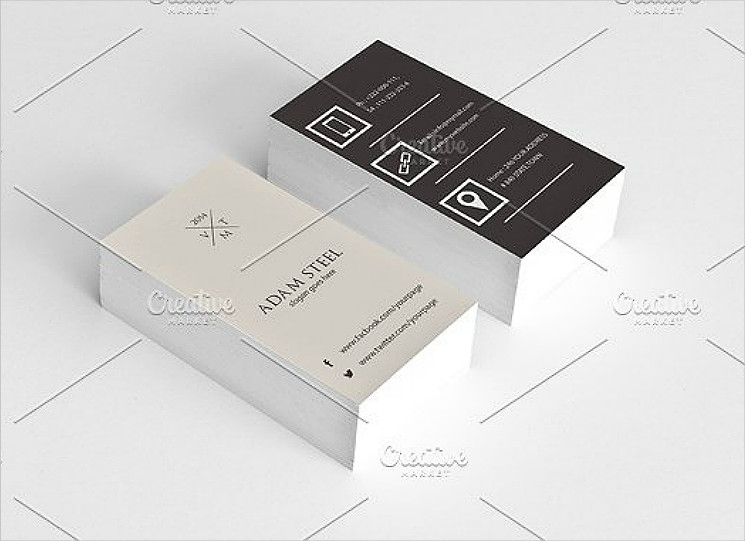
On this minimalistic business card design, the text and graphics are kept to a minimum which maximizes the blank space on the card. As seen on the sample above, both sides utilize the same color scheme but are used interchangeably. On one side of the card, the background color is white while the text and the graphics are written and illustrated in black, and on the other side of the card, it’s the other way around. The advantage of having this business card is that even though it is kept simple, the way it is presented is effective enough in capturing people’s attention, which is far more important than having to make a business card design with over-the-top features but is unable to draw attention from the people.
Vintage Ticket Typography Business Card Design
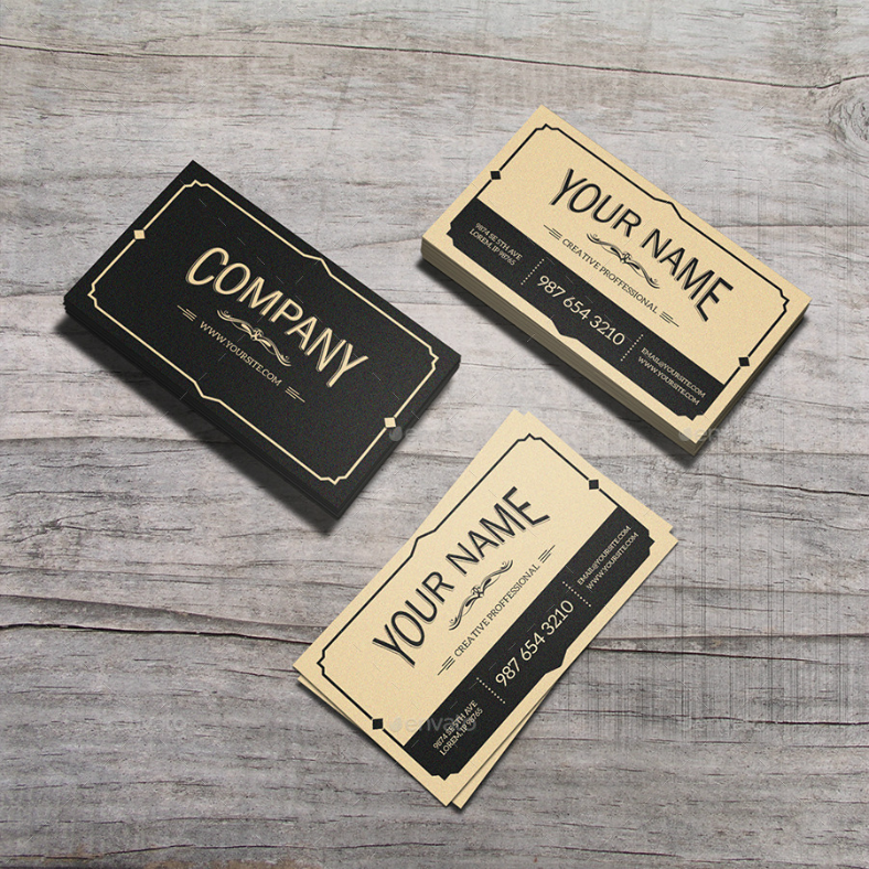
Here is another vintage business card mockup design that resembles closely to tickets being used back in the days for permitting passengers to get on train rides, or those being used at carnivals or amusement parks. For this one, similar to the previous one that we have shown you, both side of the card use the same color scheme, but the way the color is used on one side is reversed on the other side of the card. If you think that this design works appropriately to the type of business that you are managing, then why don’t you give this one a try?
Script Typography Minimalistic Vintage Business Card
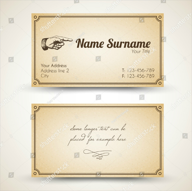
The vintage times were known to make use of script or long-hand font on advertisement medias, telegrams, and basically almost anything that involved being done through handwriting. Which is why for the business card sample shown above, no matter how simple or minimal the features are, the design is made to look vintage because of the typeface used. For the front side of the card, the name of the business person is written in large text, followed by their designation right below their name. On the bottom left and right corners of this side of the card, you can find the business person’s office address and their contact numbers respectively, which are arranged in an organized fashion to find them easily. And for the back side of the business card, the entire space can be used to write anything that you want that is relevant to the business. On this space, you may want to write the name of your business and a short tagline, or you may simply write a quote or a verse, it’s all up to you. Also, if you need help in designing your business card, you may want to read about our ten commandments of business card designs.
Unique Multi-Layered Vintage Business Card Design
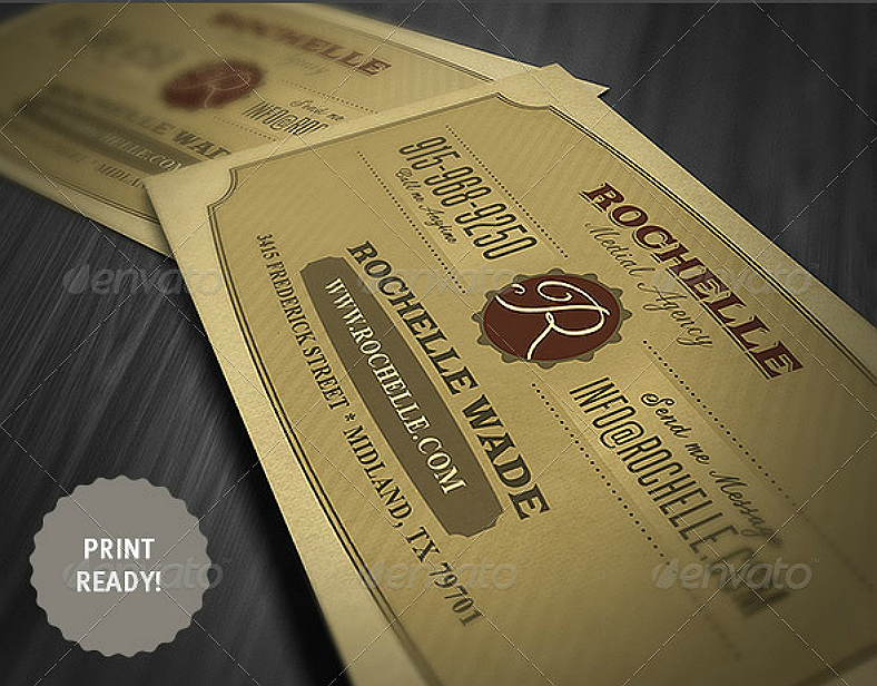
Here is another vintage business card mockup design inspired by tickets or coupons that were being circulated back in the days. The difference on this design with the previous one is that this contains far more elements than the other design, which leaned more toward a simpler appearance. For the back side of this business card design, it still embraces simplicity by containing only an emblem with a letter inside it that corresponds to the first letter on the business’s name or the founder’s name. The front page is where all the rest of the features are found, which includes the name of the business as well as the name of the owner, their contact details such as their phone number and their email address, the website address and also the street address of the business office, and once again, the logo in the middle area of the design. You may stick with the sepia color scheme for this design for a more vintage-inspired look, but you may also choose to use other color schemes for this business card design as well.
Creative Winged Vintage Business Card Design
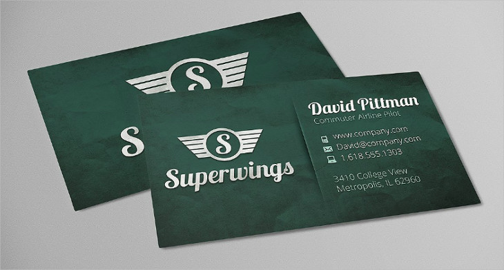
After all the fancy business card designs shown above, here is a more traditional-looking business card that contains a vintage twist to it. With this business card design, it’s not the color that makes it appear vintage but the entire design and how it is presented, though you may be able to change the color into something that can make it even more vintage-looking. Like all the other business card designs, one side of this card simply contains the logo and the name of the business, while the opposite side contains the relevant details that a reader needs to know about the business person. And, if you choose to go with this design, you may either have it in a landscape (horizontal) orientation or in a portrait (vertical) landscape, or you may even mix it up to make your business card even more unique.
Square Bordered Vintage Business Card Design
Going back to a more creative and unique business card design, this one actually has a minimalist design, with the only trace of creativity being on the way the card is presented. For this design, the features are kept simple and are compressed in the middle area of the card. For the enhancement in quality, there is a two-line border near the edges, and there are also solid-colored boxes on all corners of the card design. And similar to the previous design that we have shown you, both sides of this business card utilize the same color scheme, with one side using it in a reversed fashion as the other. This design is ideal for those who are on a limited budget and cannot afford to make a business card containing multiple colors.
King of Hearts Vintage Business Card Design
Take your creativity to the maximum level with this business card design that resembles a playing card. On this design, you may include a portrait picture of yourself in the middle of the design, the same area where the image of the royals (king, queen, jack) can be found. Surrounding your picture, there is a space provided where you are able to write your name and your title in the business, and then you can leave the rest of this side of the card as it is with traditional playing cards. On the back side of this design, you can then put the other important details that you are unable to include on the front side, such as the street address, website, email address, and the contact numbers. However, if the vintage theme isn’t really for you, you may refer to our collection of modern business card designs.
To sum it up, these business card designs were gathered from various reliable websites, and were created by skillful and imaginative graphic artists. The people who supplied these designs have had a lot of experience in this field, and they aim to be able to provide their consumers with the best quality downloadable business card designs. Downloading these designs can be done with a single click of a button, though you may be required to pay a fee first before you can start downloading one, but not to worry, the fees are at a reasonable rate.
As for the quality and editability of these business card designs, they are in vector format, which makes it not only sharp in resolution but are also able to retain its quality even after editing. Another advantage of working with vector images is that they can be edited easily, and you may be able to edit individual elements without altering the entirety of the design, and again, all these can be done without compromising it quality. So what are you waiting for? Aren’t you in need of a business card? Download a design now so you can start making your own business card.
Related Posts
10+ Blank Thank You Cards
11+ Rustic Thank You Cards
11+ Professional Thank You Cards
7+ Wedding Thank You Cards
8 Artistic Greeting Card Designs
7+ Vintage Travel Postcard Designs
7+ Retro Thank You Card Designs
9+ Square Business Card Templates – AI, Apple Pages, Ms Word
17+ Editable Identification Card Template Designs – PSD, AI, Word
9+ Designs for Wedding Planner Business Cards
12+Transparent Business Card Templates – Ms Word, AI, PSD, Publisher
12+ Business Card Designs for Landscapers
16+ Lawyers Business Card Templates – PSD, Ms Word
15+ Business Card Designs for Every Photographer
13+ Unique Pop Up Greeting Cards
