Weddings are probably every couple’s dream in life, aside from being able to reach at least a golden wedding anniversary, and this is something that usually happens only once in a lifetime. Since it only happens once, the to-be-wedded couple will usually exert all their efforts into making their wedding as memorable as possible not only to themselves but also to the attendees who witnessed the ceremony. When we mentioned “exerting all their efforts,” it doesn’t always have to mean spending a lot to be able to make an event memorable.
Yes, extravagant parties may be memorable most of the time, but not all memorable parties have to be extravagant. A couple will be able to pull this off without having to spend a lot by simply taking advantage of their interests and incorporating to the theme of their wedding. Another way is by thinking out of the box and just be as creative as possible, while still keeping the ceremony formal and intimate enough. The third option that we can recommend for you is to take inspirations off the Internet, which is in fact, abundant of ideas ranging from “how tos” to “what to dos.”
Simple Wedding Thank You Card Template
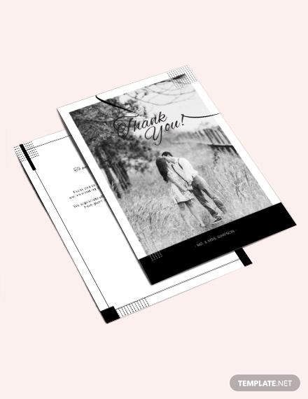
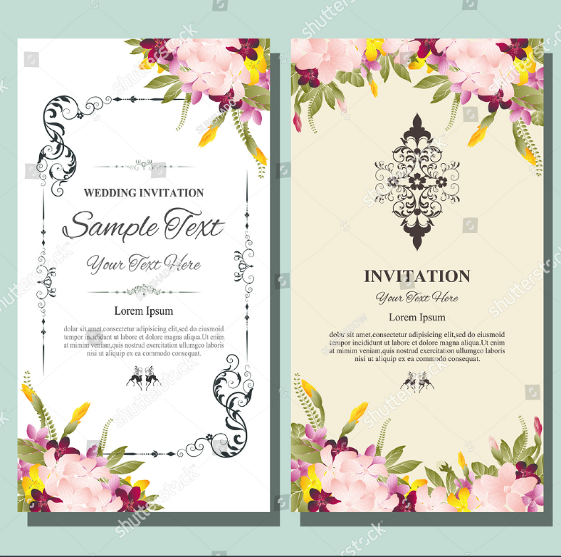
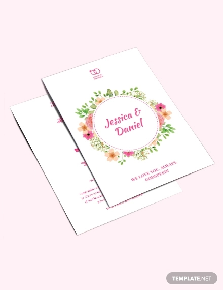
In addition to those wedding ideas that you can research online, you can also find various stuff that you can download such as pre-designed templates as well as DIY instructions on how to make these stand out. To those needing design templates for wedding cards, we have an entire collection of them below that you can check out. These templates may prove very useful for those who are planning a wedding since these will save them a lot of time and effort in the making of these cards. No need to get yourself all stressed out by actually making your wedding cards from scratch, scroll down and see the card designs yourself. Then at the end of this article, let us know if any of the designs that we have provided were able to capture your interests.
Marriage Greeting Card Template
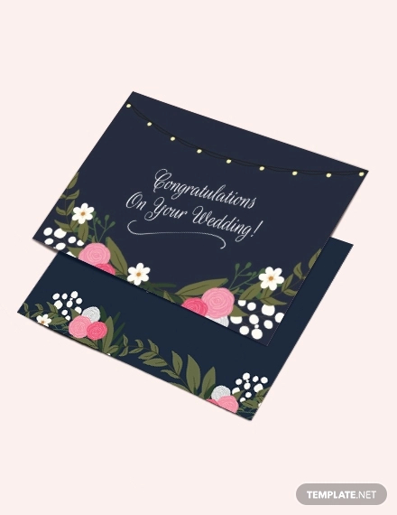
Wedding Congratulations Card Template
Bundled Fall Season Wedding Card Design
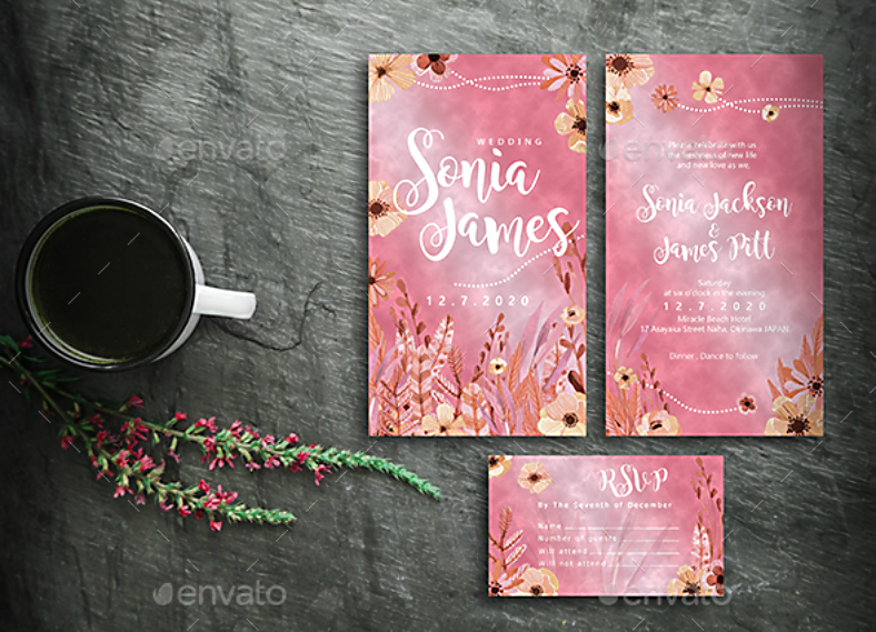
For the first wedding card design on this list, it is actually a bundle of designs that include one for the save-the-date card, another for the invitation card, and a third one for the RSVP card, and you may be able to download all three designs for as low as $9.00. These card designs will make you feel like it’s the fall season because of its color scheme, and this would be perfect if the schedule of the wedding takes place during autumn.
Modern Elegant Wedding Card Design
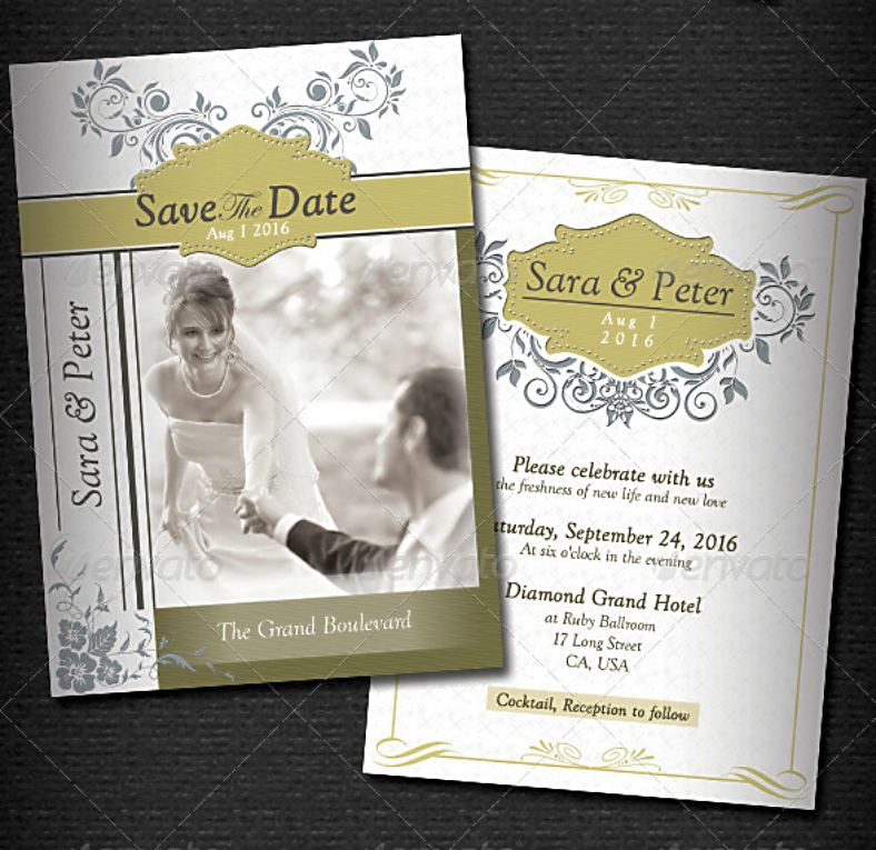
Here is a wedding card design that is somewhat simple yet also modern and elegant. As you can see from the sample above, you can choose between a grayscale theme and a colored one. On its background is a textured surface, with the textures resembling small leaves. Slightly off-center on the design is a horizontal strip filled with a gradient color, which is where some details of the event are written. And right above and below this strip are ornate graphics to further beautify the look of this wedding card design.
Two-Tone Vintage Wedding Card Design
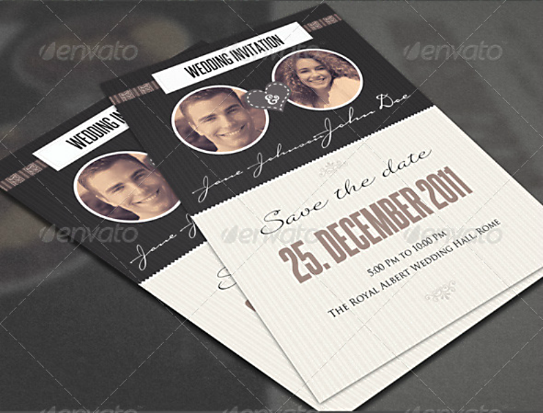
Check out the vintage wedding card design above, which divides that entire card in two distinct halves. The upper half uses a dark background and contains portrait image of the to-be-wedded groom and wife with their names written below it. On the lower half of the design, the background is in a light color, and this is where the details regarding the wedding are written, which includes the date, time, and the venue of the ceremony.
Romantic Elegant Wedding Card Design
If you can get hold of a wedding card design that has a space meant for a cropped picture, then why not use it? Take advantage of this awesome feature and make use of one of your photos taken during your prenup. If you haven’t had your prenup yet, then just have this wedding card design ready at hand and then go have your prenup. The picture not only enhances the appearance of your wedding invitation, but it also makes it look dramatic, as well as romantic, in general.
Flat Graphic Illustrations Wedding Card Design
No picture? No problem! If you already need to have your wedding cards designed and printed even if your prenup photos are not ready yet, then simply make use of flat human illustrations in place of those image, such as the one shown on top. But aside from that feature, this wedding card design also has other elements that help it to stand out, such as the elegant ornate borders and the flat elements that are surrounding the illustrations of the groom and bride.
Red Color Scheme Wedding Card Design
We have always associated the color red with love, which is why the color scheme used for this wedding card simply spells perfection. This dual-sided wedding card design simply pulls it off in every aspect with its choice of colors, typeface, and other elements. The front of this design simply contains the names of the couple that are about to be wedded, while the back contains all the information about the wedding such as the date and time, and the venue.
Artistic Hand-Drawn Wedding Card Design
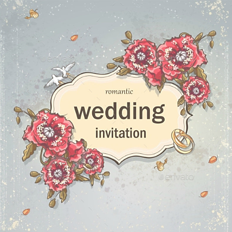
If you enjoy hand-drawn illustrations, then you will definitely enjoy this simple yet artistic wedding card design. This one showcases a hand-drawn inspired artwork by its graphic artist and even makes use of a slightly washed-out filter to make the design appear authentic. On the middle portion of this design is an emblem, where the text is seen, and this emblem is surrounded by elements that symbolize love and unity, such as the flowers and wedding rings, respectively.
Cute Caricature Wedding Card Design
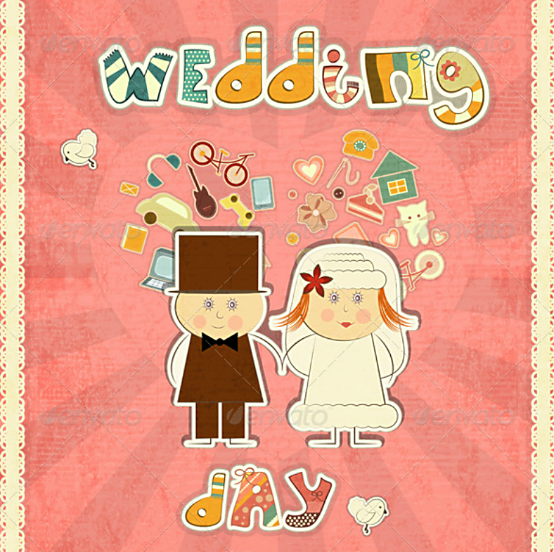
We have already shown you one design on this list that featured an illustration of the groom and bride, and here is another one that you might be interested in. Unlike the previous illustration that leaned more toward realism, the one on this design has a more caricature-like appearance. Another nice feature for this design is its use of various patterns for its typography, and this alone makes the entire design look colorful.
Stock Tri-Fold Wedding Card Design
Why stick to using single-paged wedding cards when you can always take advantage of all its spaces and make it into a tri-fold design? This wedding card design resembles brochures, which come in various folds, and the reason behind the use of folds is to help in organizing its content. For this wedding card design, the content is also being arranged very well within the folds, making it much easier to read.
Chalkboard-Inspired Simple Wedding Card Design
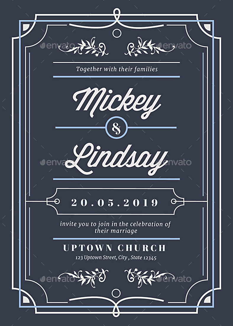
Here is a chalkboard-inspired design for those who prefer a rather retro theme for their wedding cards. This typographic wedding card design mostly features text indicating the details about the wedding, but with some added elements such as the elegant borders, and a few ornate decors to help in enhancing the appearance of the design. The use of contrasting colors between the background and its elements help in making the text and other features stand out, while its choice of colors are also easy enough for the eyes.
Blue Motif Wedding Card Design
Check out this very nice wedding card design. This one is perfect for those weddings that are having blue as their motif. The front side of this design simply features a rounded element with a solid blue background, and over this background is a text that indicates the initials of the to-be-wedded couple and the date of their wedding. Surrounding this element are a patterned background and an illustration of blue roses on two of the four corners of the card. And on the back side of this design, the same patterned background and corner roses can be seen, but unlike the front that had a rounded emblem, this one features a box containing all the information about the wedding.
Retro Floral Border Wedding Card Design
To those looking for a vintage-themed wedding card design, this one may be an ideal pick because of its color scheme, its decorative elements, and its typography. Check out the beautiful design above, it effectively balances simplicity and creativity with its elements. And for this wedding card design’s colorful features, there are abstract floral borders on both the top and bottom edges of this design.
Abstract Flower Illustration Wedding Card Design
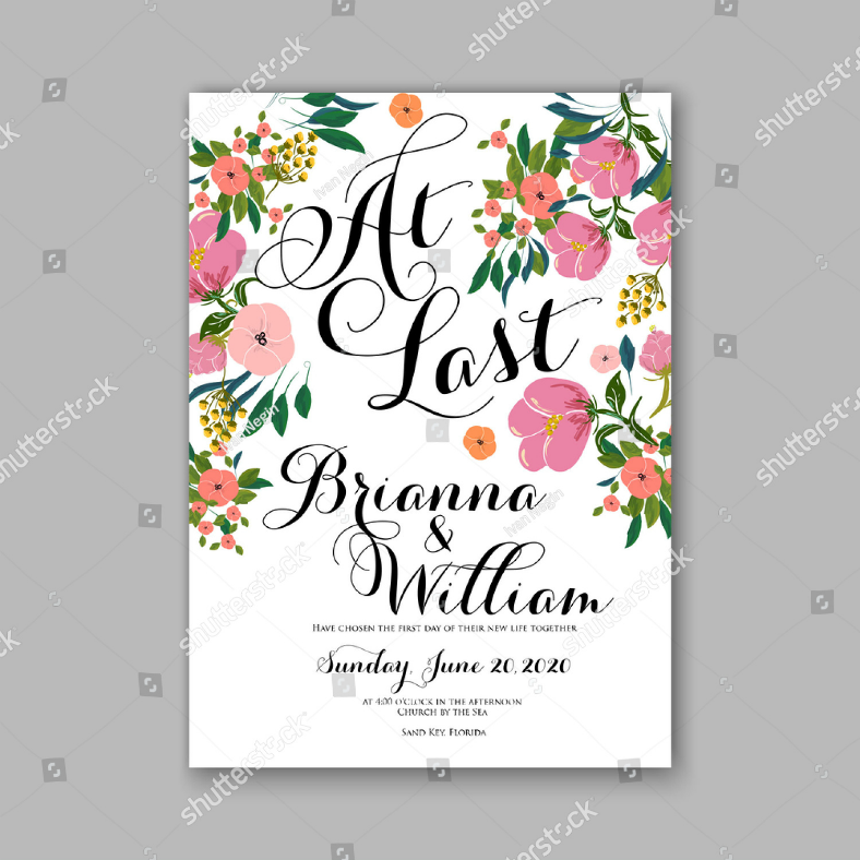
At last, a wedding card design that showcases the use of multiple vibrant colors in the form of abstract illustrations of flowers. This wedding card design is comprised of only two sets of elements, namely the floral illustrations and the typography, and the use of these elements are maximized to add color to this design and to make the features stand out in contrast with the solid white background.
Beautiful Vintage-Themed Wedding Card Design
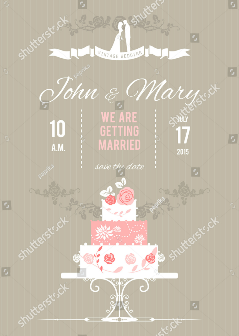
But to those who would rather keep the use of colors limited to prevent the risk of making a design look cluttered, this vintage wedding card design may be a very good choice. You could say that there are only three colors used for this wedding card design: tan (pale brown), rose pink, and white. Another advantage of using a limited number of colors in a scheme is it makes the whole design easy on the eyes.
Bread Toast Funny Wedding Card Design
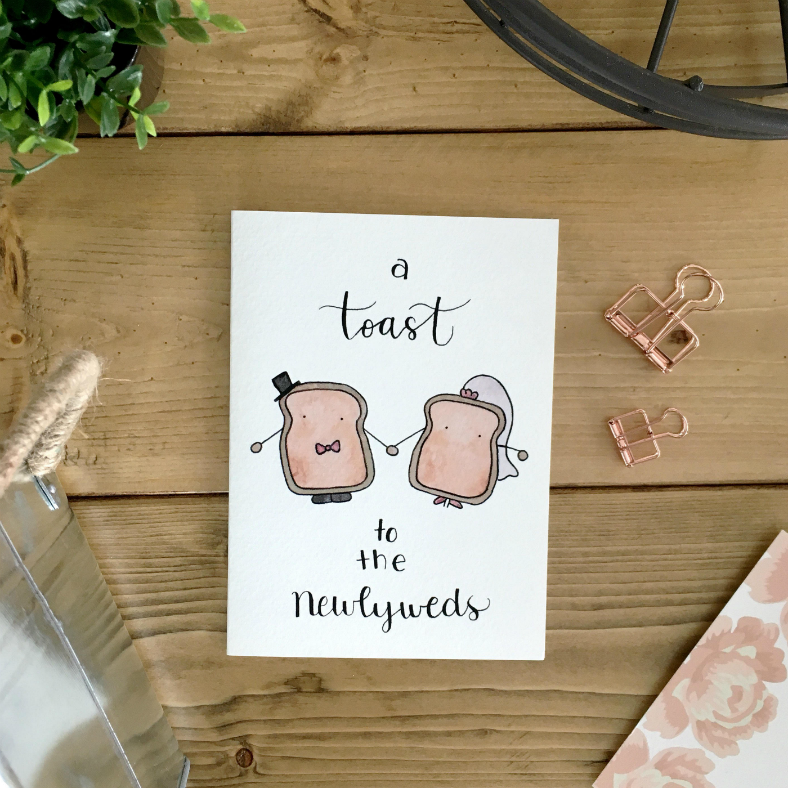
During a wedding reception, a segment is set for the best man—most preferably a toastmaster—to take the stage with a champagne glass in hand, make a speech with some words of wisdom for the wedded couple, and request the attendees to raise their glasses in honor of the couple. This gesture—referred to as a wedding toast—often ends with the person giving the speech with, “May I request everyone to stand up and join me in giving a toast to the newlyweds.” For this wedding card design, they took that statement a little too literal (but in a funny way) by actually illustrating a pair of toasted bread slices dressed up as the groom and the bride.
If you want to have a lot of freedom in the designing of your wedding cards, you may want to go with the design shown on top. This wedding card design is very minimalist and highly customizable that you will indeed have the freedom that you want. This design simply bears a solid white background with some floral decorative illustrations surrounding the typography in the middle. Do what you want with this design. You may add a few more elements on the front or you can take advantage of the back instead. When using this design, just make sure to avoid going over the top with the addition of elements to prevent the wedding card from becoming chaotic.
For the politically-inclined, I suggest you go past this design because it might somehow be offensive to you. But if you think you can take a good joke, then check out the wedding card design above. Unlike the previous card designs that we have shown you that were meant to be given to the persons invited, this one is for the wedded couple. On this design is a short message of congratulations to the couple, along with an image of United States President Donald J. Trump.
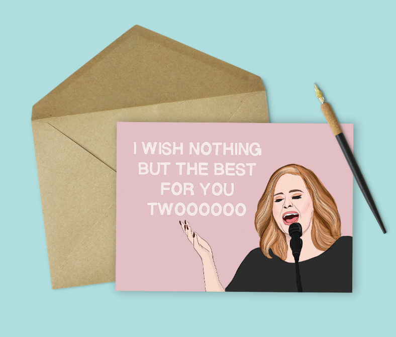
Funny Adele Wedding Card Design
For those who found the previous wedding card design offensive but still want to include an image of a celebrity, you may want to go with this one instead. Just like the previous design, this one is meant to be given to the newlyweds to congratulate them and provide them with best wishes. Here, an image of the singer Adele is illustrated on the lower-right corner, and a line from her song “Someone Like You” is written on the upper-left that fits appropriately to the purpose of this wedding card.
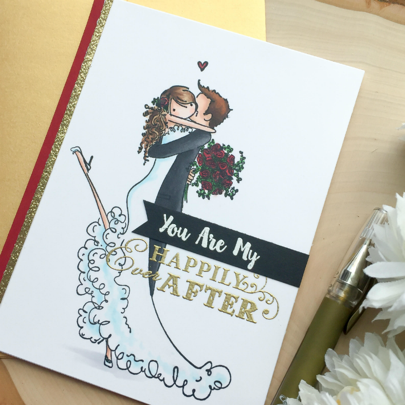
Happy Ever After Wedding Card Design
This time around, we will be showing you a few wedding card designs that are neither intended to be given to the invitees by the hosts nor are these meant to be given to the couple by the guests. While this design is meant to be used by the couple, it is to be given by the husband to his wife, or the other way around. This beautiful wedding card design is very romantic just from the illustration alone, and it helps in expressing the emotions of the person giving this. To complete the look and presentation, also check out our gallery of wedding envelope designs.
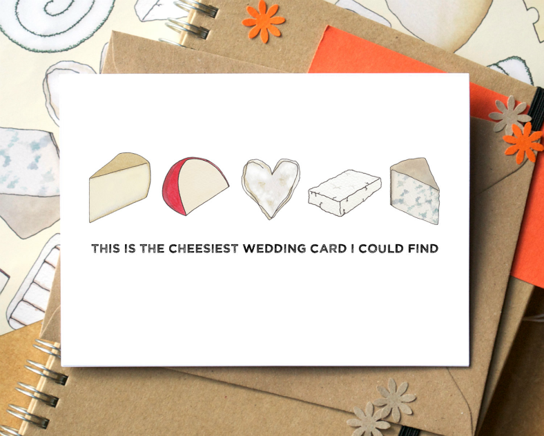
Literal Cheesy Wedding Card Design
Here is another card that can either be given by the guests to the couple, or just like the previous design, it can also be given by the couple to each other; this can even be used for designing wedding anniversary cards. An amazing feature about this design is its use of literal meaning, and for this case, taking cheesy literally. We all know that when we say that something is “cheesy,” we are actually referring to something that is overly dramatic or romantic. But for this case, a row of cheese are being illustrated along the middle row of the design.
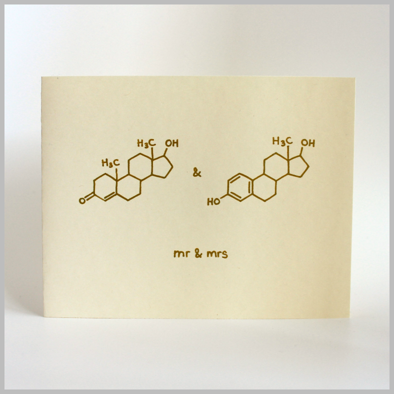
Chemistry Structures Wedding Card Design
Here is another humorous wedding card design that all of you may enjoy, most especially those who are very knowledgeable in science—specifically in chemistry. To those people who are not familiar with what is being shown on this card design, those are actually the chemical structures of testosterone and estrogen. You may say that this wedding card design is very simplistic with its line illustrations over a solid white background, but there’s also no doubt that this is design will bring out laughs from its recipients. In addition to this design, newlyweds may also use this as a basis for making thank-you cards.
Rounded Flat Illustrations Wedding Card Design
Back to another wedding card design that features illustrations of the couple, and in a comical way. When you look at the graphic illustrations on this design, they somehow resemble the art style from the animated television series South Park with their round-shaped heads and eyes, and the lack of noses. Lastly, the caption on this design hilariously fits our modern generation with the popularity of social media websites nowadays.
The releasing of a pair of white doves has been practiced during wedding receptions almost all over the world, and it is symbolic of the groom and the bride as they start their journey as a couple. Individually, the white doves symbolize purity, love, happiness, and prosperity. In addition to that symbolism, it has also been said that the presence of white doves in weddings will bring good fortune and everlasting love between the couple. For this wedding card design, it shows an illustration of a pair of white doves in contact with each other, and some words of well-wishes written below them.
One of the widely used social media apps nowadays is Tinder, which is somewhat also considered to be a matching mobile application. Many people, most especially the singles, use this to find people who might match their interests and preferences, and if they do, they simply swipe right on the screen. This wedding card design effectively resembles Tinder’s user interface, and you can either choose to use illustrations or actual portrait photos of the couple to resemble the account’s primary photo.
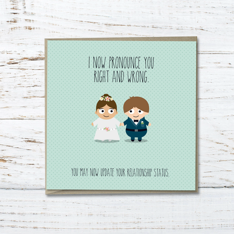
To those who have seen the 1987 movie The Princess Bride, which starred Saw‘s Cary Elwes and Wonder Woman‘s Robin Wright, you will very much be familiar with the caption written on the wedding card design above. This caption is actually taken from one of the scene’s dialogues, wherein a priest is presiding a wedding ceremony but could hardly pronounce the words properly. This is probably one of the most hilarious scenes from the movie, but it also perfectly fits the purpose of the wedding card. To the newlyweds, you may also use this design for creating wedding thank-you cards to show appreciation to those who witnessed your memorable event.
Bride Carry Tradition Wedding Card Design
For many newlyweds, it has been practiced that just after their wedding, the groom would lift his bride on his arms just as they enter their house or their hotel room. This practice was said to be first observed by the ancient Romans and was believed to be done to prevent bad fortune and evil spirits to enter the household by possessing the bride through the soles of their feet. Nowadays, that superstition has no longer been observed and the act of carrying the bride is entirely for fun.
Diamond Ring Wedding Card Design
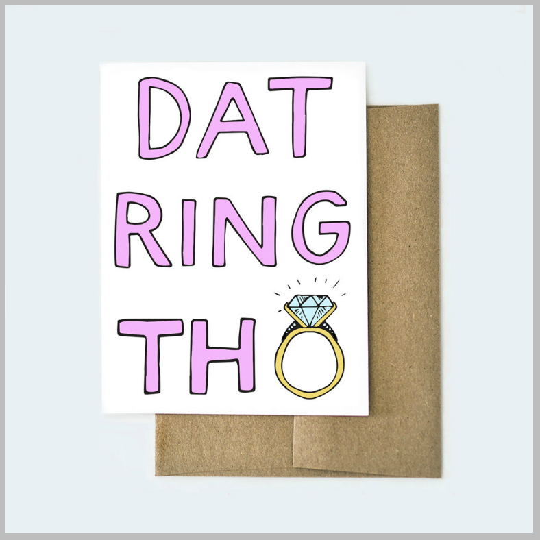
To those who want to go for simple yet funny wedding cards, you may want to check out the design shown above. For this design, it is almost entirely typographic except for the illustration of a diamond ring at the lower-right corner. However, you may still consider this design as purely typographic since the illustration of the diamond ring also serves as the letter O.
Here is another entirely typographic wedding card design for those who prefer simplicity for their wedding cards.This card design is perfect for giving to the wife by the husband, or vice versa, and the back portion can be used to write down a personalized and heartfelt message.
Lovely Couple Illustrations Wedding Card Design
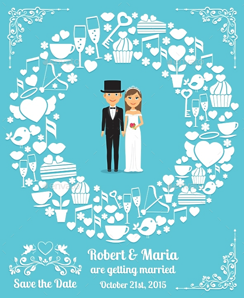
And finally, the last wedding card design on this list, which once again, features a pair of character illustrations in place of an actual photograph. The flat illustrations on this design resemble the couple, standing under a wreath of flowers and other decorative elements. Below their illustrations are the text that indicate the necessary information regarding the wedding, which includes the schedule of the event. To create balance between the colorfulness of the elements, the design’s background is in a solid dark color that also helps in making the illustrations stand out.
As mentioned during the introduction of this article, we stated that by the time you reach the end of this article, you would be able to find a wedding card design that works for you. So were you? We sincerely hope that you found at least one design that works perfectly for the wedding event that you are planning since these card designs are not only high in quality but also made by professionals. But those information alone may not be enough to convince you to download these designs, which is why we are about to delve further into more details behind these wedding card designs.
We already mentioned earlier that these designs were created by professional graphic artists, but what we haven’t told you is that these were actually collected from among hundreds of the best ones that we have found on the Internet, and we made sure to choose only the best to be able to provide our clients with design templates that are worth their every penny. In terms of editability, you’ll be glad to know that these designs are not only fully editable, but they are also very easy to edit. Another great feature about the wedding card designs that you have just seen is that their quality will not be compromised since many of these designs are in vector format, and vectors are able to adapt to modifications very well.
When it comes to how much you will need to pay for these designs, you will be able to download these easily and without actually having to spend a lot. The point of having this is to actually bring professional-quality card designs conveniently to people at a very reasonable price, and we are providing you with a lot of options to make sure that you will indeed be able to find what you need here. Before you actually proceed to downloading these designs, make sure you have a good enough Internet connection and you have the appropriate graphics editing tool installed on your system to prevent any hindrance in the downloading and editing processes, respectively. If you are all set, then scroll back up to the wedding card design of your choice, and click that download/buy now button.
Related Posts
10+ Blank Thank You Cards
11+ Rustic Thank You Cards
11+ Professional Thank You Cards
7+ Wedding Thank You Cards
8 Artistic Greeting Card Designs
7+ Vintage Travel Postcard Designs
7+ Retro Thank You Card Designs
9+ Square Business Card Templates – AI, Apple Pages, Ms Word
17+ Editable Identification Card Template Designs – PSD, AI, Word
9+ Designs for Wedding Planner Business Cards
12+Transparent Business Card Templates – Ms Word, AI, PSD, Publisher
12+ Business Card Designs for Landscapers
16+ Lawyers Business Card Templates – PSD, Ms Word
15+ Business Card Designs for Every Photographer
13+ Unique Pop Up Greeting Cards
