The expansion of digital channels has caused the logo design market to steadily evolve and change as per the demands and preference of the consumers. The current trend is leading towards a more personal and inclusive engagement rather than distant and formal. With the growing opportunities and changing technology, we have today compiled a list of 8 logo design trends that are running strong in 2016.
1. Flat Design
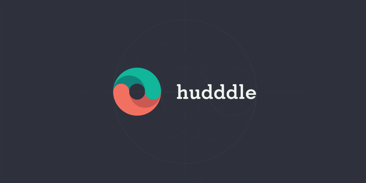
Flat designed logos continued to dominate the design market with their clean and sophisticated appeal. These logos tend to load faster and the simple pattern, shadows, gradients give way for delicate lines and colours. The flat designed logos register better in print as well as the online platforms. These uncomplicated design elements allow the companies to develop an easy and identifiable image with the target market.
2. Handmade Design
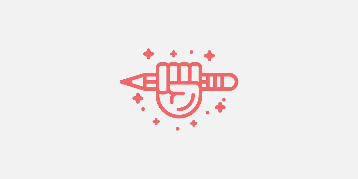
Handmade logos bring out a touch of honesty and create a closer and personal connect with the audience. Gaining popularity for quite some time now, the handmade design combined with a simple and small sketch work has been a prominent sight with a lot of company logos. With a hybrid feel that combines a digital and handmade touch, the designs are able to reflect on the crafty charm.
3. Kinetic and Dynamic Logos
The logos that change but at the same time hold a close connect with the original design are the ones that find a higher appeal with the audience. These types of logo designs help to make the consumer aware of the direction and diversification of the company. The trend fascinates the consumer with the new while also maintaining an association with the original.
4. Letterstacking
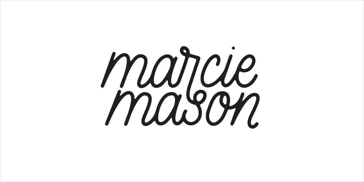
A creative logo design trend, letterstacking is one way to engage the viewer to draw the meaning out of the letters. It offers the designers with inventive ways to present long text in interesting visual bytes. Giving a visually appealing break to the long text the style has gained the popularity in the design arena.
5. Monolines
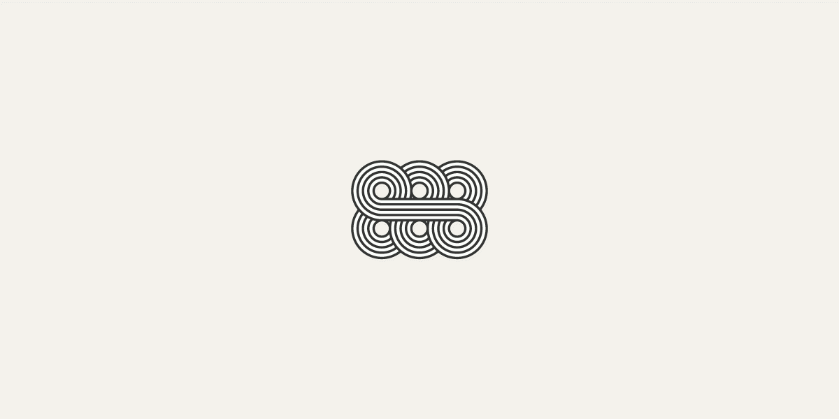
Monolines is the concept of using just lines in the same amount of thickness to design a complete logo. Intricate in execution, the design is able to put emphasis on the elaborate beauty that lies in simplification.
6. Overlapping Gradient Logo Design
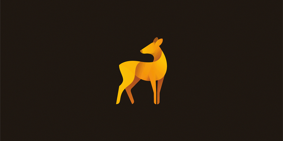
Using shiny, bright colours in overlapped format is one common web technique that is being used to create greater, beautiful and impactful logos.
The technique uses the initials of the company in a creative way, making the logo more noticeable and distinctive in the crowd.
If you are planning to design an individual logo or one for a company, try and include any of the above-mentioned creative design ideas to create a striking and inspiring design.
Related Posts
30+ Jewelry logo Designs, Ideas, Examples ...
25+ Mountain Logo Designs, Ideas, Examples ...
25+ Flower Logo Designs, Ideas, Examples ...
30+ Creative Guitar Logo Designs - Premium PSD ...
21+ Creative Lion Logo Designs, Ideas, Examples ...
24+ Awesome Wave Logo Designs, Ideas, Examples Design ...
60+ Logo Designs - Printable PSD, AI, Vector EPS Format ...
1925+ Logo Designs, Ideas, Examples
30+ Furniture Logo Designs, Ideas, Examples ...
25+ Shark Logo Designs, Ideas, Examples ...
29+ Wolf Logo Designs, Ideas, Examples - Premium ...
40+ Kangaroo Logo Designs, Ideas, Examples ...
21+ Logo Designs, Ideas, Examples - Premium ...
40+ Best Circular Logo Design, Ideas, Inspiration ...
29+ Best School Logo Designs, Ideas - Premium ...
