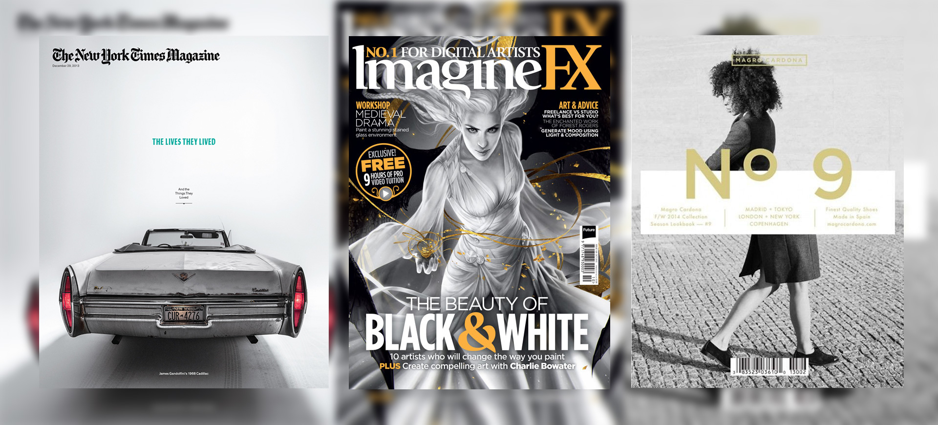
An impressive magazine cover can be explained as a judicious blend of attention grabbing graphic and high-grade theme or content. A cover with these two qualities will increase the reach of the magazine and will ultimately boost the sale. Striking, unusual and extreme, we have today compiled a list of 10 best magazine covers that will inspire you to create your personal unconventional and inspiring design.
1. Imagine FX: Black and White
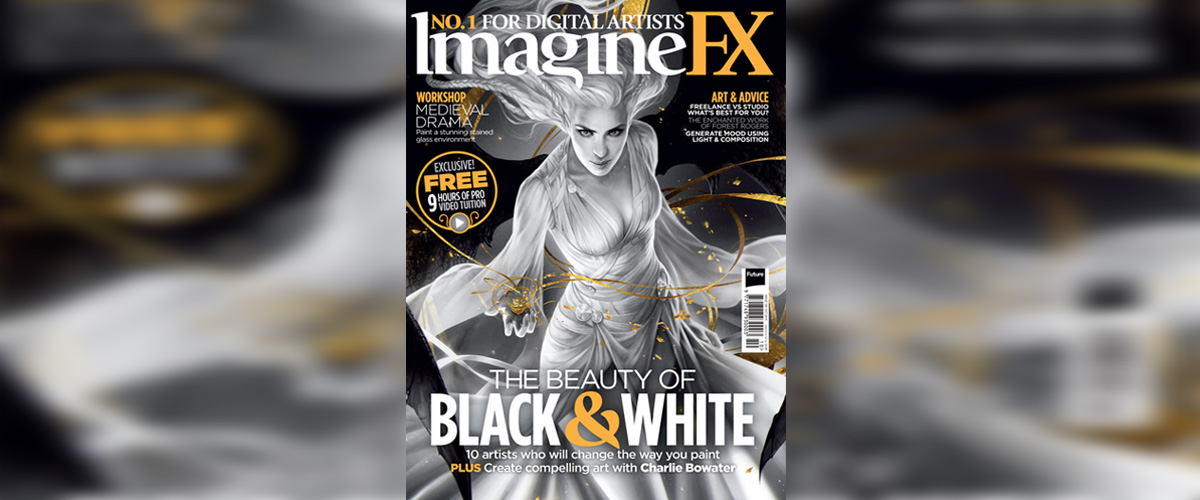
Imagine FX with its ‘The Beauty of Black & White’ issue showed us the real beauty in the classic combination. The Cellotouch lamination and CF Satin gold foil make the cover carry an authentic style and design. With sharp and clear-cut image and the right punch of colour, the design comes out impressive and different.
2. Printed Pages
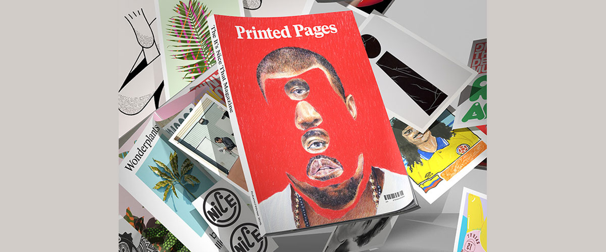
Whether you love him or hate him, you definitely cannot avoid him. And, artist Eric Yahnker decided to celebrate Kanye West with the incredibly designed magazine cover for It’s Nice That Magazine Printed Pages. The cover with the unusually dispersed feature grabs the attention of the viewer at the very first glance.
3. Cosmopolitan
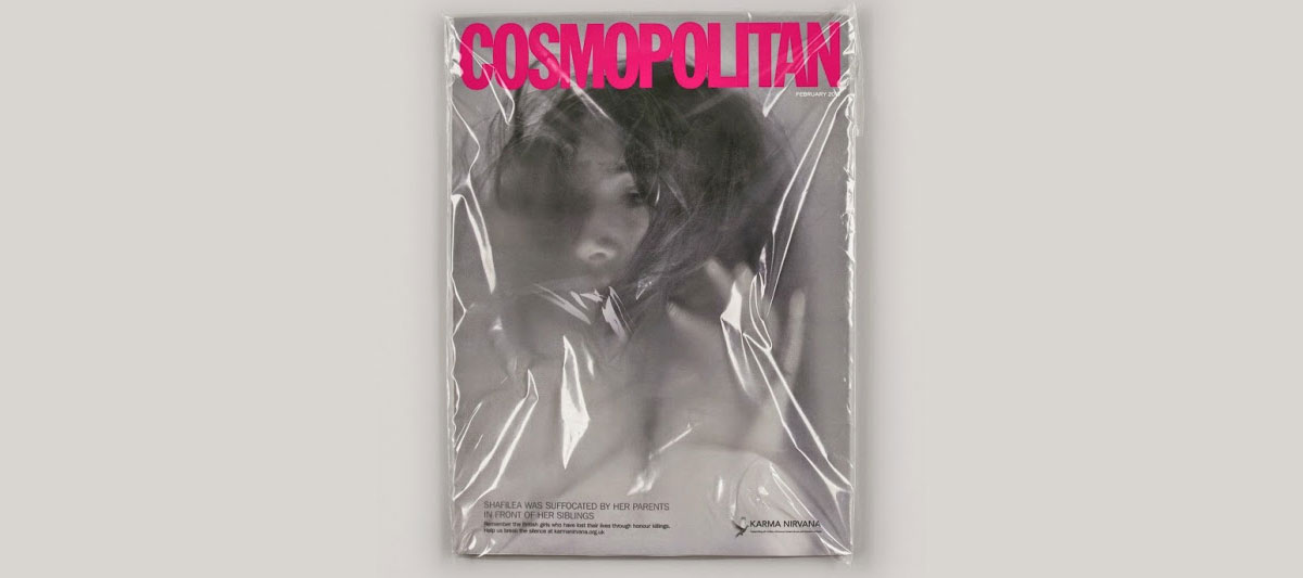
This Cosmopolitan cover was a part of a campaign for Karma Nirvana, the UK charity that helps victims of honour-based violence. The image used for the cover highlights the death of 17-year-old Shafilea Ahmed, a British-Pakistani woman who was murdered by her parents in front of her siblings when she refused an arranged marriage in 2004. The photo was taken by Erin Mulvehill.
4. New York Times Magazine
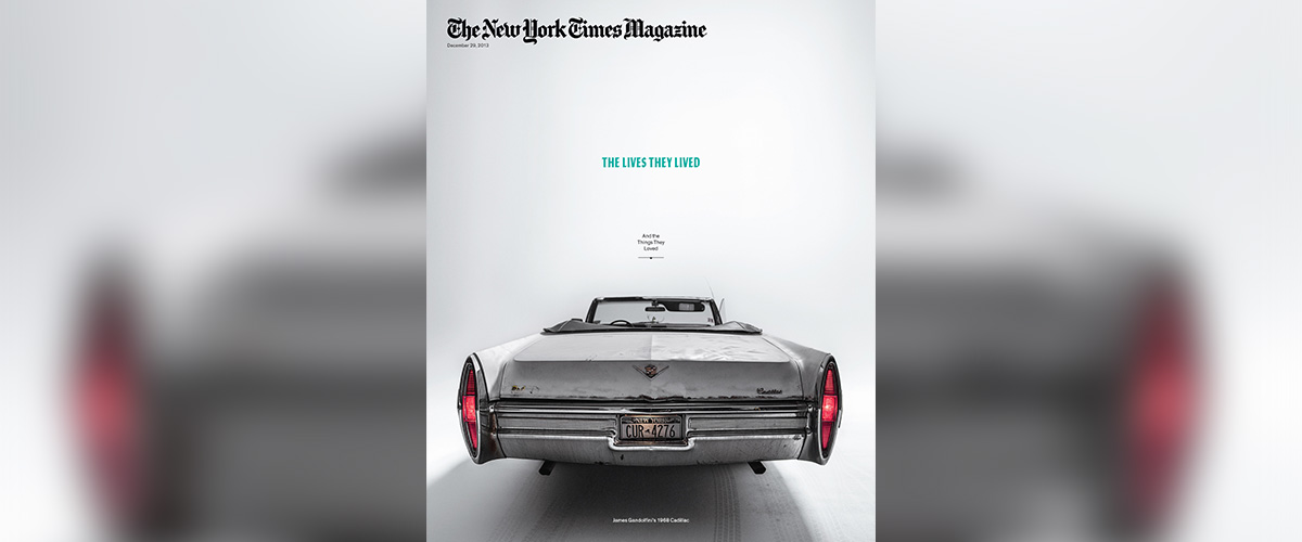
This New York Times Magazine features Gandolfini’s worn out Cadillac convertible that represents the theme ‘The Lives They Lived (And the Things They Loved)’. The placement of the car in the middle of the page makes the viewer distinctly look directly towards the car without any disturbing elements. One point perspective acts as the key feature in the magazine’s design.
5. La Luna de Metrópoli
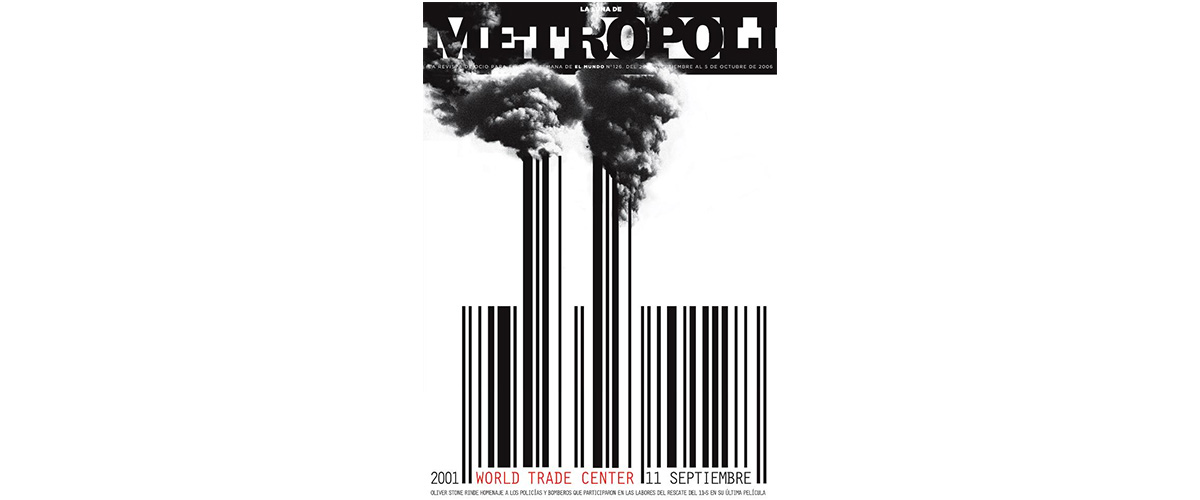
Barcode is a central element for purchasing anything from the store. But, there are few magazines who make the barcode an integral part of their design. The cover of La Luna de Metrópoli incorporated the bar code as an illustration for the September 2001 issue that shook the world with the World Trade Center attack.
6. Dwell
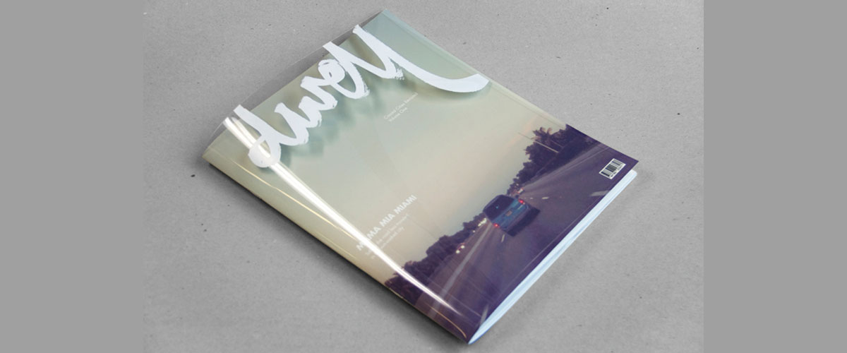
Sidney Lin took a transparent route for the cover of the Dwell magazine. The masthead carries the name of the magazine in brushstroke typography. The logo on the transparent acts as a cloud for the image printed on the page inside.
7. Blend
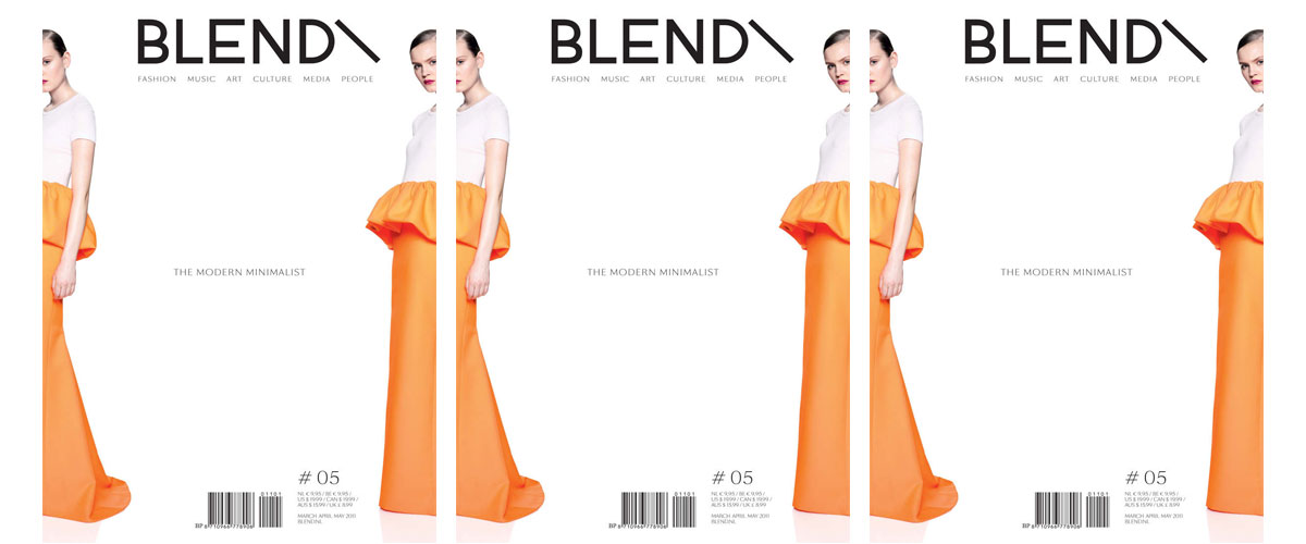
This issue of Blend magazine carries a minimal style that flips the typical layout. Focusing on the background and the title of the issue, the magazine sidelines the image creating minimal to no distraction for the viewer.
8. Observer
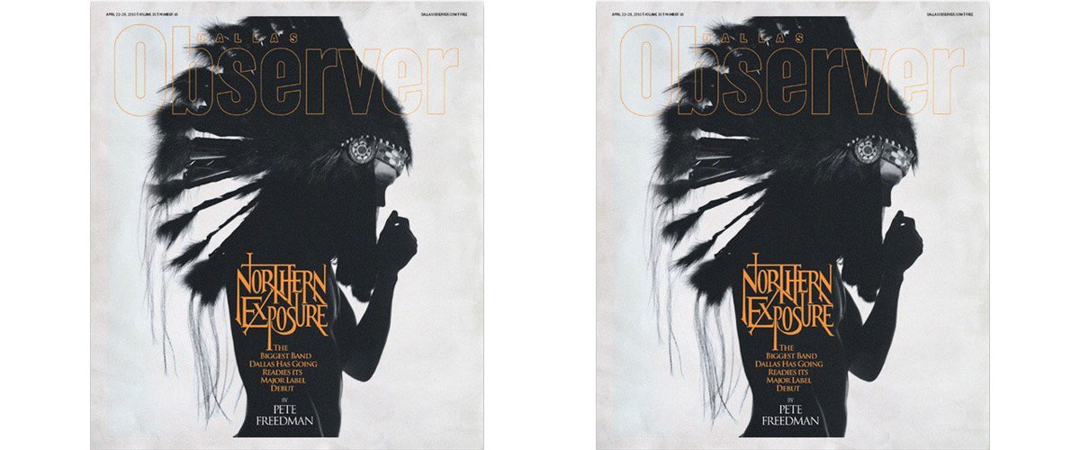
The cover of Dallas Observer carries a moody and atmospheric value with the image showing a silhouette of a man wearing Native American headdress and the shadows cast across his face.
9. BEople
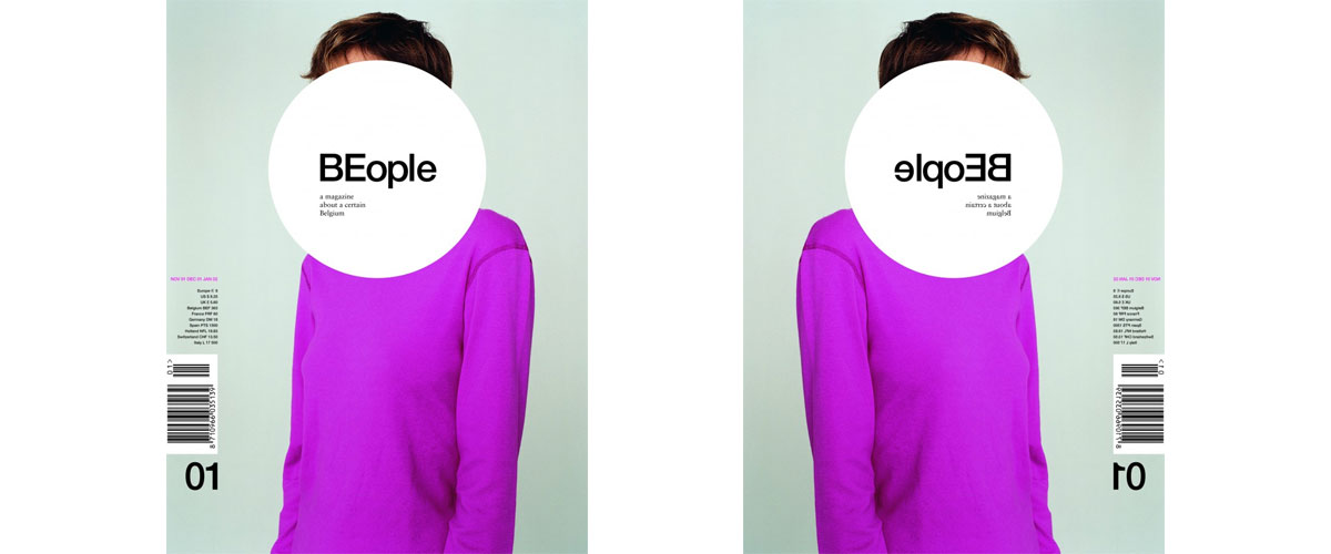
The Belgium magazine BEople uses a concrete masthead in the middle of the page. The masthead is placed just above the face of the model to break the connection between and model and the viewer and to boost the sense of anonymity.
10. Magrocardona
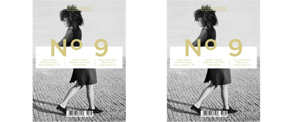
The magazine Magro Cardona uses surrealism as the base for their cover. The cover displays the body of a model split in two with her head and legs walking in the opposite direction. The cover with its unusual visual makes the viewer look twice to understand the concept.
Take inspiration from these 10 unique magazine cover designs for your next big creative project.
Related Posts
Best Health Magazines of 2016 - Premium PSD ...
21+ Vintage Party Flyers - Premium PSD, Vector ...
Dwayne Johnson is People's Sexiest Man Alive for 2016 Design ...
12+ Fashion Event Flyer Designs
24+ Booklet Mockups - PSD Download - Premium ...
20+ Advertising Designs - PSD, PNG, JPG, Vector EPS Design ...
50+ Best Sport WordPress Themes & Templates ...
90+ Grunge Textures - Free PSD, PNG, Vector EPS ...
8 Embroidery Designs - Premium PSD, Vector ...
24+ Book Cover Mockups, PSD Download ...
20+ Flower Drawings, Sketches - Premium PSD ...
40+ Drawing Designs , Sketches - Premium PSD ...
11+ Typewriter Fonts - TTF, OTF Format Download ...
44+ Ad Design Templates - Premium PSD, Vector ...
18+ Night Photography - Premium PSD, Vector ...
