Google’s Material Design boasts a set of rules and guidelines that act as an inspiration for the web and mobile design, especially the Android app designs. With the help of material design, designers are detached from the burden of data and the constraint to make the web elements look real. The sole aim of material design deals with making the user experience equal and in par irrespective of the device through which the design and data is being accessed. We have today compiled a list of 10 examples of mobile apps that make efficient use of material design.
Daily Stock Forecast is a free service useful and applicable for the day trading professionals. Created by Derek M Tishleran, the application is built with polymer and material design, making it very user-friendly to view and engage.
Matrand may be just a random number generator, but a real mathematician would begin to love and appreciate it. The app sports a great look and feel, which is smooth looking with a lot of blank space and a clean white and green color palette.
Google Calendar
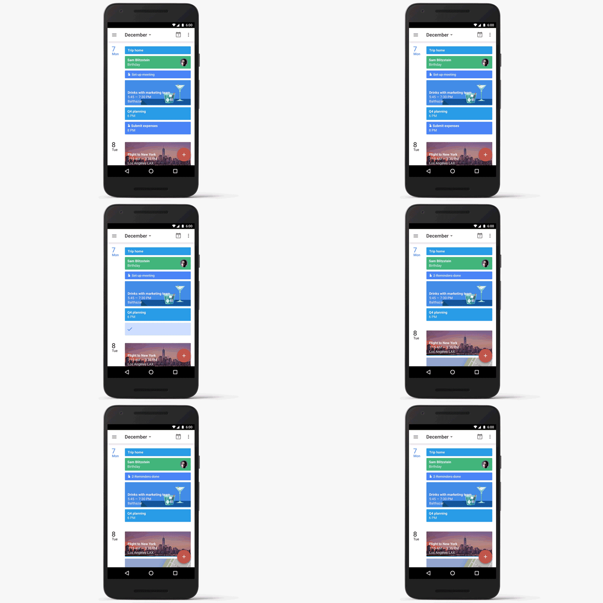
Of course, it makes sense that the best example of Google material design can be found in the very Google app. Google’s best example of material design is the Google Calendar App, which features everything we would love to view in a calendar app.
Headspace
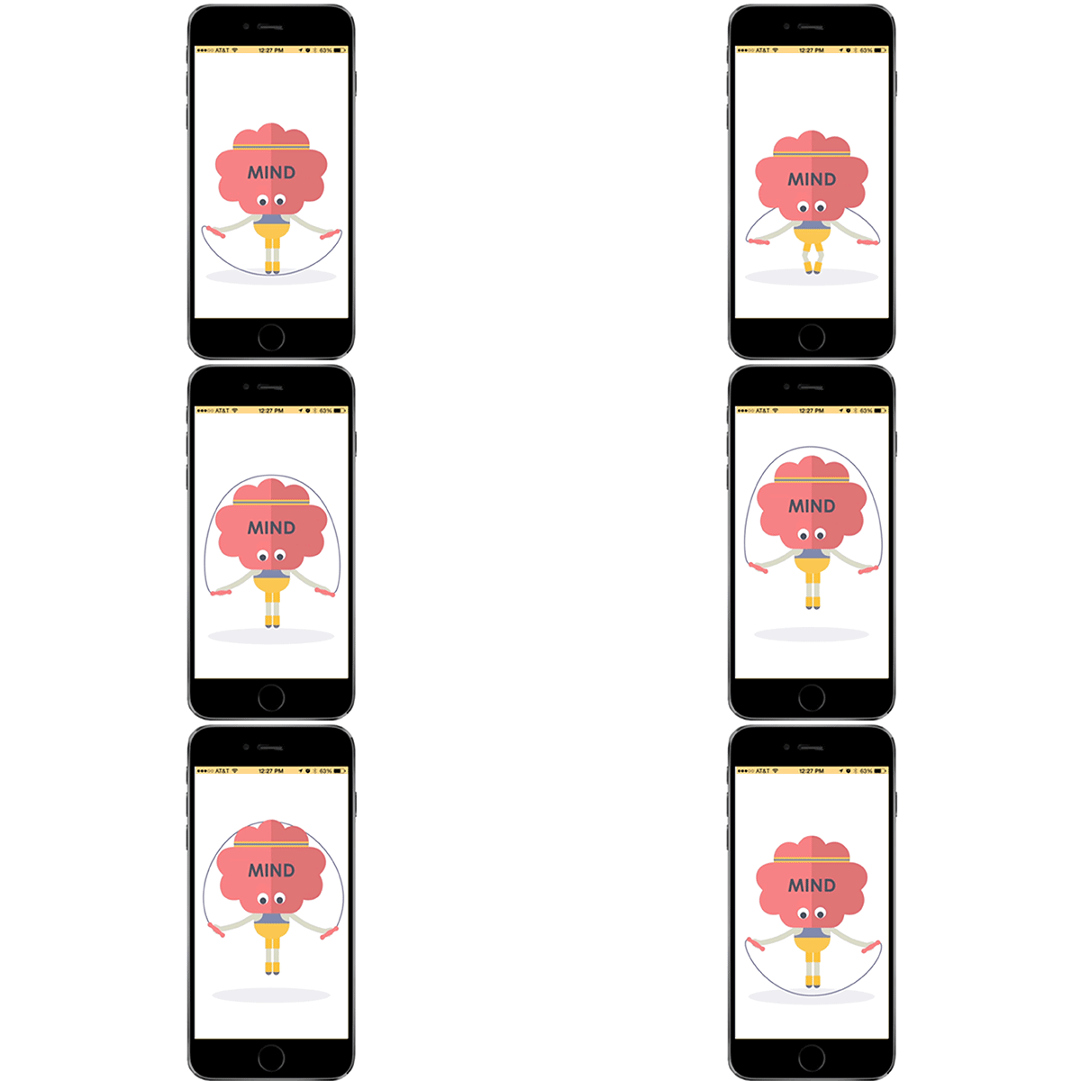
Featuring just the needed minimal design, Headspace, a meditation app sports the simplest icon for an app on the Play Store. A lone orange dot placed against a white backdrop duly justifies the nature of the app.
Evernote
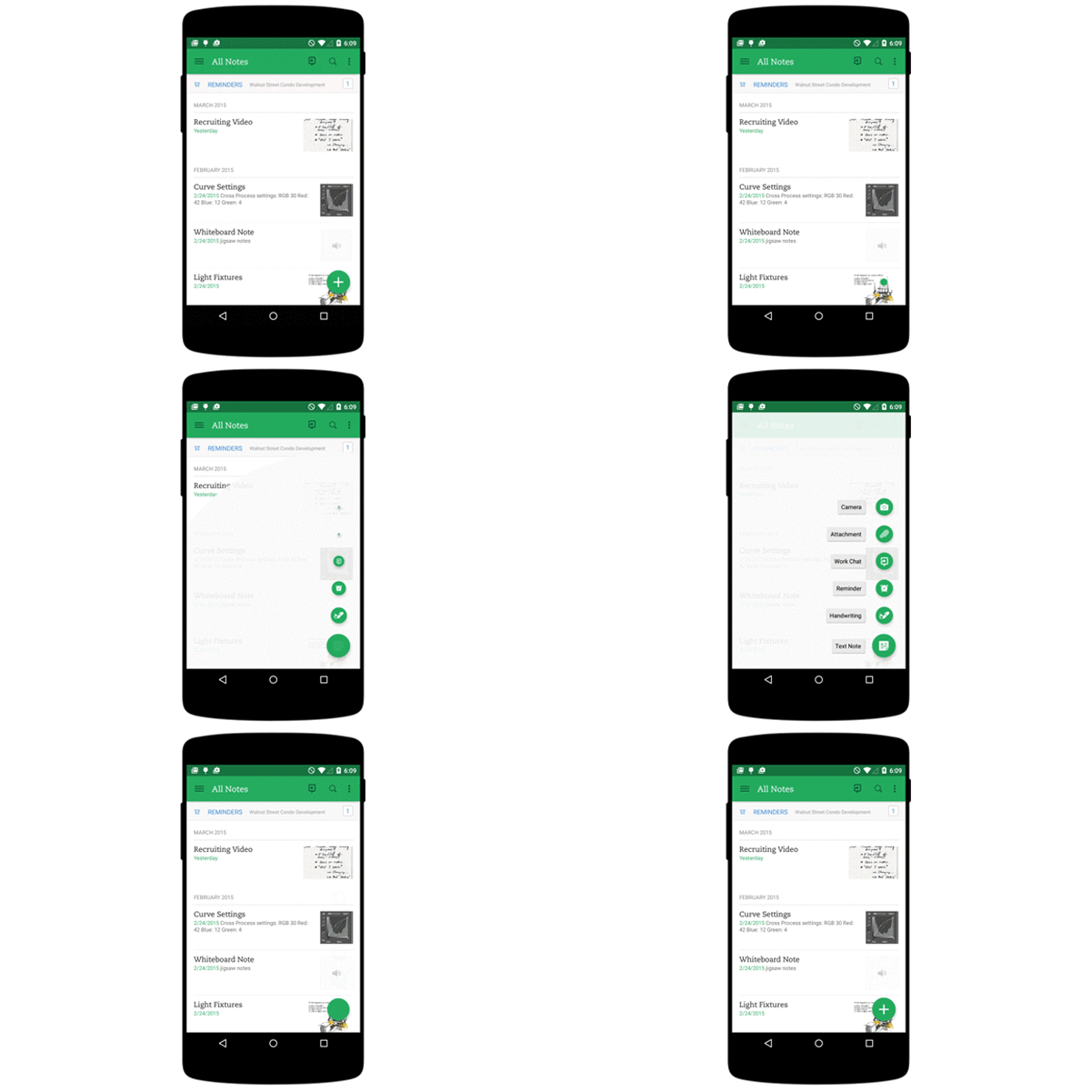
Evernote is often praised for its material design. The app carries a consistent and advanced color scheme that is well designed and functional. The icons clearly depict whether it is a text note, hand written note or a photo that you will be taking. The elephant icon is also straightforward and elegant reflecting a thoughtful design layout.
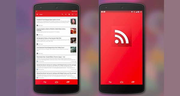
A minimal but powerful RSS reader, it shows you the latest stories from your Feedly account in a card based layout. The swipe shortcuts help you mark the stories as ‘read’ without the need of leaving the main story list.
PaperBoy
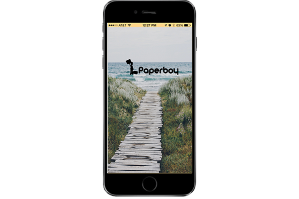
PaperBoy is a Feedly-synced app that offers a great user interface with large images and smooth animation which is surrounded by colorful material design elements. The app can also read the stories out loud if you are in a rush to personally go through the complete story.
BuzzFeed
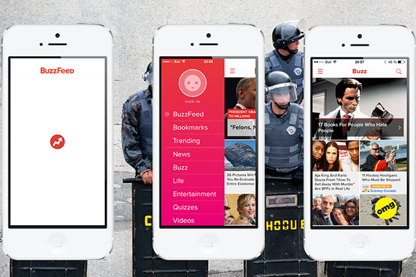
BuzzFeed is not just about LOLs and funny GIFs; the site is packed with some excellent writers who come up with interesting content about tech, lifestyle, history, health and various other topics. The app offers an attractive design that adheres to the Google’s current standard.
Messenger
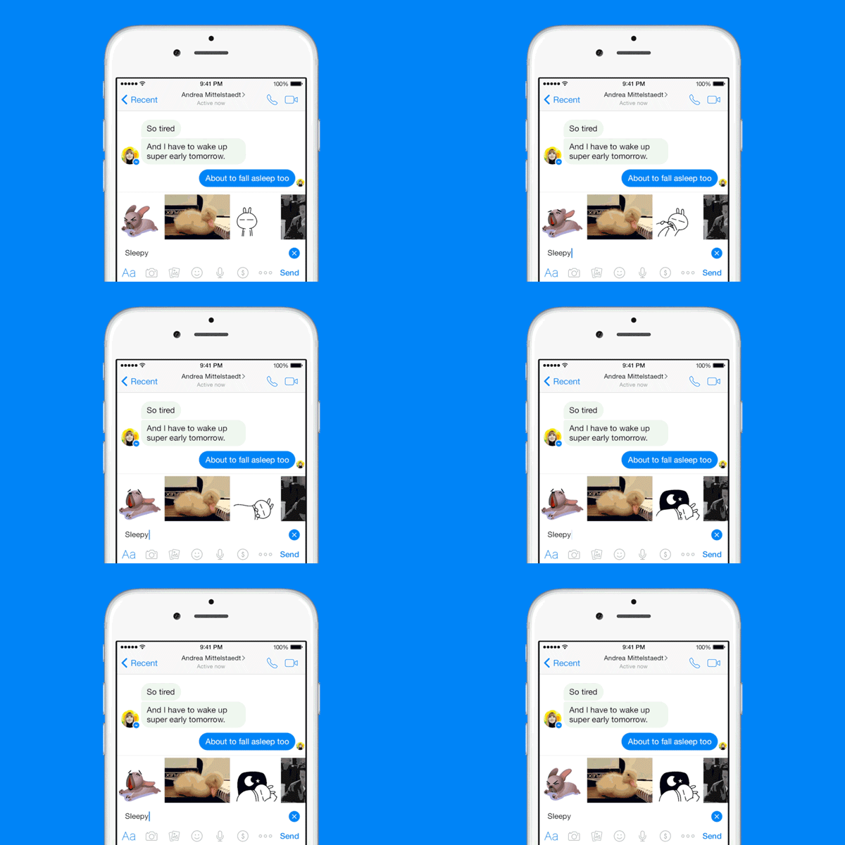
Although phones from various companies have their default messaging apps, Google’s new Messenger is tough to beat in terms of a clean and intuitive interface for traditional texting. If you don’t use hangout for all your needs, Messenger serves as an efficient alternative.
If you like to prepare lists, Wunderlist does it exceptionally well. Even though it uses material design, it manages its individual identity. The top notch tools help to make and maintain lists in a thorough and detailed manner.
Download the one that best supports your need, and be prepared to see your phone go visually light and extra organized.
Related Posts
Top 11 Email Marketing Trends for 2023
The Best New Portfolio sites, March 2023
Best Poster Designs 2023: Ideas and Tips
Hit and Miss of Olympic Logo Designs from 1924 till 2023
10 Iconic Moments Photographed in 2023 Rio Olympics
Top 5 Logo Design Trends of 2023
2023 Packaging Design Pentaward Winners
Digital Design Trends for 2023
Best Travel Apps for 2023
9 Script Fonts for 2023
10 Best Free Fonts for 2023
10 Best Mobile Games of 2023
Logo Design Strategies for 2023
Top 9 Web Design Trends for 2023
10 Most Popular Graphic Design Trends of 2023
