Last year, Google introduced the Material Design Awards to honor apps that have gone an extra mile in applying Android’s design principles and employing material design. Material Design is a visual language that is created for the users that synthesis the classic principles of good design with the innovation and possibility of technology and science. Continuing with the annual Material Design Award, Google has made the winner announcements for various categories for the year 2016.
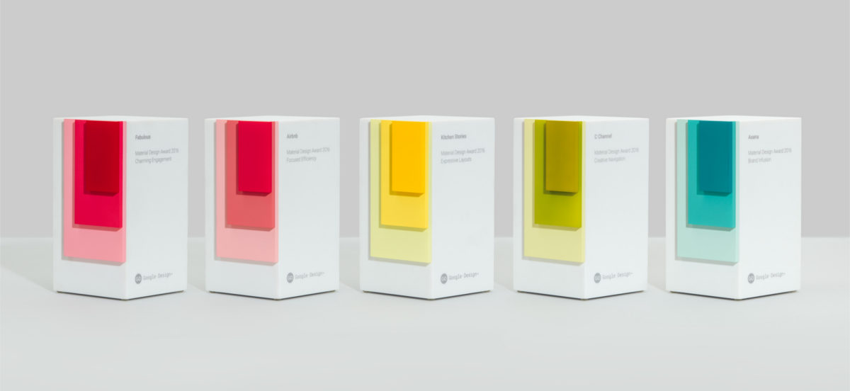
There are 5 categories in which the awards have been distributed. These categories highlights how some apps have greatly adapted the app design guidelines provided by Google to express their brand. These apps are also extremely user friendly. These apps have taken the level of design and style to an edge and therefore have been honored for their efforts. The categories have been divided as per the specific aspect of material design used in creating an app to satisfy the users.
Brand Infusion: Asana
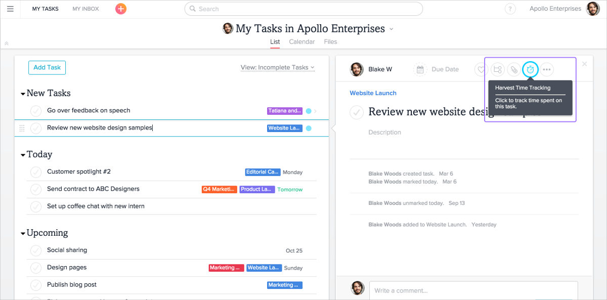
Asana: Team Tasks and Projects that aims at helping users and organizations to achieve focused teamwork in order to generate productive output. The app provides an interactive platform to achieve efficiency. The best part of the design is the way the content has been organized. Since the app is about being focused and efficient, the content is organized intelligently to achieve the objectives. Visually, the app is subtle in appearance yet solid in impression. The design team has done a good job.
Charming Engagement: Fabulous-Motivate Me!
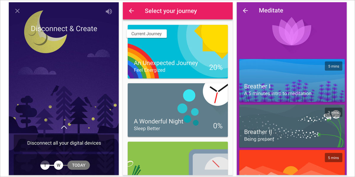
The app describes itself as a “happiness trainer”. The app aims at using positive reinforcement to help users adopt to new routines and achieve their targets and goals. The app design is completely in sync with the concept and visually, you can sense the positivity that the app aims at restoring. It has charming illustrations, cute animation and, it is functional and personal. In short, it has everything to keep the users hooked and engaged.
Creative Navigation: C Channel
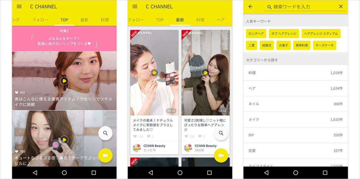
The app contains content covering mostly fashion and food. The content is generally in the form of videos that are created in studios and some others which are submitted by users. Since the app is heavy on content, generally it becomes a problem for users to navigate through such apps. But, this app has been awarded for its creative navigation design. The content has been organized into series of tabs that makes navigating through the content easy with a simple swipe. Users can look through the products even when a video is playing which makes the functionality of the app seamless.
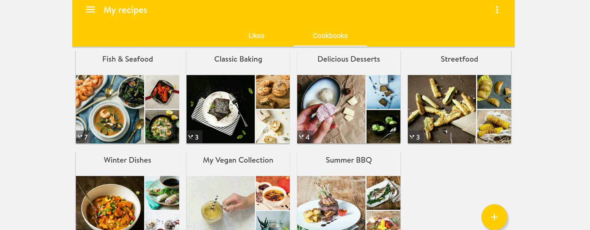
Expressive Layout- Kitchen Stories
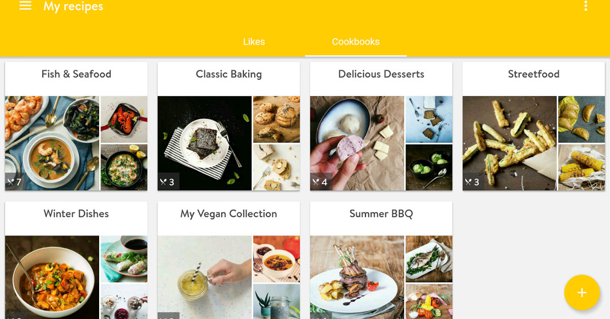
The major task while designing a layout is to make sure that it appear harmonious and not chaotic. Only when it is harmonious will the users be able to remain loyal to the app. Kitchen stories provide its user a variety of recipes arranged in an effective layout. Users can easily go through the recipes while working in the kitchen as the layouts have been arranged very intelligently.
Focused Efficiency- Airbnb
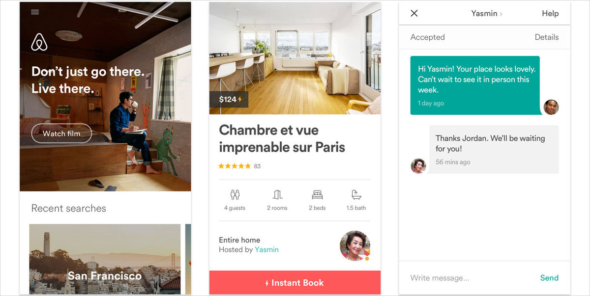
Even with the advancement of technology, traveling and making a reservation can be a difficult task for the users, considering all the complex procedure one has to go through. That is where Airbnb comes or the rescue. It aims at saving user’s time through its efficient design and interface. The efficiency helps the users in easy sign-in, browsing and booking. The app is equally enchanting when it comes to visual appeal.
The apps will be honored at the SPAN 2016 conference in Los Angeles on October 27.
Related Posts
Top 11 Email Marketing Trends for 2023
The Best New Portfolio sites, March 2023
Best Poster Designs 2023: Ideas and Tips
Hit and Miss of Olympic Logo Designs from 1924 till 2023
10 Iconic Moments Photographed in 2023 Rio Olympics
Top 5 Logo Design Trends of 2023
2023 Packaging Design Pentaward Winners
Digital Design Trends for 2023
Best Travel Apps for 2023
9 Script Fonts for 2023
10 Best Free Fonts for 2023
10 Best Mobile Games of 2023
Logo Design Strategies for 2023
Top 9 Web Design Trends for 2023
10 Most Popular Graphic Design Trends of 2023
