As most of the viewers across the globe have become accustomed to complex and sophisticated textual and visual design, both in the virtual and physical realm, it has become all the more important to not just disseminate information but to actually create an experience. Good photography acts as one of the primal and essential elements in making the website look professional as well as appealing. We have today compiled a list of 10 tips for successfully using photography in web design.
1. Quality

A good photography can help to turn a great design into amazing and captivating. Try and invest a quality amount of time to click and select the photos for your website. Even though the photos available on the internet might seem like a time saving and money saving solution but try and go for professional photographers as they will help you procure high-quality photos with the needed intent and idea.
2. Relevance
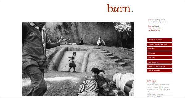
Make the photographs used in the website form an emotional connect with the viewer. This will not just help to boost the growth of your business but also reflect a story that will stick in the mind of the viewers, leading to better impact and better results.
3. Size


It is a known fact that bigger images develop a high-interest rate. Take this into consideration while deciding on the photographs for the website. Also, make sure to balance the content on the website with the relevant images.
4. Stock Photos
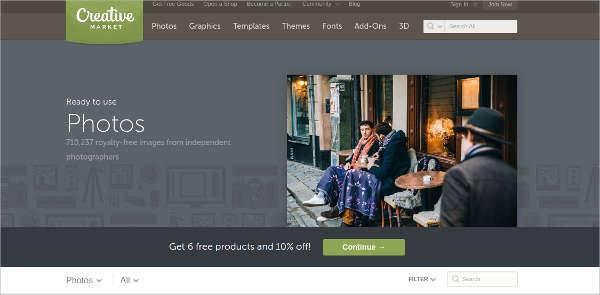
Although we would advise you to use a professional photographer, but if there is a strict budget to follow there are many stock photo sites around the net which offer great quality images for a reasonable amount of money. Although these shots are generic, but they might help you get started and put you in a rhythm.
5. Real People

Make the subjects or the people in the photograph look as real as possible. The photos should not just express plain models posing as some client or other relevant characters. Try portrait, the more real the people the more authentic the experience.
6. Be Clever With The Subjects
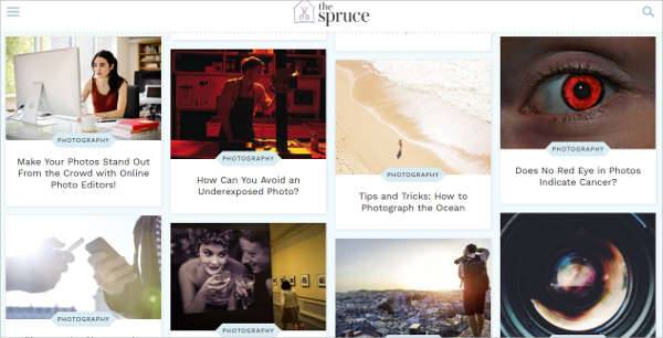
Beware of the subjects smiling in the camera. It takes away a natural value and makes the photograph look fake and put on. Try and set the scene and the people present in the photograph in the required tone.
7. Lighting
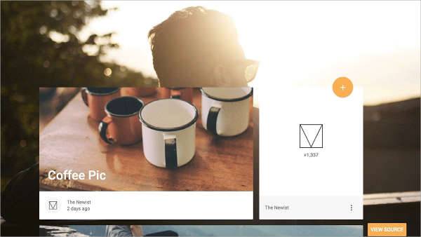
Make sure the lighting in your photograph is bright and clear. Keep a check that the sole focus lies on the subject and all the other elements support the subject in the frame and not deviate the attention of the viewer. We have a short section on macro photography here.
8. Crop Images
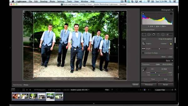
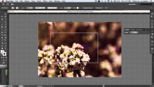
As a graphic or web designer, you can always crop the photo or image to draw the attention of the viewer directly to the central idea and subject. Trimming the edges allows you to focus on the part of the photo that is most relevant. Check out for more on photography ideas here.
9. Try Different Shapes

Instead of going for the balanced rectangle shape, try cropping the photographs into something unique and different. This will help to bring a unique feature and also give the photographs in the website an appealing twist.
10. Do Basic Photo Editing
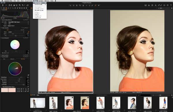
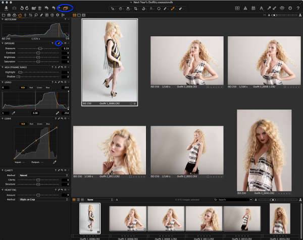
Do the basic editing where necessary and fix the minor errors which lessen the presence of the website.
Ensuring good photography will help to elevate the website design and also make it convenient for the readers and viewers.
Related Posts
Top 11 Email Marketing Trends for 2023
The Best New Portfolio sites, March 2023
Best Poster Designs 2023: Ideas and Tips
Hit and Miss of Olympic Logo Designs from 1924 till 2023
10 Iconic Moments Photographed in 2023 Rio Olympics
Top 5 Logo Design Trends of 2023
2023 Packaging Design Pentaward Winners
Digital Design Trends for 2023
Best Travel Apps for 2023
9 Script Fonts for 2023
10 Best Free Fonts for 2023
10 Best Mobile Games of 2023
Logo Design Strategies for 2023
Top 9 Web Design Trends for 2023
10 Most Popular Graphic Design Trends of 2023
