Businesses, organizations, and groups often come together to discuss matters either with themselves or with a third-party audience. These events or gatherings come in the form of meetings, symposiums, seminars, or conferences. But what are the differences between these?
A meeting is a business gather that is called at any time, and is held in any venue. Meetings are usually informal and are meant to discuss a common subject matter. A symposium is a formal gathering that is held in an academic setting wherein the participants have specializations in their respective fields. In symposiums, only a single subject matter will be taken up, but each speaker will give their own discussions from their own perspectives. A seminar is a form of teaching, and is commonly held in schools or academic centers, and aims to gather people to discuss a specific subject. Seminars are commonly interactive—encouraging people to actively participate—and will usually involve take-home materials for the attendees. Lastly, a conference is the formal counterpart of a meeting wherein the attendees participate in exchanging their views and opinions regarding various subject matters. A conference may cover topics from different fields and may not be academic in nature at all times.
Now that we have made that clear, let’s move on. If you are planning on organizing a conference—whether it is related to business, church, or any other field—then you are definitely in the right place. Below are some of the most visually attractive and creative poster designs ever found on the Internet, and we are offering them to you so you can use them to make your own conference posters.
Intercessors Prayer Conference Poster Design
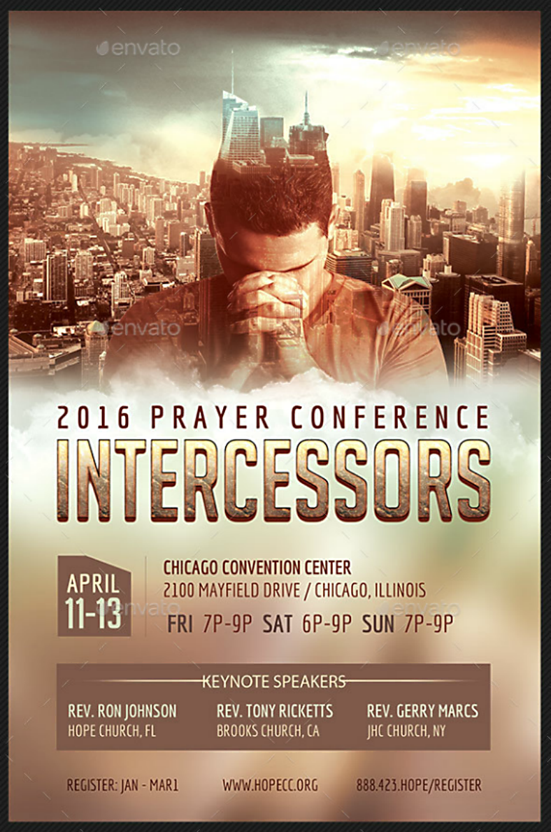
Let’s get right into the main topic of this article, which is the collection of poster designs for conference events and gatherings. Let’s start with this first conference poster design, which is intended to promote or advertise a prayer conference. Religious conferences and gatherings are usually initiated by church organizations, and it can be attended by the people under that particular congregation, or it can also be attended by multiple church groups. When it comes to the latter, it is usually for the purpose of having a common objective, which is to unite and pray regardless of the belief.
The Lost Believers Conference Poster Design
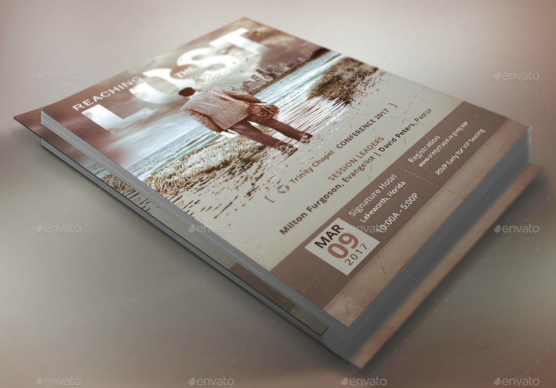
Here is another conference poster design intended for religious activities, events, or gatherings, and this one is created specifically to invite those believers who have become lapsed or “lost,” according to the message written on the poster. To describe this poster design, it shows the back of a person who seems to be lost and is looking out to the sea. Obviously, this person appears to have no direction in life and is searching for answers, and this is exactly the purpose of the event being advertised on this vintage poster design—to reach out to the lost and give them the answers that they are searching for.
Enlightenment Religious Conference Poster Design
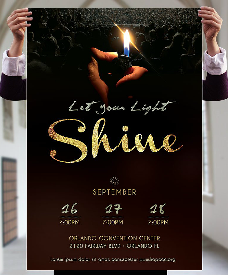
And here is yet another conference poster design for events and gatherings that are connected with the church. To describe this poster design and its two distinct halves, the upper half of this poster design shows a crowd of people with all their attentions focused on one thing in common and an image of a person’s hand with a lit lighter in hand. The lower half of the design bears a simple color gradient as the background, and it is here that the text indicating some details of the event are being written. Once again, the message being implied on this poster design tells people that only God can provide us the light that will lead us to salvation, thus the organizers of this event are inviting people to come to be able to have their faiths strengthened or restored.
Annual Business Corporation Conference Poster Design
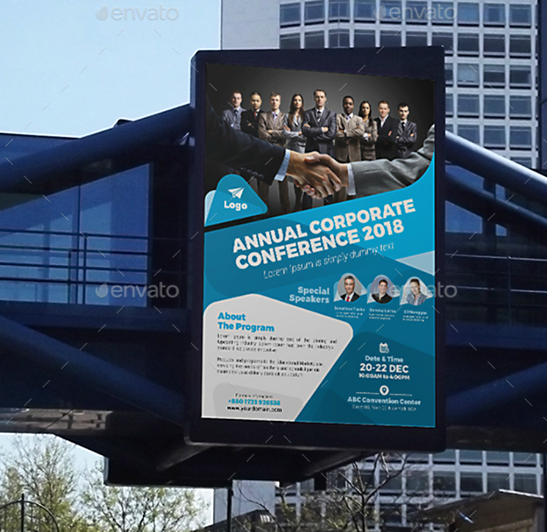
Now for a different kind of conference poster design, and the most common conferences are related to businesses and corporations, which is the case for the poster mock-up shown above. This visually stunning conference poster design bears a space on the upper portion that can be used for adding photos or images relating to the business, and in this case, a row of people that may be the people managing the corporation. In front of them, which is slightly just off the center of the poster, you can see the arms of two people giving each other a handshake, which is the gesture of agreement, acknowledgment, and respect when it comes to businesses. On the remaining bottom portion of this poster design are the details regarding the conference, and it even includes a brief description on what the program is about or aiming to achieve.
Global Economic Business Conference Poster Design
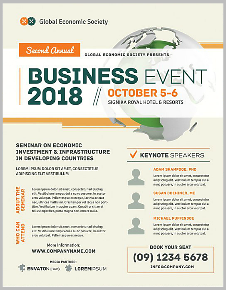
If you are planning on providing the public with a lot more information than usual in your conference poster, then this design may provide you with that opportunity. For this conference poster design, it minimizes its use of graphics and illustrations and throws in a lot of blank spaces for the text and descriptions of the event. As you can see from the sample provided above, the design leans heavily toward providing its audience with the necessary information that they need to know regarding the conference. This includes a short description of the seminar, the target audience who are being invited to attend, and a list of the people who will initiate the discussions along with their respective credentials. The graphic illustrations seen on this design only work to support the entire appearance of the poster in order to prevent it from looking uninteresting.
Annual Women’s Conference Vintage Poster Design
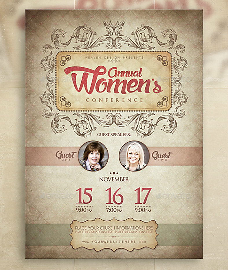
Sometimes, there are seminars and conferences initiated by women that are meant to be attended by women. These conferences could talk about anything from women equality or women’s rights to less serious topics such as those pertaining to arts and crafts. Even though our generation today has since been promoting gender equality, there are still aspects in life that can only be done—or at least “best done”—by a specific gender group. And this is where this vintage poster design comes in, it is primarily used to advertise events that are exclusively for women.
Minimalist Typographic Conference Poster Design
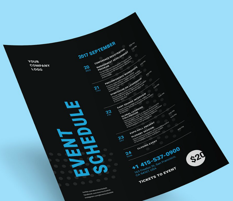
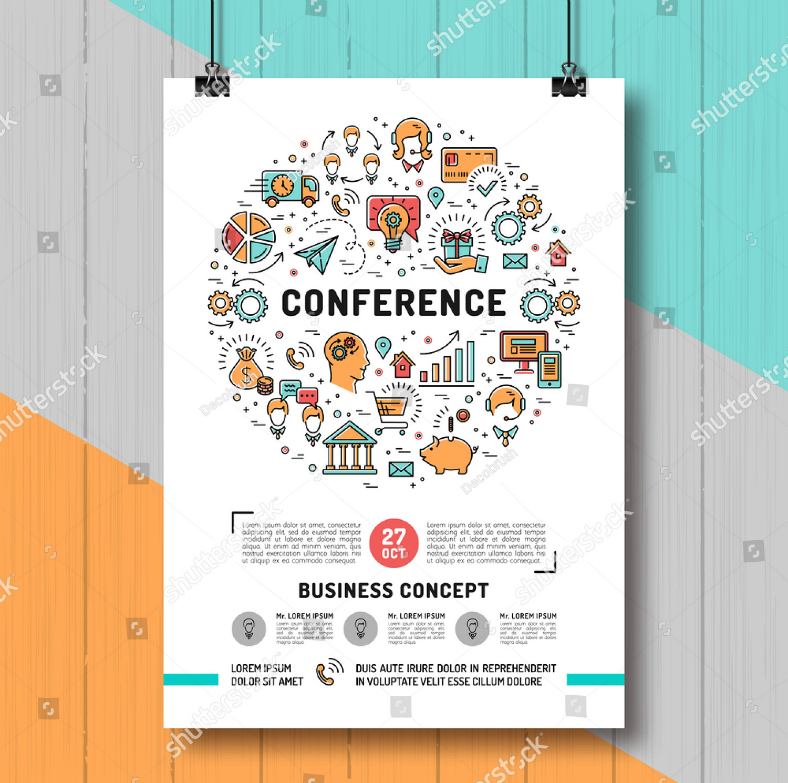
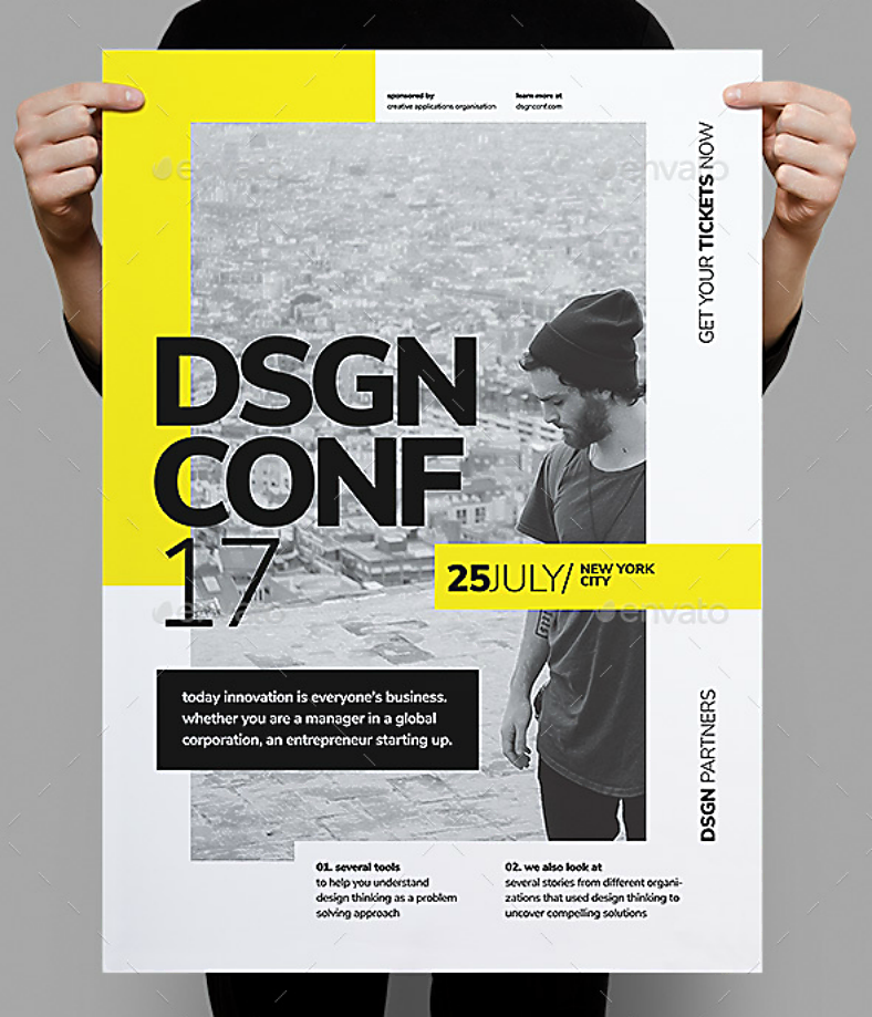
Once again, to those looking for a minimalist look for their conference posters, the design shown above may be the right one for you. This typographic poster design means to make it easier for its readers to read the contents but organizing them very well. The color scheme used for this poster design effectively contrasts the background and the text, which helps in making this much more easier to read. And, in addition to those features that have just been mentioned, the colors on this poster design are also very easy on the eyes.
Church Worship Conference Poster Design
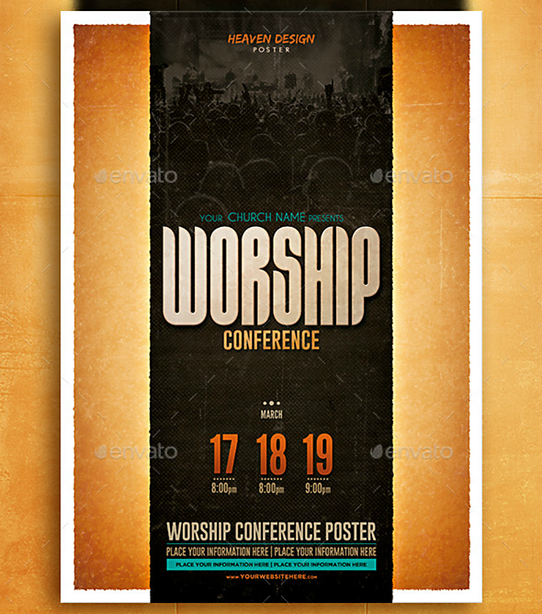
Once again, we have here a poster design for a religious kind of conference—a worship conference, to be specific. The background of this vintage poster design shows a dark and faded image of a crowd attending an event—which could be a worship conference—and the foreground is where the most relevant features on the design are found. The features that we are referring to are actually the text that provides audience with the necessary information about the worship conference, and this includes the dates and their respective times, the venue of the conference, and other details that you can add.
Business Conference Poster Design
Data Summit Conference Poster Design
Water Conservation Conference Poster Design
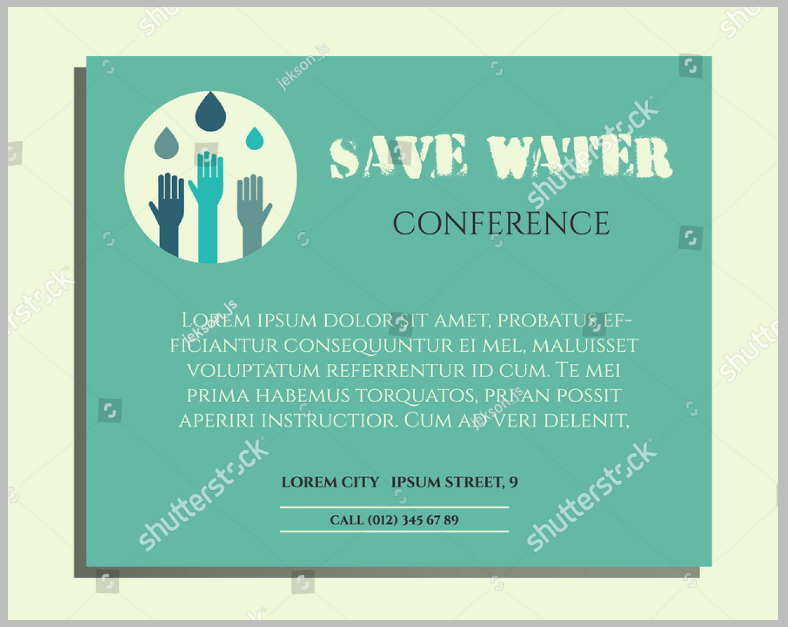
Water—the natural resource that consists of two hydrogen ions and one oxygen ion—is one of the most important, if not, THE most important natural resource for human population, and it already makes perfect sense when we say that we should always conserve its use. Our entire planet is made up of about 71 percent water, and 96.5 percent of that is found in the Earth’s ocean. On the other hand, the adult human body consists of around 50 to 60 percent water, and we commonly get thirsty when that water level in our body falls below the normal range. Almost everything that we do in our day-to-day lives involve water, which includes cooking, bathing, cleaning, and watering plants. People can last up to over a month without food but can hardly survive a few days without water. With regards to the conference poster design above, it is intended for those seminars that discuss about the importance of water and to teach people ways on how to conserve water. Indeed, water is very important and we will never realize that unless we run out of this natural resource, thus the saying, “You won’t miss the water ’til the well runs dry.”
Men’s Courage Conference Poster Design
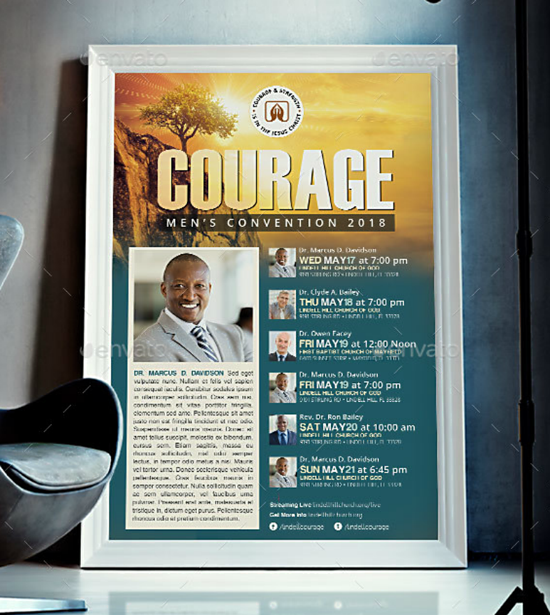
Previously, we have shown you a conference poster design for those events that are specifically addressed for women, here now is the gentlemen’s counterpart of that poster design. Like we said, there are still certain aspects in life that cannot be performed or practiced by both men and women, and this includes those that jobs and practices that require a lot of physical strength and endurance. Also, when it comes to men’s health, there are also areas that are only compatible with people with the hormone testosterone. For conferences and seminars that are meant to be exclusively attended by men, here is the appropriate poster design for those events.
Infographic Illustration Conference Poster Design
Simple Innovative Conference Poster Design
Here is yet another simplistic yet awesome poster design that simply implies that posters don’t need to contain a lot of elements to be able to convey a message. The main purpose of posters is to promote and advertise something and to provide the general public with the much-needed information about what is being advertised. And while graphical elements are also somewhat necessary on poster designs, those are simply for beautifying the look of the poster and prevent it from looking dull. If you can achieve a balance between the design’s simplicity and fanciness, while keeping the content as informative as possible, then you will have an effective and highly presentable conference poster.
Simple Business Conference Event Poster Design
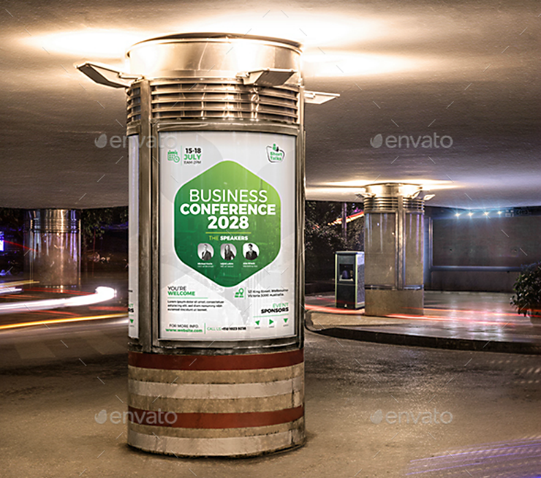
Lastly, a minimalist business-related conference poster design that makes use of a lot of white space. In the world of graphic designs, you can never have too much white space. In fact, a lot of white space may only make a design cleaner and more presentable to its audiences, and in this case, the poster design should always be presentable and formal since this is, in fact, to promote a business conference. This conference poster design contains a hexagon-shaped element where all the highlighted content are being placed, and those surrounding text written on the white space simply help in supporting those highlights.
Did you enjoy looking at our conference poster designs? Were you able to find a design that works for your cause? These poster designs were actually gathered from among hundreds of the best ones on the Internet, and we made sure to only pick those that we think are worth your every penny. As to who designed these conference posters, these were actually done by professional graphic artists from all over the world, some of the best, in fact. So rest assured that what you have just seen have been professionally-made for you.
When it comes to editability, these conference poster designs can be easily edited just as long as you have the appropriate editing software for them—Illustrator for vectors, Photoshop for PSD. Some designs may have limited editability features, but you can be certain that the most important aspects of the designs are those that you can freely edit. And when it comes to the cost, we guarantee that not only will you be getting your money’s worth, but you are going to be getting far more than what you are paying with our designs. These event poster designs can be downloaded for such a reasonable price, you’ll never want to miss this amazing opportunity. So what are you waiting for? Start downloading a poster design now.
Related Posts
22+ Quote Poster Designs
16 Vacation Poster Designs
14 St. Patrick’s Day Poster Designs
8+ Sumptuous Food Poster Designs
49+ Printable Christmas Template Designs – PSD, AI, Word
15+ Christmas Party Invitations
Key Elements of Brand Identity Design
Top Trending Designs for Typography in 2023
7 Blog Design Trends Dominating 2023
How to Create Appealing Instagram Stories that Grab Attention
Advertisement Design Trends 2023
Best Designs for Album Covers 2023
12+ Best Web Designs for 2023 – Word, PSD, AI, EPS Vector
Top Best Font Style that Can Be Used in 2023
Best Digital Design Trends of 2023
