Nowadays, promoting or advertising something can be done through more modern methods such as television commercials, or Internet banners and ads, but these methods will surely ask a lot from your business in terms of financial matters, which may not be a problem for those that have already established themselves and are already stable. But what if a business has just started or has not yet fully established themselves? Businesses like these are still tight on their budget and may need alternatives to be able to reach out to the general public. You may also see Christmas Poster Designs
Thankfully, there is also the existence of traditional marketing strategies, such as the use of flyers, brochures, banners, and posters. Below are some of the best restaurant poster designs that you can find on the Internet, and they can be used for both stable businesses and those that have just started operating. The designs below are intended for different types of dishes and delicacies, which is why it is safe for us to say that we guarantee you will able to find at least one design here that is perfectly meant for your business. If you want to see these poster designs yourself, go ahead and scroll down. You may also see Event Poster Design.
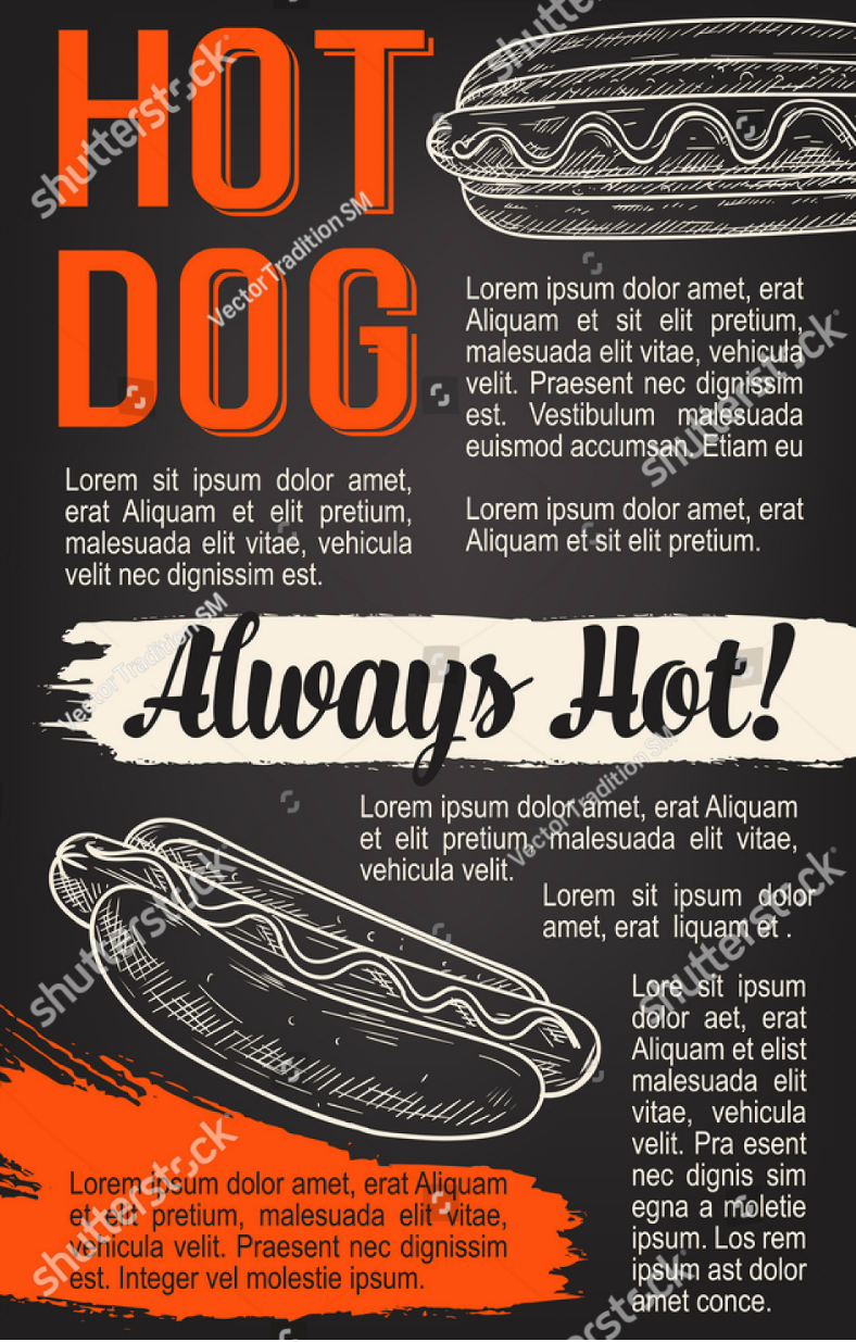
Hot Dog Sketched Restaurant Poster Design
Before we proceed talking about this poster design, it’s probably safe to say that majority of the world’s population love to eat hot dogs, I mean, who in the world doesn’t like hot dog? Calling it unhealthy is definitely not a reason for people to hate this food since there are already hot dogs nowadays that were produced for various types of diet. There are even vegetarian hot dogs nowadays, which are made of tofu instead of meat. The chalkboard poster design above is intended to be used for restaurants that serve hot dogs, and the illustrations included only make them appropriate for its purpose. You may also see Sumptuous Food Poster Designs.
Photorealistic Food Restaurant Poster Design
Not only is this poster design one of the best ones available on the Internet, but the food contained on it are also the best ones that you can feast on. The upper and lower edges of this design contain a green gradient background, and this is where the texts are written. On the other hand, the middle portion of this design, which is also its horizontal focal point, is where the images of the dishes can be found. So whatever type of restaurant you have or whatever delicacies you are offering to your customers, we assure you that this poster design is versatile enough to adapt to any of them. You may also see Vintage Poster Design.
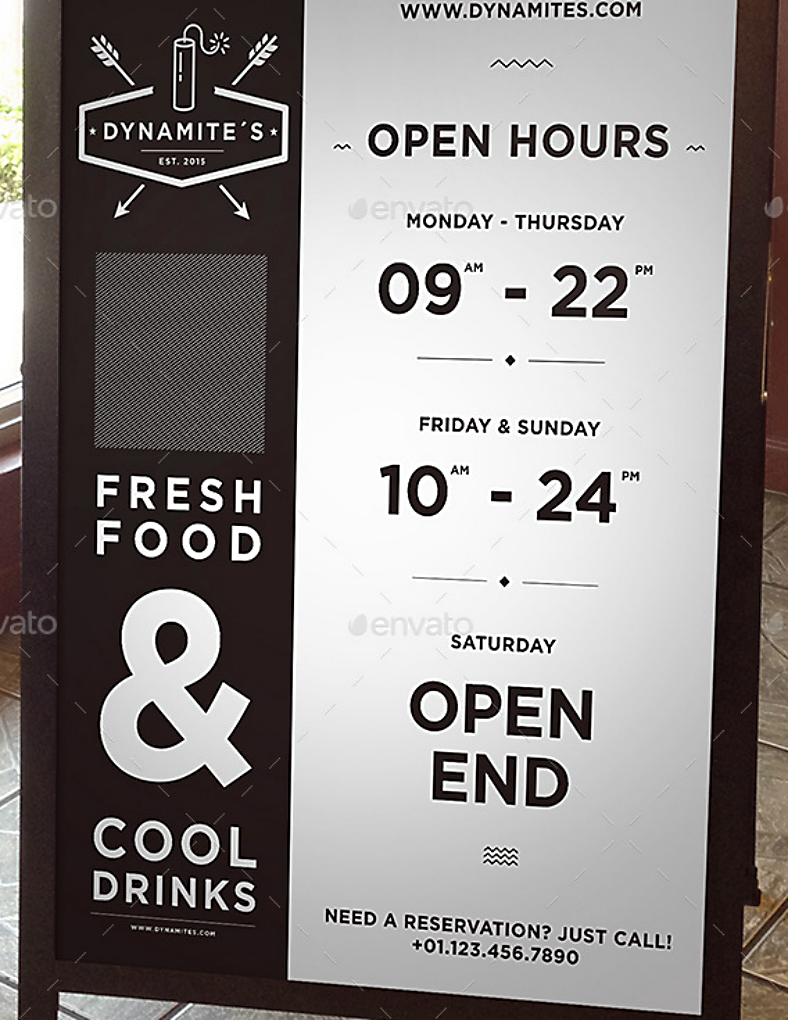
Minimalist Restaurant Poster Design
Here is a good example of a restaurant poster design that can be used a bit differently after being printed. While most posters are being attached on walls or other surfaces, this one is placed on a wooden frame and left outside an establishment. The advantage of using your poster like this is it gives you the opportunity to move your poster around if you decide on transferring it to another position. You will no longer need to attach multiple copies of the poster or remove and reattach your posters to be able to reach a larger number of people.
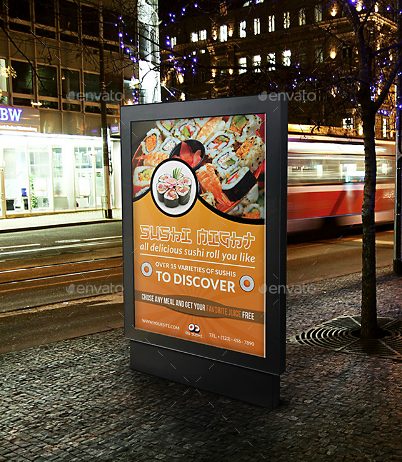
Roll Night Japanese Restaurant Poster Design
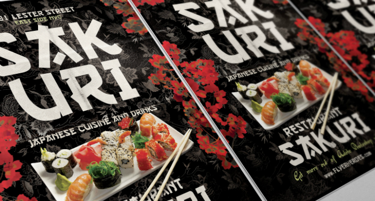
If you haven’t had enough of Japanese foods that you are still looking for another poster design that you may be able to use for your Japanese-themed restaurant, the mock-up design shown above may be perfect for you. Unlike the previous design that simply showed the dishes in the middle portion of the design, this one divides the entire design into two parts, with the upper half intended for you to add pictures of your dishes. On the other hand, the lower half of the design is intended for the text, which will help in promoting your restaurant even further. You may also like Wanted Poster Design.
Pasta Stock Restaurant Poster Design
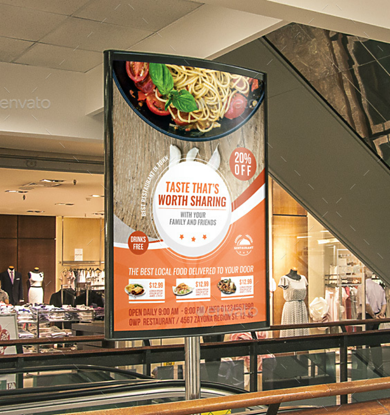
When we think of pasta—not ramen, but pasta—we usually associate it with Italy, the same country that we associate with pizza. But the popularity of pasta has reached all parts of the world that different countries have added their own twist to this dish. But regardless of which country you’re living in, people love pasta, whether they are in the form of spaghetti, lasagna, or macaroni. If you think that your restaurant can offer pasta dishes that can satisfy not only the locals in your country but also the ones from where the dish originated, then don’t hesitate to use the visually appealing poster design above.
Gangnam Bibimbap Korean Restaurant Poster Design
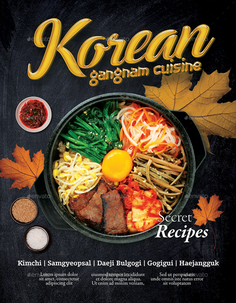
Korean food is also a must-try for people who have not gotten the chance to sink their teeth into one, and trust us, you will be asking for more afterward. From dishes ranging from samgyeoupsal (also spelled samgyupsal), or Korean barbecue as others would call it, to bulgogi, or even bibimbap, there are actually a lot of Korean dishes to choose from depending on the preferences of your taste buds. For the poster design shown above, it shows an entire bowl of bibimbap, which actually translates to “mixed rice” since the contents include white rice topped with vegetables, chili paste, soybean paste, soy sauce, meat, and a fried egg. For those who haven’t tried this dish, it’s time for you to try it now. And for those looking for a mouthwatering Korean restaurant poster that they can download and edit, it is best to give the design above a shot.
Happy Child Fast Food Flat Poster Design
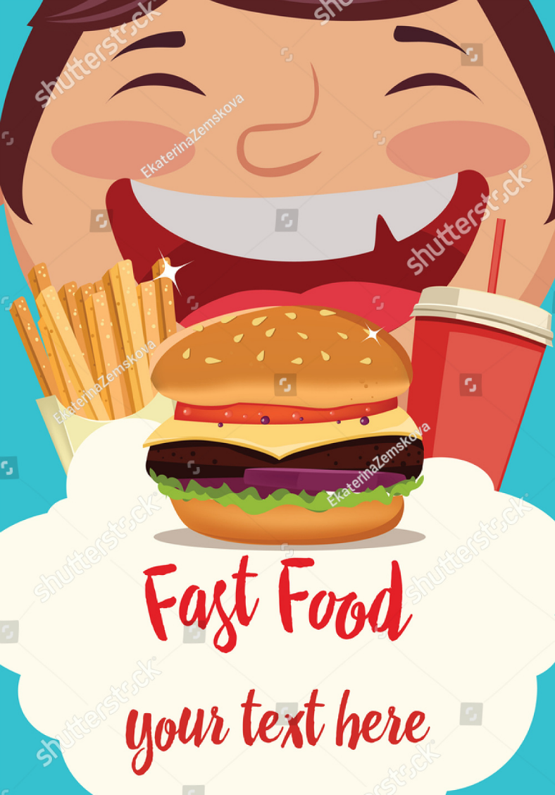
People often say that fast food are no good because they are greasy and full of preservatives, and while the statement is true, if you think that you have got something to offer that’s different from your competitors, then why not go with the poster design shown above? Who knows, you might be running a fast-food joint that offers dishes that are healthy. If you are, then for sure your establishment will stand out and even surpass the others just because you are able to offer something that is different from them. And from the looks of this flat design, just see how happy that person is, and that is something that you may probably see when people get a load of your healthy fast-food dishes.
Chalkboard-Inspired Seafood Restaurant Poster
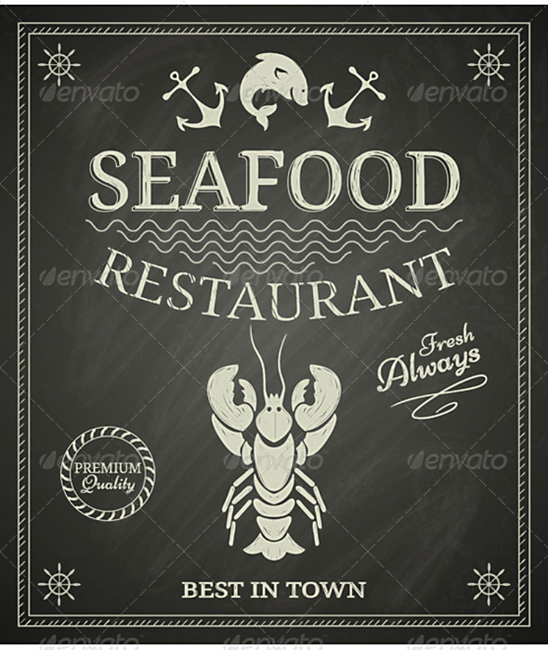
There are people who don’t eat meat for various reasons, some because of their culture, some because of health reasons, and some simply because of preference. For these people, the next best thing that they can have is seafood, unless they are allergic to it. Another subtle yet very effective route that the artist went with this poster design is the theme that inspired it all, and this is the chalkboard theme, which brings out the authenticity of the poster with the designs that were used by seafood restaurants back in the days. If you want a visually attractive and authentic look for your posters, then give this vintage design a try.
Hand-Drawn Burger Restaurant Poster Design
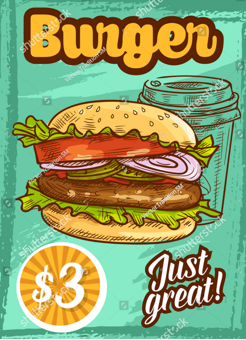
Hamburgers, so tempting! Have you ever seen the movie The Pink Panther? Not the original one but the remake. Yep, I know what you are going to say, “the movie was bad and didn’t live up to its source material.” But the movie itself isn’t the point here, it’s the scene where Inspector Clouseau takes his first ever bite on a hamburger. Do you remember his reaction? If you haven’t seen the movie, his reaction was priceless, that the whole world stopped, and that what he tasted was the most heavenly and impossibly delicious piece of sandwich on earth. For most people, they would have a somewhat similar reaction every single time they eat a hamburger, and that’s why this food is very popular. If you are running a burger joint or a restaurant that serves hamburgers, then why not promote it by using the poster design with the mouthwatering food illustration above?
Pizza Italian Restaurant Poster Design
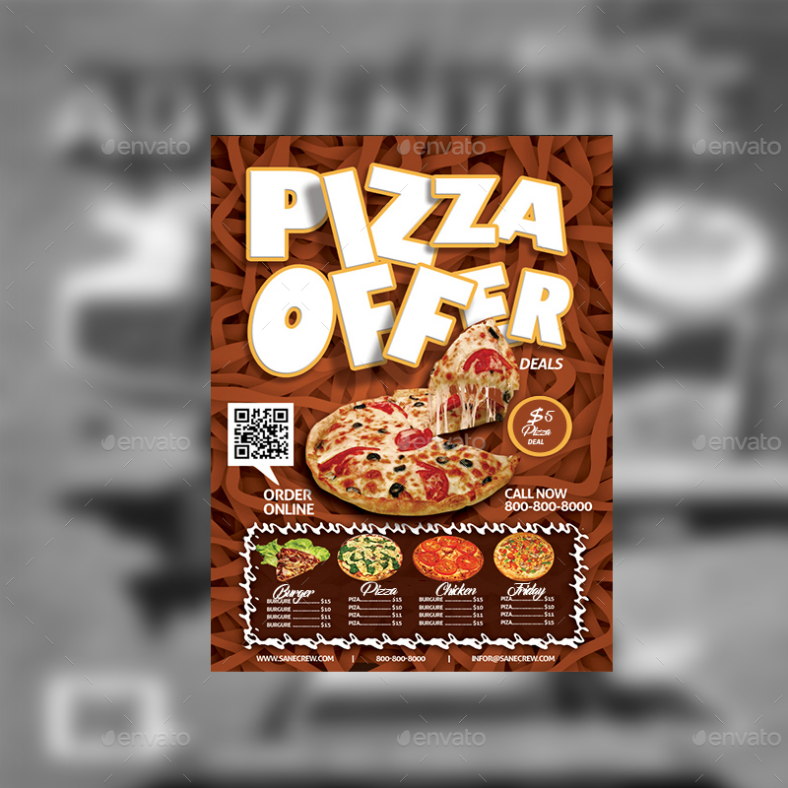
Another Italian delicacy on this poster design, but instead of featuring pasta again, this one features pizza. For those who are unfamiliar with it, pizza is a circular but flat piece of dough topped with tomato sauce, cheese, meat, and vegetables, though there are also vegetarian pizzas that have all those toppings except for the meat. And for those who are looking for a healthier variation of this dish, there are also pizzas that use a wheat-based dough and even substitute meat with tofu just to add a touch of protein to the food. But enough with the variations of pizza and back to the poster design shown above, it shows a large image of a pizza in the middle, which is intended for featuring their best-seller, and there are also smaller images of pizzas on the bottom portion for the other types of pizza that the business is able to offer.
Good Seafood Two-Tone Restaurant Poster
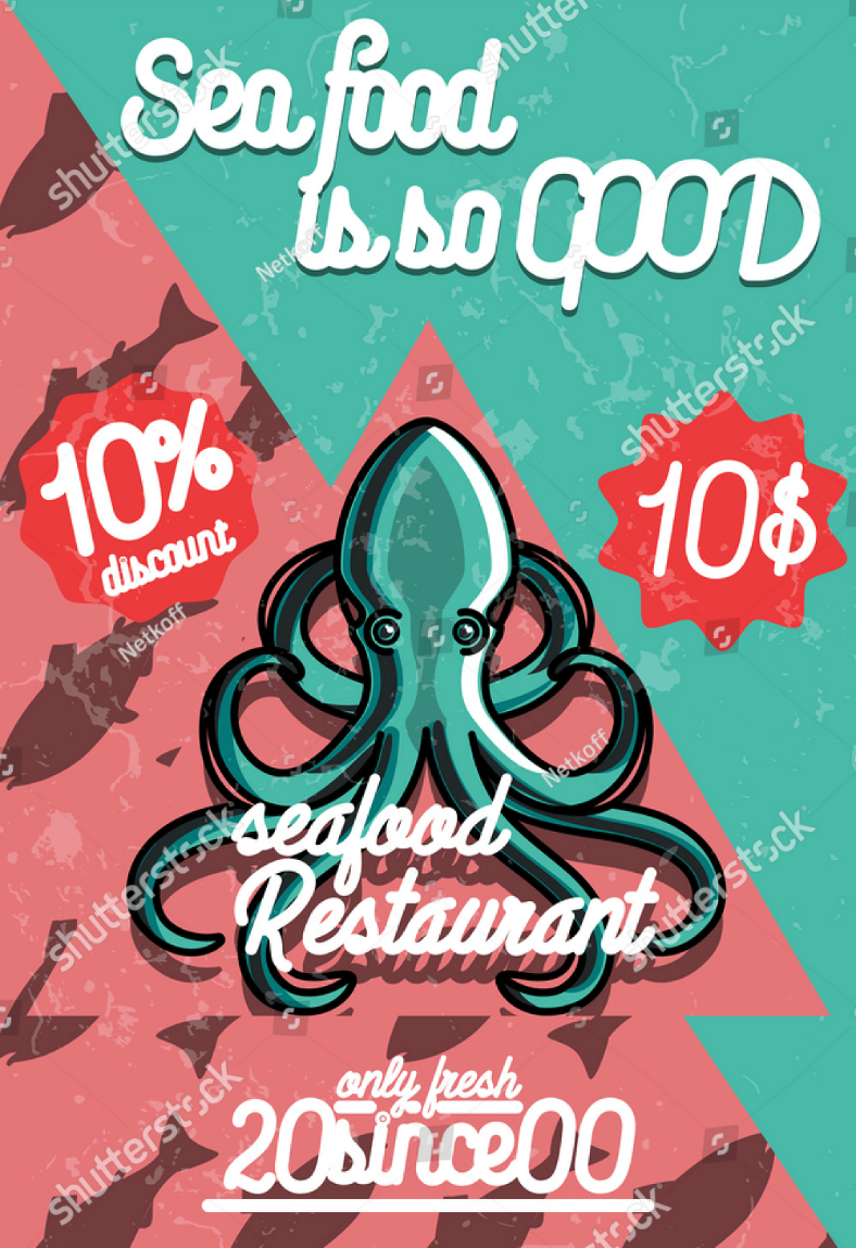
Lastly, another seafood restaurant poster design, but more modern and colorful this time around. As you can see from the image above, it shows the entire poster divided into two equal parts, with the lower-left half bearing a salmon pink background with silhouette images of fishes, and the upper-right half bearing a blue-green background that somewhat resembles the ocean. In the middle portion of the design is an illustration of a squid, which is surrounded by text that help in promoting the restaurant.
So, have you found the specific poster design that is perfect for your restaurant? We really hope you did because these designs have been made by some of today’s best graphic artists from all over the world, and they have contributed their awesome creations to all of us at a very reasonable fee. And just because these designs are cheaply priced, it doesn’t mean that the quality is cheap as well. These designs have an outstanding quality and are targeted to businesses that are tight on the budget.
When it comes to editability, these designs are very easy to edit, and it is because of its format. These poster designs use the vector format, which is not only fully editable but is also able to keep its sharpness regardless of how much editing you put into it. The reason behind this is because vectors consist of numeric codes that are able to adapt easily to changes, unlike raster graphics that consist of pixel blocks that stretch out when enlarged. Now that we have done our part in promoting the various restaurant poster designs that we have on our list, it’s time to do your part and download a design so you can start promoting your business as well.
Related Posts
7+ Summer Party Poster Designs
Best Poster designs 2016 Graphic
20+ Poster Mockup
18+ Boxing Day Designs
14+ Bastille Day Card, Flyer, and Poster Designs
11+ New Year Designs
8+ Shoot a Par with these
Wanted Poster Design Design Trends
Event Poster Design Design Trends
Travel Poster Design Design Trends
12+ Celebrate US Independence Day with these Poster Designs
Vintage Poster Design Design Trends
10+ Gothic Fonts - TTF, OTF Format Download Design Trends ...
20+ Flower Vectors - EPS, PNG, JPG, SVG Design Trends ...
58+ Halloween Designs - Free Printable PSD, AI, InDesign, JPG ...
