Hello people, it’s time to get in love with this month’s new portfolio websites. Get in, enjoy and have a great time viewing your favorite portfolio sites which allow the professionals, artists, freelancers and other talented lot to connect and helps them to work on a creative medium to display their works.
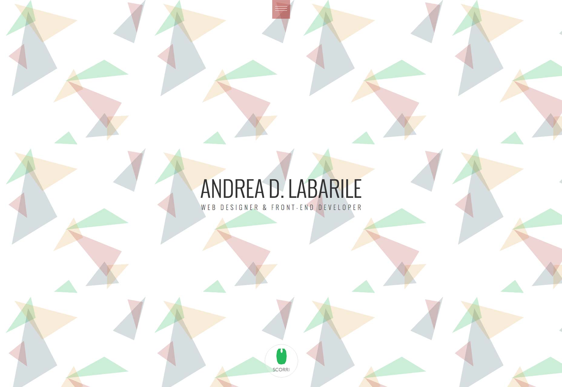
ANDREA D. LABARILE
This Italian styled site is impressive, simple and has great UX work. It looks fabulous and one could not have asked for more. His ideologies are admirable and worth keeping your eyeballs engaged for quiet sometime!
Admire his work and design ideas which are worthy of keeping your eyeballs engaged for a few minutes into it!
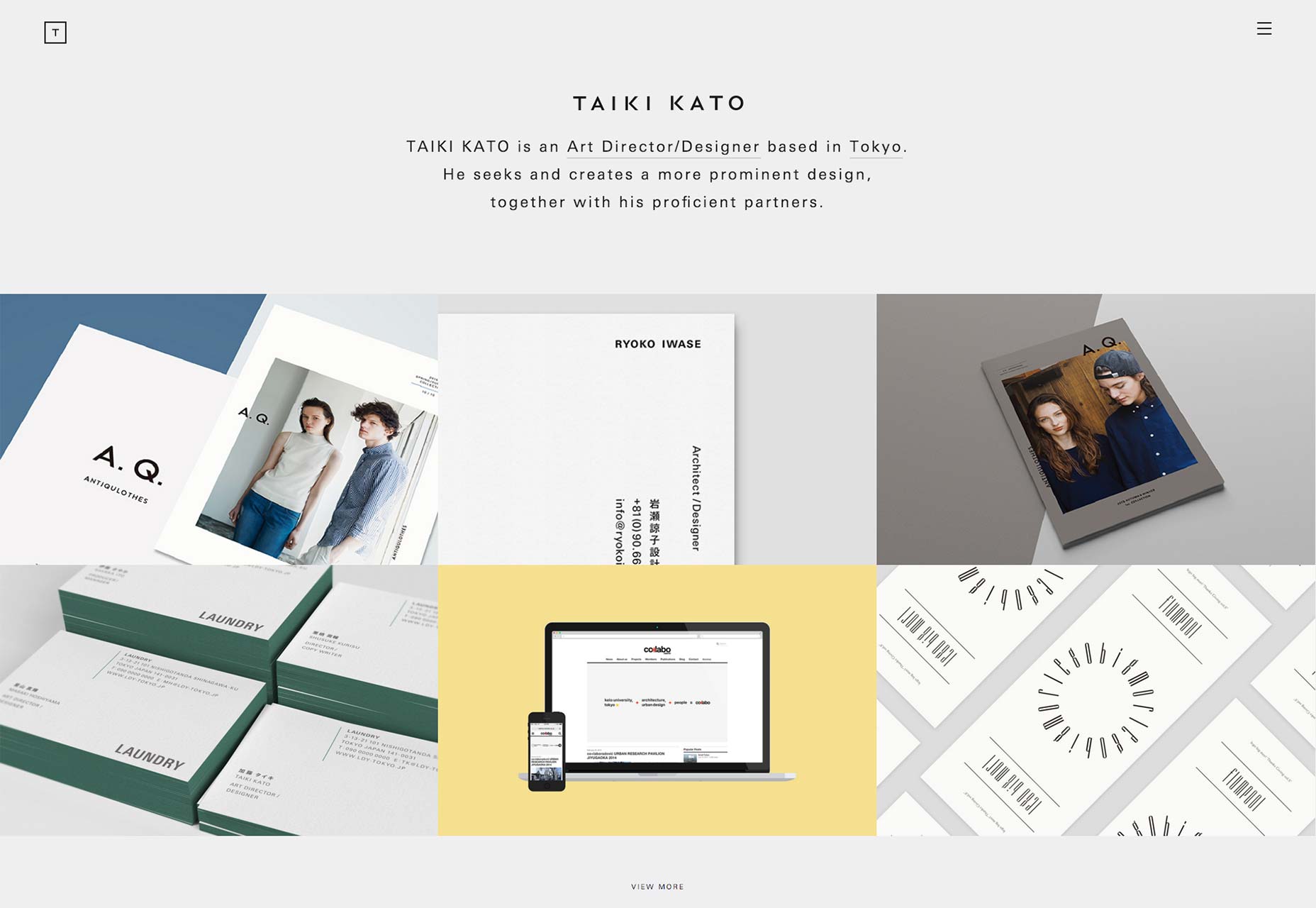
TAIKI KATO
Taiki Kato’s collection labels him as an art designer and that shows in his design.
This noticeably unique site offers great visual of use of topography- in English and Japanese. His impeccable way of managing two different languages is adorable and the fact that he’s doing a remarkable job in this task, is making the sit look even more spectacular.
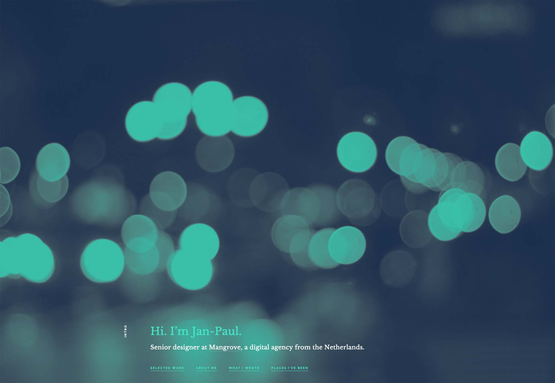
JAN-PAUL KOUDSTAAL
Jan-Paul Koudstaal does significant work on his portfolio website. He’s a great designer who has been awarded for his site being the most popular website in the year 2015.
It is a one-page wonder portfolio. Do visit this phenomenal site for hands on experience on the feel of portfolio sites.
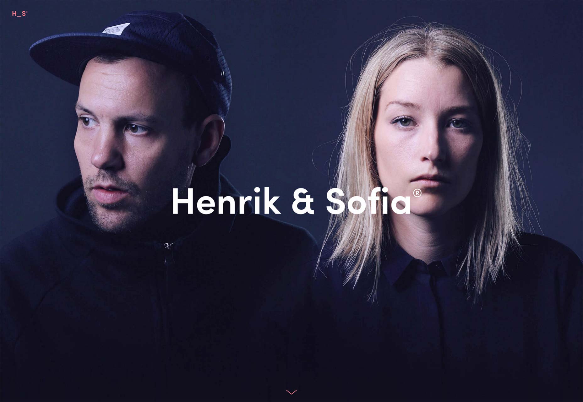
HENRIK AND SOFIA
Henrik Leichsenring and Sofia Gillström own a design studio and work as partners. They are a creative team and specialize in branding, designing, art direction and integrated campaigns.
With their great UX and modern style pattern, their portfolio is a specimen of how designers can work out their style.
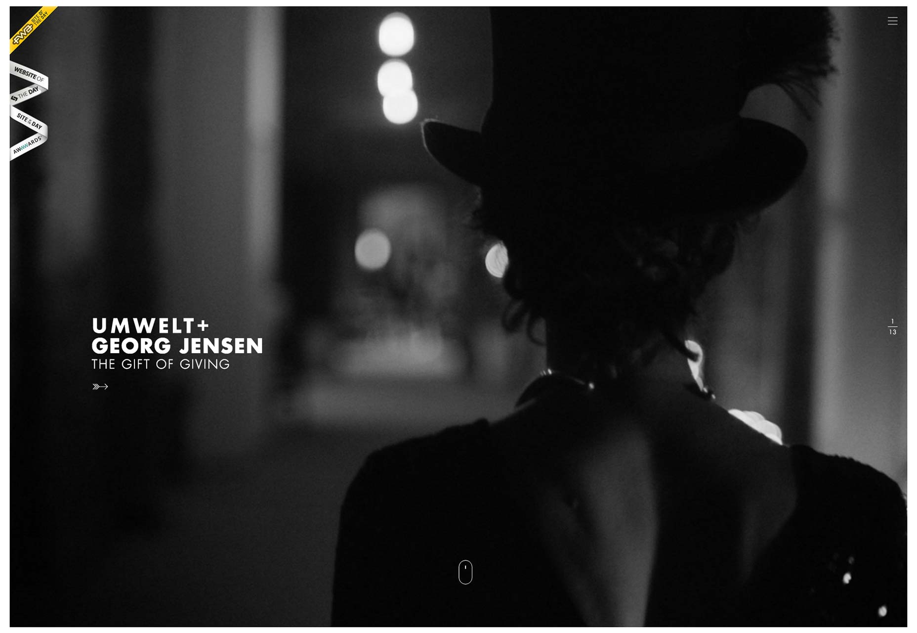
UMWELT
The best thing about Unmelt is that he makes the portfolio site look so appealing with his designs.
It truly is an elusive portfolio navigation with a stunning series of images. With the vertically-centered test, it look more superb.
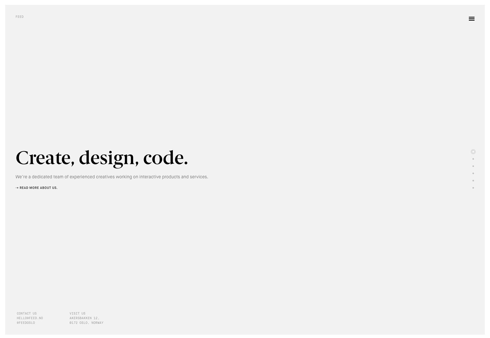
FEED
“Create, design, code”- that’s what has been the mantra of Feed for quite some time.
You are definitely going to like Feed’s website, it is so natural. However, they need to fix their UX errors.
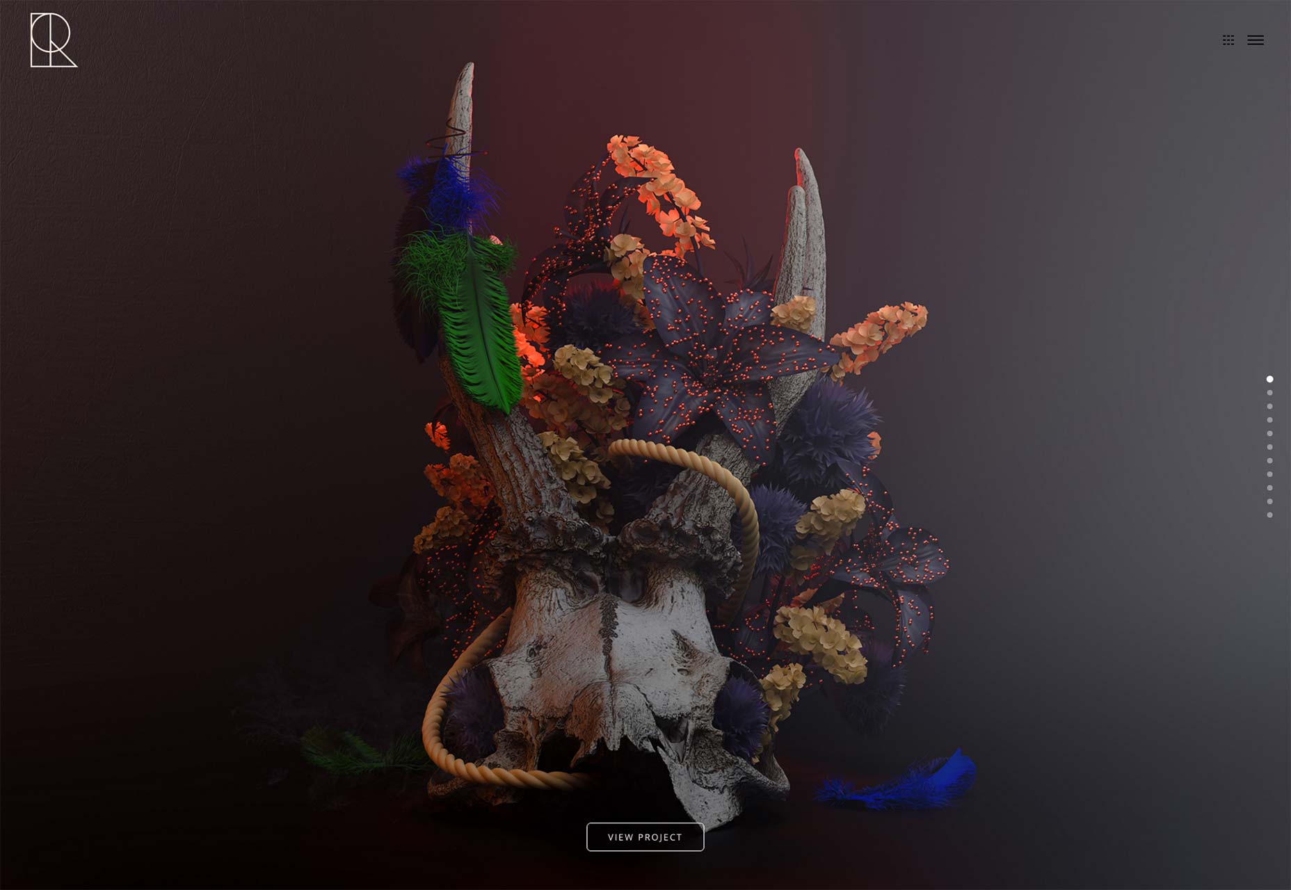
RAFAEL MERINO
Rafael Merino’s website portfolio is just beautiful enough to look in on the full-screen way.
Though you would not find anything pioneering in the layout or the design, but he does makes you involved in the design imagination process in such a way that you will be tempted to watch it for a long time period.
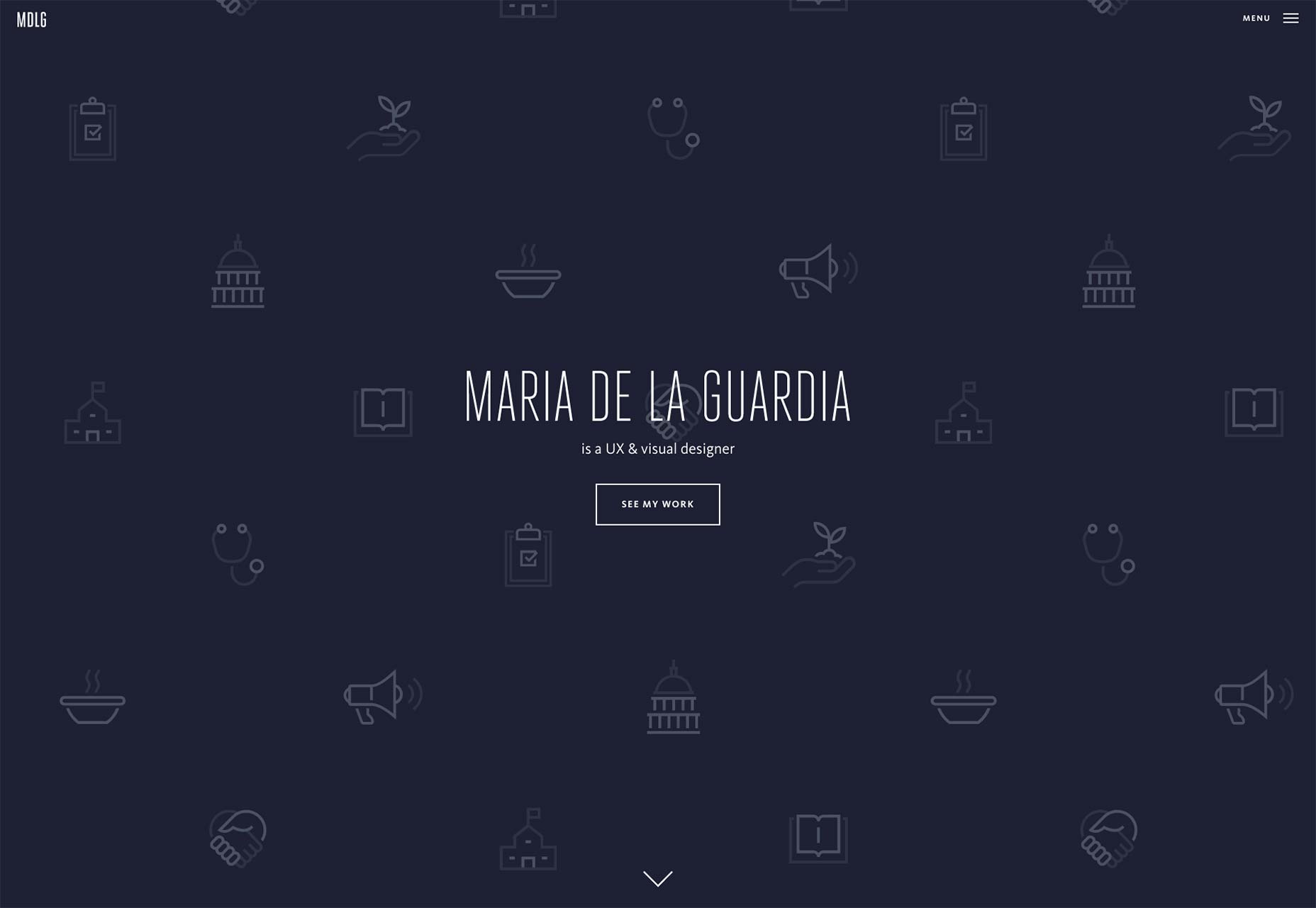
MARIA DE LA GUARDIA
Maria De La Guardia’s portfolio looks good, just like any other website portfolio. But what makes it outstanding is the way she blends blog admissions into the collection with her graphic work.
And why not, if you have written something that you are proud of, then you must add it to your portfolio as that brings a uniqueness to the design.
STUDIO RODRIGO
The studio Rodrigo’s portfolio website is flexible, for it can acclimatize extremely well to small screens and large screens.
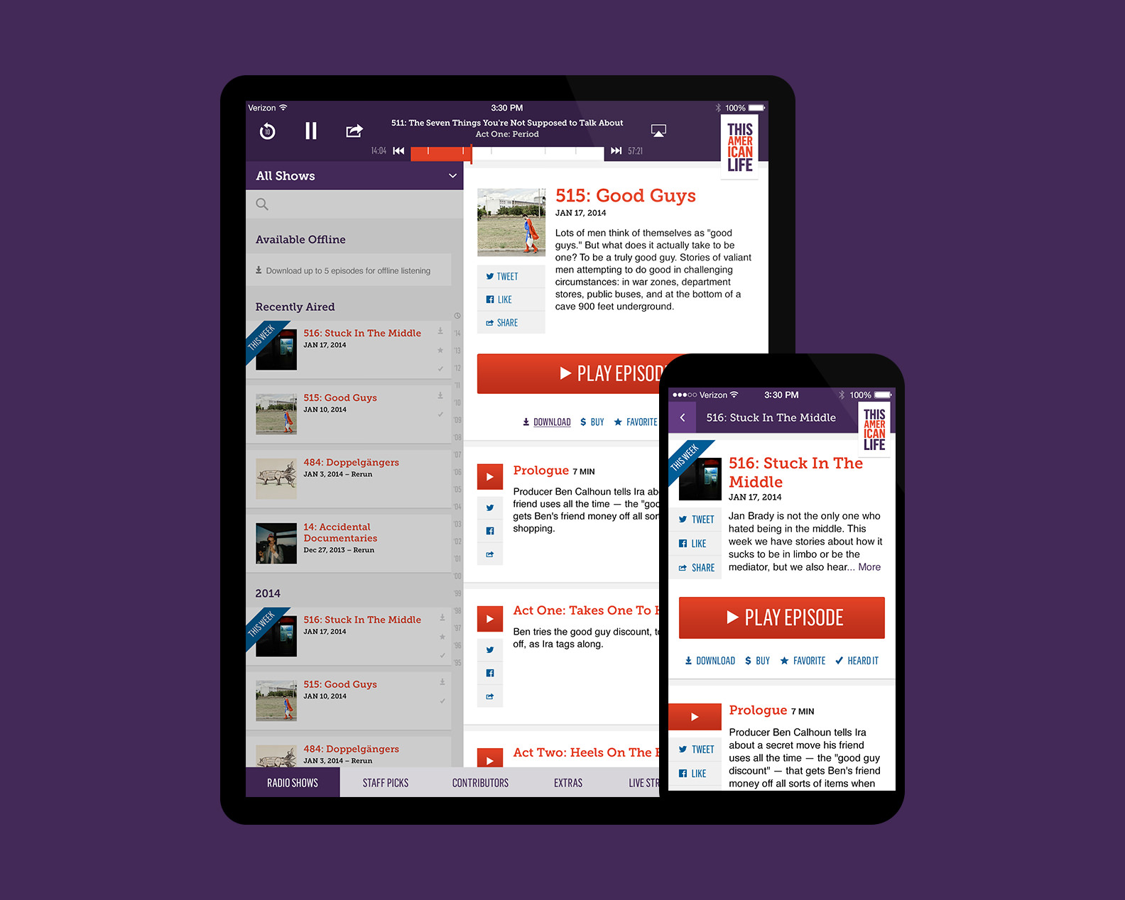
They brought the concept of centered columns a couple of years ago, and now it is being followed by many. They teach us how to make a slight amount of text look good even on an HD screen.
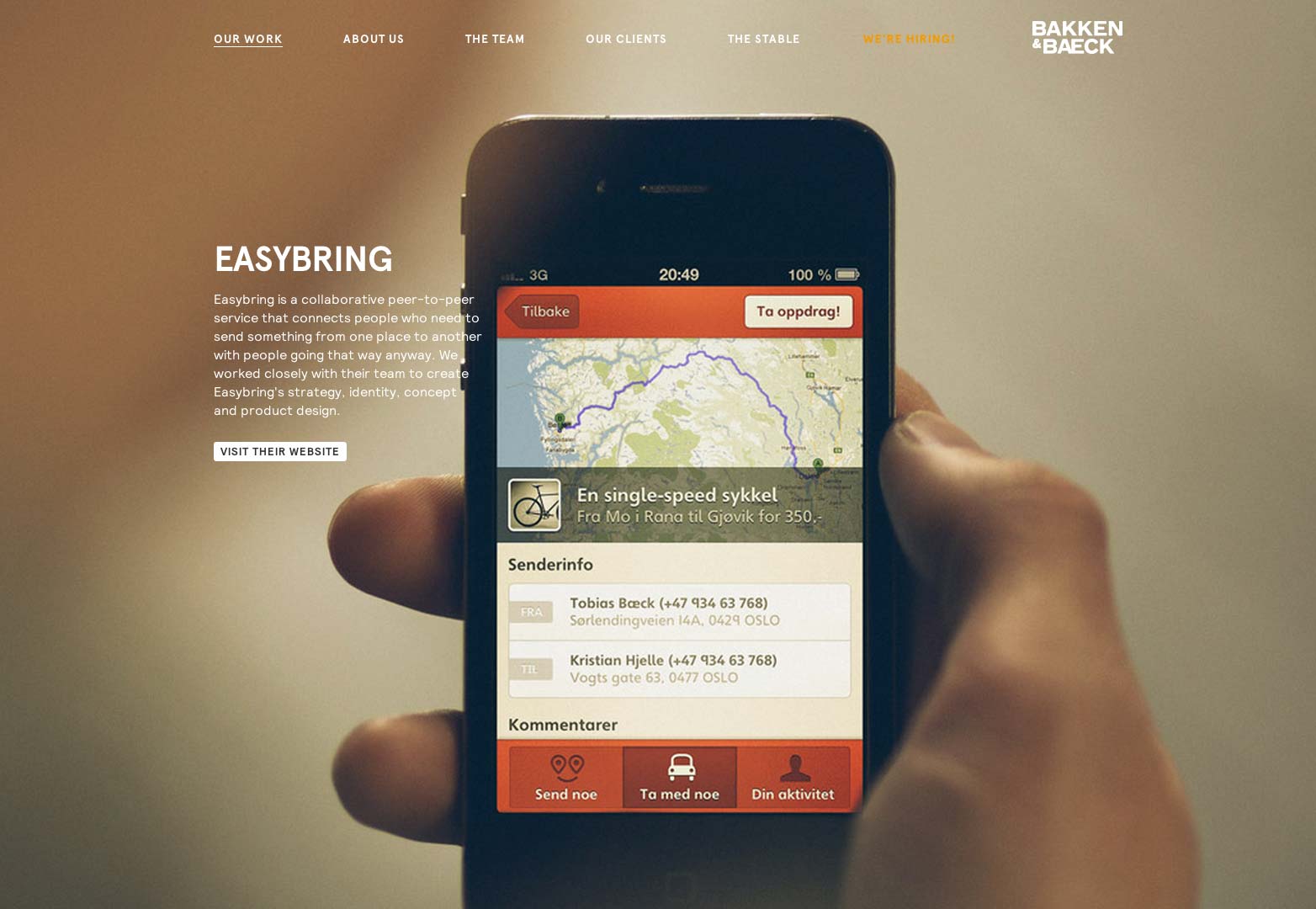
BAKKEN & BAECK
With Bakken and Baeck, mono-space fonts are back in design style!
Though it is nice to have a different variety of portfolios, it requires immense hard work to be able to pull it off perfectly. And that’s exactly what Bakken & Baeck have done remarkably well.
Related Posts
Best Designs for Album Covers 2023
12+ Best Web Designs for 2023 – Word, PSD, AI, EPS Vector
Top Best Font Style that Can Be Used in 2023
Best Digital Design Trends of 2023
Magazine Design Trends 2023
Top UX Design Trends 2023
Exceptional Packaging Ideas in 2023
Visual Design Trends 2023
Branding Design Trends 2023
Top 11 Email Marketing Trends for 2023
Best Poster Designs 2023: Ideas and Tips
Hit and Miss of Olympic Logo Designs from 1924 till 2023
10 Iconic Moments Photographed in 2023 Rio Olympics
Top 5 Logo Design Trends of 2023
2023 Packaging Design Pentaward Winners
