With all the visual graphics and high-quality pictures, one can sometimes overlook it, but typography forms an integral part of every design, be it print or digital. And when this typography is tested out in advertising, it can take the advertisement a level higher in conveying the message to the masses.
Typography can be as appealing as disturbing, so next time when you come across an impactful digital or print ad, make sure to consider the typography because it can be one of the very elements why the ad seems appealing to you.
Today we are discussing 10 such awesome typography designs that make the advertisement creative and influential.
1. Vans
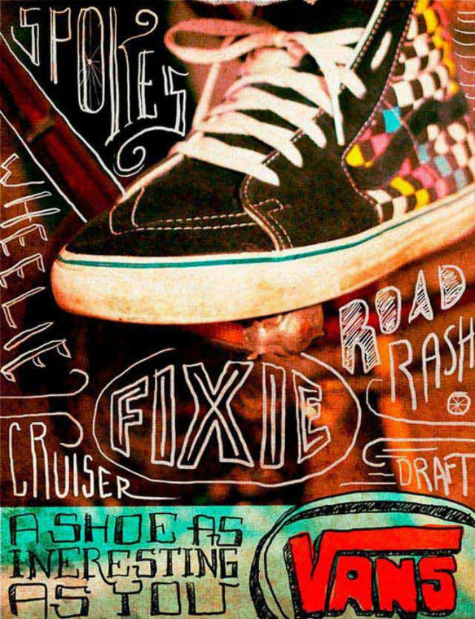
The comfortable and stylish shoe brand Vans, in its advertisement, uses dispersed, creative and casual typography to attract the attention of the viewers. The type goes well the nature of the brand that focuses on all styles and designs of casual shoes.
2. United Nations- Population Day
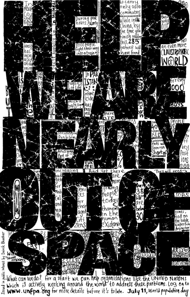
This United Nations, Population Day advertisement makes the message loud and clear not just with the copy but also with the style and usage of bold type. The message being stretched over the entire frame of advertisement with letters of different types covering the ad, depict the ever growing population and the urgent need to curb it.
3. Toyota
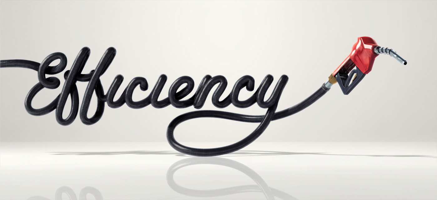
This Toyota advertisement couldn’t use a better style of font to reflect on the efficiency of the Toyota brand cars. The word efficiency being cursively written with the fuel pump, in the end, displays excellently on the minimal nature of graphic and type required to spread the right message.
4. US Preventive Medicine- The Prevention Plan (Cobra)
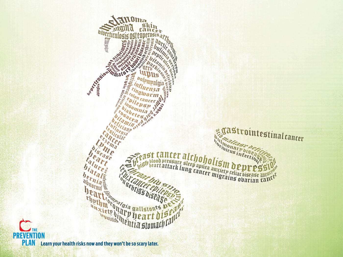
The prevention plan advertisement shows the letters in different fonts placed in the form of a snake to show that it is better to take care and learn about your health risks in time so that they are not so scary later.
5. Harley Davidson Nightster
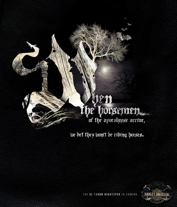
Harley Davidson Nightster advertisement with the ghostly font aptly covers nature of the motorcycle. Moreover, the colour of the advertisement chosen as dark black and shadowy white placed against the backdrop of dried tree and bats flying makes the advertisement all the more realistic and believable.
6. Coalition to Stop the Use of Child Soldiers (America)

This powerful advertisement sending a message across to stop the use of child soldiers is going to give you chills with the use of the image of a young boy with a gun placed next to the strong message of the campaign printed in an all caps type that appears serious in its appeal.
7. Species Risk Extinction
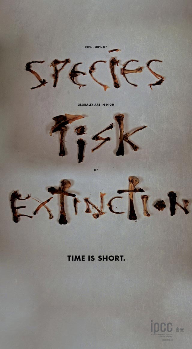
This species risk extinction advertisement takes the typography and design to the very basic by elaborating the message with the usage of typography in the form of bones. The typography upgraded with this simple detail of using bones instead of font makes the message all the more clear and direct.
8. Aspirin
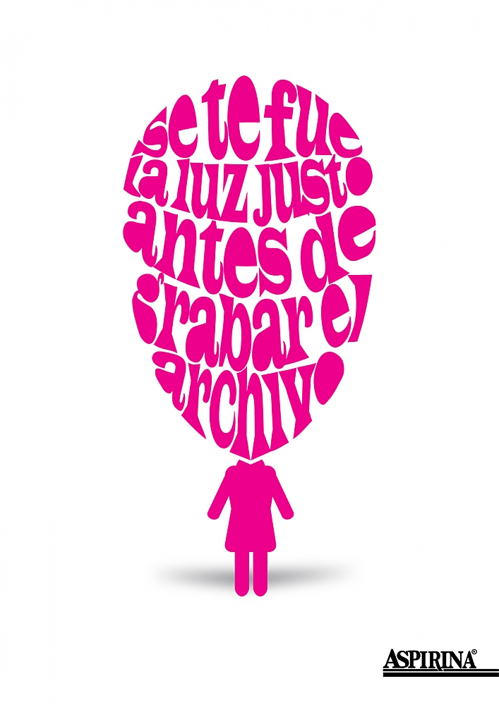
Aspirin ad that shows the impact that a headache can have on an individual with large bold typography placed in a format of enclosed circle pointing on the heaviness of the brain. The typography again comes out as the primary focal point to make the message and advertisement crisp and creative.
9. Australia Post
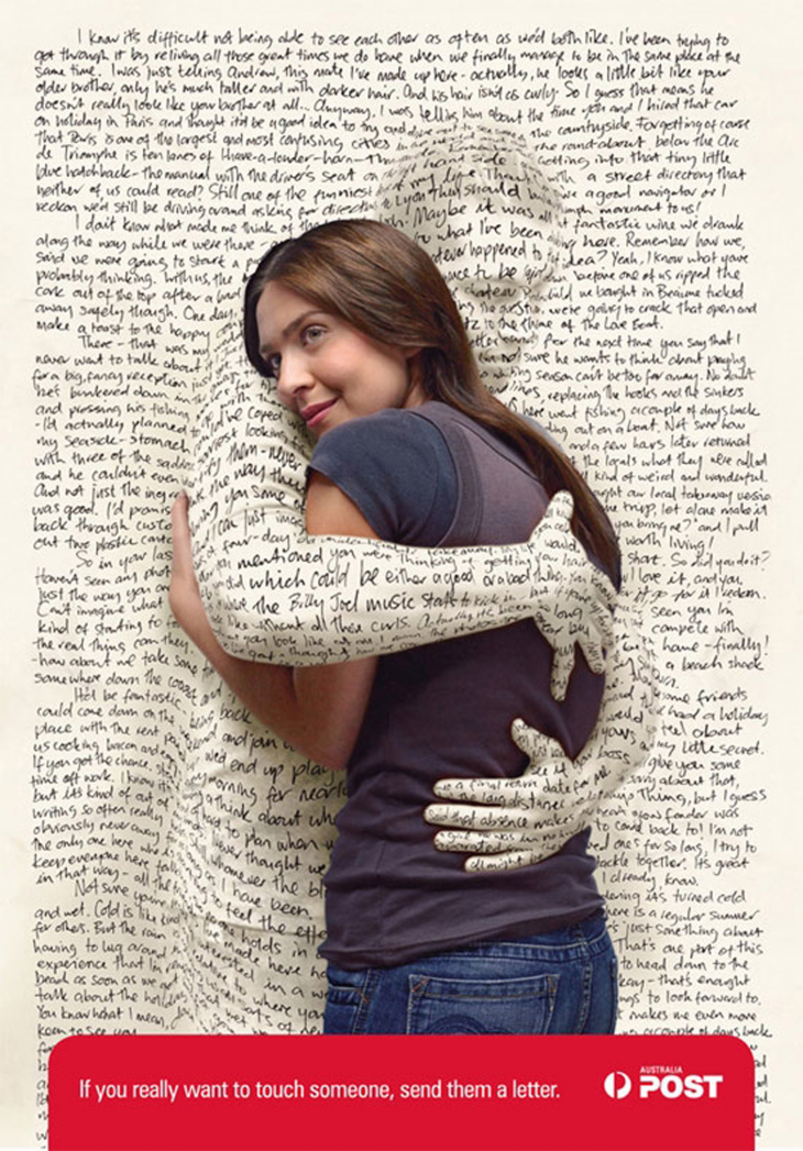
Australian post advertisement morphs the typography in a creative style by showing you the emotional connection one has with the letter. The man has been camouflaged in the form of letter covered in cursive handwriting to determine that letters will always remain the closest and most personal form of communication.
10. Fanta Tastable
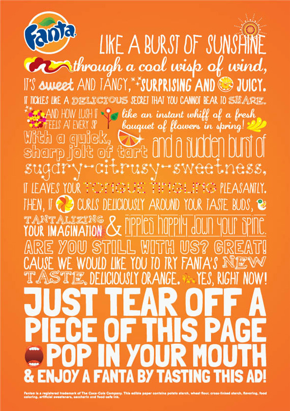
Fanta print advertisement uses a multitude of types and fonts to depict the nature of the drink and its likability with a number of people. Starting with a readable casual font and ending with a strong bold one makes the ad instantly catch the attention of the viewer.
A good design is always judged on the universality of design. Each and every element holds an equal importance and whether it is experimental, casual, sincere or overly creative, typography in an advertisement can help to set the tone, and create a sync between the graphic visual element and the product or the service being advertised.
Related Posts
Top 11 Email Marketing Trends for 2023
The Best New Portfolio sites, March 2023
Best Poster Designs 2023: Ideas and Tips
Hit and Miss of Olympic Logo Designs from 1924 till 2023
10 Iconic Moments Photographed in 2023 Rio Olympics
Top 5 Logo Design Trends of 2023
2023 Packaging Design Pentaward Winners
Digital Design Trends for 2023
Best Travel Apps for 2023
9 Script Fonts for 2023
10 Best Free Fonts for 2023
10 Best Mobile Games of 2023
Logo Design Strategies for 2023
Top 9 Web Design Trends for 2023
10 Most Popular Graphic Design Trends of 2023
