Working in a real estate industry or planning on putting up one? Don’t get yourself left behind from the competition. Many real estate firms have adapted to both the traditional and modern methods of getting themselves recognized and in providing their prospects with the assistance they need. If you wish to see how you can reach out to people the traditional way, you can go check out our collection of real estate flyers or brochures.
But then again, we are now living in a world that embraces technology, which is why it is very important for us to adapt to this type of environment. Setting up a website to promote your firm is the best and most professional way that you can do this. But if you are entirely new to this, you may need some inspiration as to how you can make your website. Below is a list of some of the best real estate websites on the Internet, and you can all use them as sources of ideas for your own website.
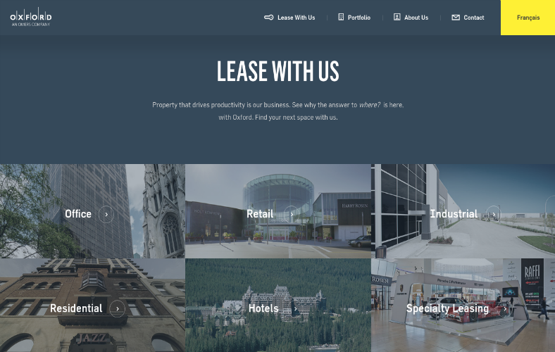
Oxford Properties Group
Welcome to the website of the Oxford Properties Group, which is a world-renowned website for real estate investors, developers, and managers. Once you step foot on their website, you will be greeted by an image of one of their high-rise structures, and a link that will redirect you to a brief history on how the industry came about. Scrolling down the home page will take you to a list of the website’s various sections which include the industry’s different branches as well as the types of properties that they have to offer, just think of this as an online real estate catalog.
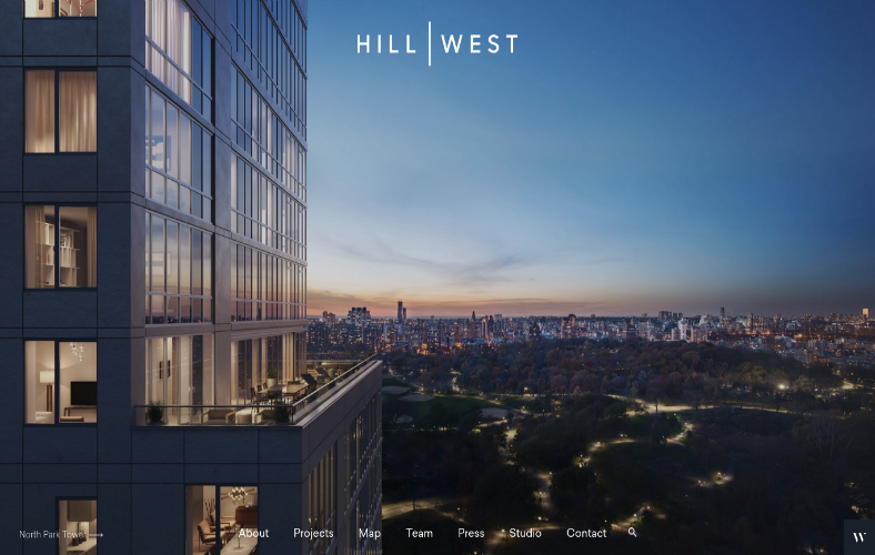
Hill | West
Take a look at this mesmerizing website by Hill | West, which showcases breathtaking views and scenery while featuring some of their properties. While the main page of the website is very simplistic and only features a slideshow of images, it allows visitors to focus all their attention toward some of the industry’s best-known properties. To allow for easy navigation, a row of tabs are arranged on the bottom-most portion of the home page that can lead visitors to various sections of the website.
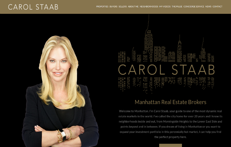
Carol Staab
Carol Staab is one of today’s most-recognized name when it comes to real estate, and she has indeed made a name for herself in the industry. Based in Manhattan, New York, Carol Staab has had a reputation of finding people the perfect properties that fit both their preferences and budget. Because of her reputation, it only makes sense that she and her industry deserves a stunning website that easily stands out from the competition. As you get to her website, it would be impossible not to recognize the illustration of the borough of Manhattan on the logo, which is totally understandable considering the prestige she has gained for all her successes. If you wish to make a highly memorable logo for your website, go check out our collection of real estate logos as a source of inspiration.
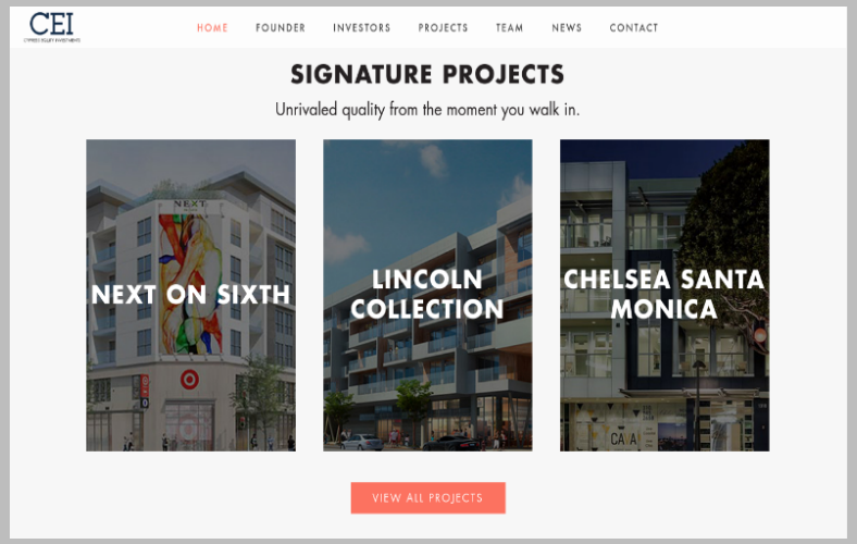
Cypress Equity Investments
CEI Homes is a real estate company that was founded in Los Angeles in 2001, and is basically comprised of real estate professionals who have had gained the needed experience in executing investments strategies from their three decades in the industry. The website’s home page greets its visitors with a slideshow of some of their best properties along with the goals that the company is planning on achieving, and scrolling down will show a section featuring some of their signature projects. This company aims to have growth, integrity, and vision for them to be successful.
Versed
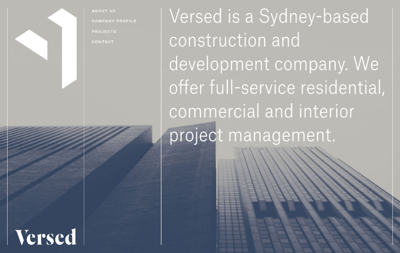
Versed is a construction and real estate company that is based in Sydney, Australia, that knows how to give what their every client wants by fully understanding their preferences. This company is fully aware of all the challenges and complexities in the industry, and are willing face them just to finish their projects. Upon arriving at the website’s home page, you will be presented by a minimalist-looking interface that is divided into three columns, each with a designated purpose. The first and left-most column is specifically intended for the company’s logo and name, followed by a column that contains the different sections of the website, and the last and right-most column is where a brief introduction of the company is written.
The Dana Hancock Team
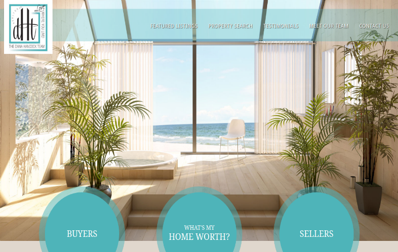
The team organized by Dana Hancock is one that is willing to go the extra mile in providing home sellers with prospects and home buyers with various properties to choose from. This team is comprised of advisers, facilitators, and negotiators to really assure that a client will get the service they deserve. As you can see from the image above, the main page of the website shows its visitors a breathtaking view of the ocean from the perspective of one of the firm’s best sea view properties. This website can be navigated easily since most relevant information can be found conveniently on the home page, with some of the tabs settled at the top-most portion of the page and a few testimonials from satisfied clients placed on the bottom half. If you prefer to use WordPress for your website, you may also refer to our collection of real estate WordPress themes and templates.
Advalurem Group
A professional and world-renowned real estate company calls for a modern and intelligent-looking website that appropriately fits their image. With an experience of over fifty years in the world of real estate, clients can assure themselves of satisfying services and results when they call on this real estate firm. The main page of the website is very simple, as it only contains a single image as the background with an added parallax scrolling effect. On this main page are the tabs that can lead visitors to the different sections of the website, along with a short introduction as to why this firm is considered as one of the best all over the world.
Rentberry
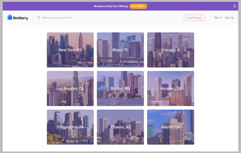
Rentberry is a company that is a little bit different from the previous ones that you have just seen on this article, wherein it offers their clients with properties—specifically apartments—that they can rent. This is a company that perfectly fits those people who wish not to have their own property but would rather rent one to minimize expenses and responsibilities. For frequent visitors, Rentberry also offers sign-up opportunities for them to be easily notified when a property that perfectly suits their preferences becomes available. The interface of the company’s website resemble a Web search engine, and this is a good move by the company since most people are very familiar with how to use search engines. If a visitor already knows what they are looking for from an apartment, they will only need to scroll down where clickable thumbnails of different locations are arranged. But if they have something else in mind, they can always refer to the search box where they can enter particular keywords according to their preferences. The way this website works is very similar to that of traditional real estate brochures.
Nashville Realty Group
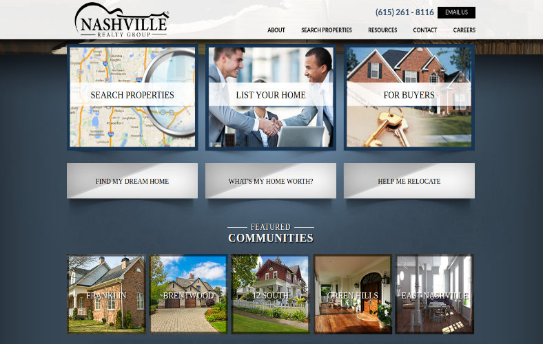
Nashville Realty Group is the ideal place for every person looking for houses or planning on putting one on the market, and the primary focus of this firm is not on the selling of houses but on the services given to their clients, to provide for their needs and demands. Nashville Realty Group assures to understand the growing demands of every client as well as the firm’s growing responsibilities, which is why they prefer to work hand in hand with their clients to be able to understand them fully and be able to provide what they need. Their websites provide easy to find sections where sellers may be able to enlist their properties and another for buyers who wish to look for their dream home. There is another section on this website that makes it superior from the other ones, and it is a section called careers where it offers people who are fresh out of school or those who want a shift in their career with an opportunity to work for the firm.
Synapse Development Group
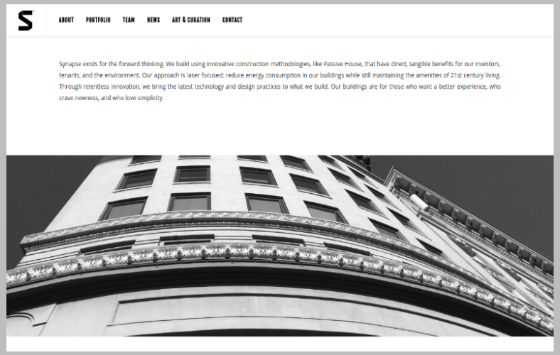
Synapse Development Group is a real estate firm that aims to deliver world class services to all their clients by anticipating what their clients need and being a step ahead at all times to avoid any delays in the rendering of their services. Just as the company takes advantage of modern technology in all their services which range from the construction of their buildings to providing their prospects with properties to choose from, their website also adapts well to the modern trends. The home page of the website right away presents visitors with details regarding the company, as well as the people who are in the group. Somewhere on the bottom half of the home page are featured articles that give mention to the firm, and the contents here serve as the testimonials section of the website.
Dwellem
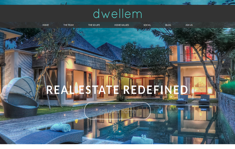
Dwellem is definitely “real estate redefined” by utilizing a customized plan in the marketing of houses and properties, and in the assistance of buyers to get them the perfect house that suits their budget and preferences. During the entire process of selling a house, each member of the team is assigned with a specific and vital task, which helps in creating a smooth sailing environment as well as lessening any hindrances. The firm’s website features videos that visitors can watch to orient themselves with regards to the team of professionals involved, the core values of the firm, and some relevant guidelines on how to choose the ideal home. If you wish to reach out to your prospects by way of using postcards, you may also be interested in checking out our collection of real estate postcard designs.
Hix Snedeker Companies
Hix Snedeker Companies is a real estate firm that has reached a combined total of 4.1 million square feet of land and has garnered a total of a 150 years combined experience from its team members. This firm also claims to be at the top when it comes to providing both home buyers and sellers with the services that they deserve, and this is something that every client would look forward to when searching for professionals to assist them in commercializing their properties. However, the look of the website presents the firm in a rather minimalist manner but still is able to hold enough relevant information to give visitors an idea with regards to the team involved. The theme of the website resembles a photographer’s online portfolio wherein the firm’s projects in various places are being presented through highly organized thumbnails.
Tips to Creating a Great Real Estate Website
- While Internet browsing on computers is still the most preferred way of navigating the World Wide Web, it is best to make your website versatile enough for those who surf the Internet on mobile devices. Web browsing on phones or tablets is best for people who are always on the go, and it would be less appealing when the contents on a website can hardly be read on smaller screens.
- Invest on a secure and high quality domain that is absolutely free of any pop-ups. The presence of pop-ups—especially unwanted ones—on a website could interrupt visitors and probably result in prospects losing interest.
- Optimize your website well that it is capable of handling heavy traffic, because if there’s one thing that every Web user hates, it is websites that take too long to load. One of the best ways that you can pull this off is by utilizing a clean and organized look for your website.
- Provide your visitors with guidelines as to the things that they should take into consideration when looking for the ideal home. You may even choose to provide them with a brief discussion with regards to the entire housing industry to further broaden their knowledge. This way, it gives prospects the impression that you are truly knowledgeable in what you are doing.
- Provide visitors with a highly convincing call to action, as well as making the contact details easy to find to fully entice them to reach out to you.
- To help you ease up on the stress of having to create a website, you may also refer to our list of some of the best online website builders.
Related Posts
11+ Free Wedding Website Themes & Templates Design Trends ...
10 Best Graphic Design Websites Design Trends - Premium PSD ...
20 Travel Websites Design That Inspire Design Trends - Premium ...
Top 10 Websites for Wedding Invitations Design Trends - Premium ...
17+ Best Non-Profit Website Themes & Templates Design Trends ...
18+ Best Fashion Website Themes & Templates Design Trends ...
8+ Best Photographer Website Themes & Templates Design ...
16 Best Medical Website Themes & Templates Design Trends ...
15+ Best Photo Website Themes & Templates Design Trends ...
21 Best Construction Website Themes & Template Design Trends ...
7+ Free Photography Website Themes & Templates Design Trends ...
18+ Free Business Website Themes & Templates Design Trends ...
Samples of Trendy Pre-built Websites for 2017 Design Trends ...
20+ Best WordPress Website Themes & Templates of 2016 Design ...
20+ Responsive Mockups - Editable PSD, AI, Vector EPS Design ...

